branding and web design, conversion design, brand identity, web design strategy, lead generation
Branding and Web Design for Conversion-Focused Sites
by raffiné studio

A service business can have a polished homepage, a strong logo, and a clean colour palette, yet still struggle to book calls. That usually means the site is doing one job, looking credible, while missing the other job, moving a visitor from interest to enquiry. In Sydney, I see this most often when the website, the brand system, and the booking path were built separately, then stitched together later with no shared logic.
Australia's online market makes that gap expensive. Consumers spent A$62.3 billion online in 2022, up from A$50.5 billion in 2021 and A$42.5 billion in 2020 Figma resource library. When that much purchasing happens online, every service business is being judged on credibility, clarity, and differentiation before anyone picks up the phone. The site is not a brochure sitting on a shelf, it's the first real brand conversation.
Table of Contents
Keeping the Brand Consistent Across Web, Social, and AI Search
What Good Looks Like Across Buyers Agencies, Brokers, and Professional Services
The First Ten Seconds of a Service Website
A visitor lands on a service site and makes a decision almost immediately. They do not sit there thinking about brand theory. They scan the hero, notice the typography, feel the friction of the navigation, and decide whether the business looks like one they can trust with a serious enquiry. That judgement happens before the visitor understands every service line.
For Australian service businesses, that matters because digital presence is now close to universal. The ABS found that 90% of businesses had internet access in 2022–23, which means your site is rarely compared against no alternative at all, it's compared against a crowded online field Figma resource library. A homepage that is merely tidy can still lose to a homepage that is sharper about who it serves, what happens next, and why the business is different.
Practical rule: if a visitor can't tell what you do, who it's for, and how to book within a few seconds, the design is doing too much decoration and not enough direction.
The mistake I see most often is a split between the brand intent and the page structure. The founder wants to be seen as strategic, but the site opens with a generic line and a stock image. The result is a weak first impression, even if the offer itself is strong.
That's why the website has to be treated as a primary brand touchpoint, not a digital brochure. A refined identity system only matters if the page architecture helps the visitor take the next step. The internal structure on Raffine Studio's work shows that this is less about a prettier homepage and more about making the first glance do real commercial work.
How Brand Identity and Web Design Connect
Visual note: all supporting graphics in this article should be presented in black and white to match a clean, minimal brand presentation.
Brand identity, visual identity, and web design get blurred together all the time, but they're not the same thing. Brand identity sets the positioning, promise, and tone. Visual identity covers the logo, colour system, type, motion, and imagery. Web design is the architecture, layout, interactions, and performance that carry the brand through a live experience.
A useful way to think about it is a shopfront, signage, and interior layout. The brand identity tells people what sort of business they've walked into. The visual identity gives it recognisable presence. The web design decides whether they can find the counter, understand the service, and move toward a booking without confusion.
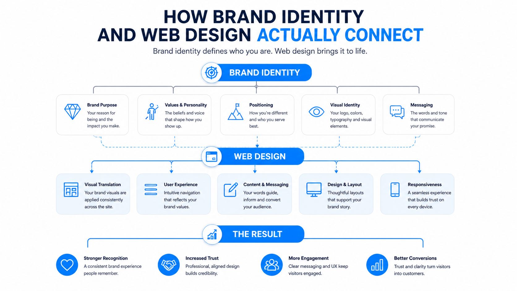
Where each layer shows up on the page
Positioning belongs in the headline, subheadline, and hero support copy. If the brand is trying to speak to high-trust, high-consideration buyers, the first message has to sound deliberate, not hype-driven. Colour and typography affect whether the site feels calm, technical, premium, or casual, and that impression lands before the body copy is read.
Information architecture is the layer that often gets ignored. It determines whether the visitor sees a service path, a case study path, a trust path, or just a wall of menu items. The best brand systems don't fight the website structure, they inform it.
That is where design tokens become useful. They keep spacing, colour, type, and component styles consistent across the main site, landing pages, social templates, and AI-generated snippets. Without that shared system, a business can look coherent on one page and fragmented everywhere else.
Good branding makes the promise clear. Good web design makes the promise usable.
The practical takeaway is simple. If the brand language and the page hierarchy don't agree, the visitor feels it immediately. Beautiful visuals without strategic identity feel generic, and strong positioning without visual discipline feels unfinished.
The Conversion Mechanics Behind a High-Performing Site
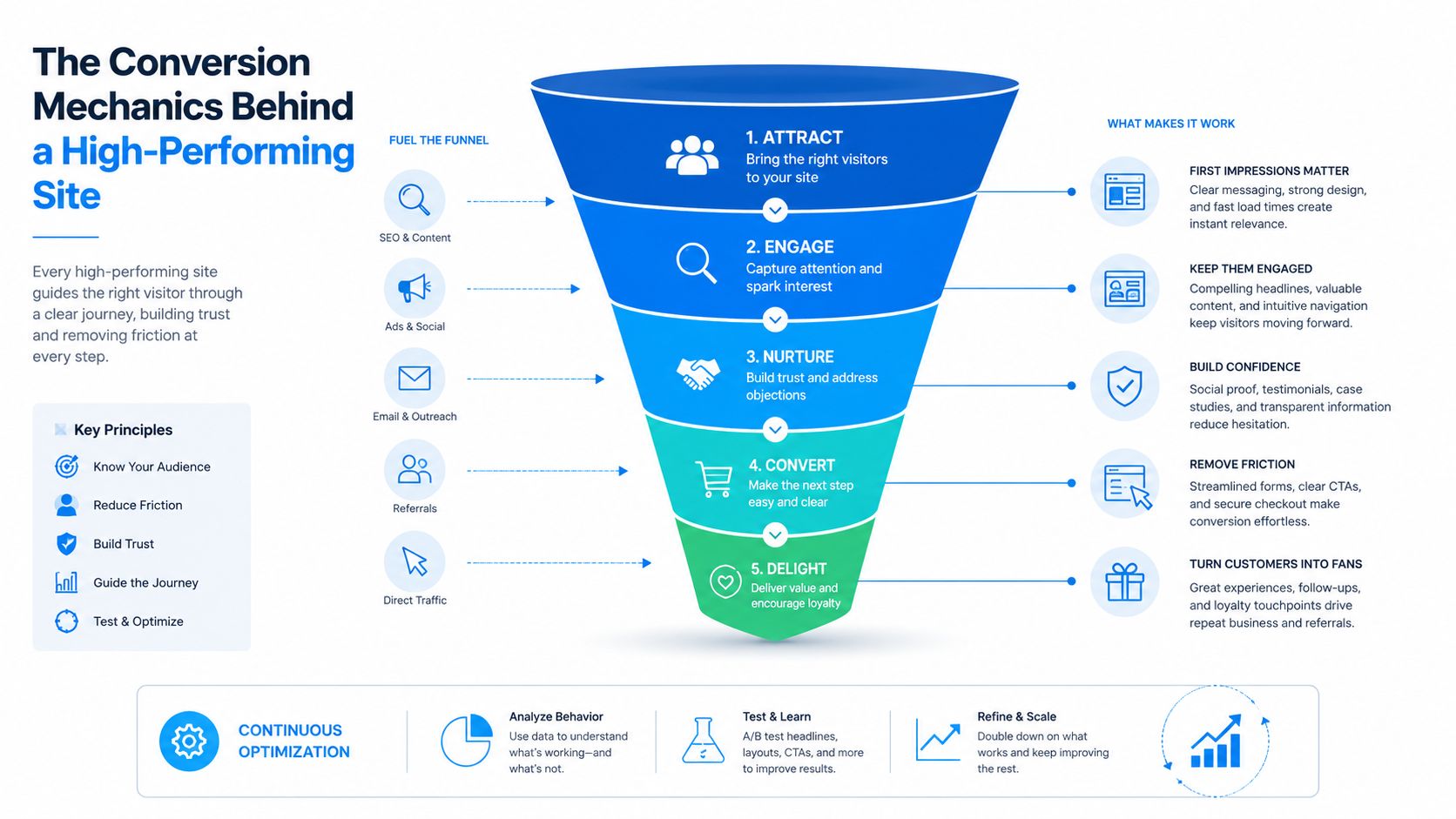
A high-performing site doesn't win because every element is loud. It wins because the eye lands where it should, the message stays consistent, and the next action feels obvious. One benchmark reports that sites prioritising UX can achieve a 400% higher visit-to-lead conversion rate than poorly designed sites, which is why branding choices can't be separated from conversion mechanics Tenet.
The pieces that actually move bookings
The first lever is visual hierarchy. A page needs one dominant action, not three competing invitations. If the booking button shares attention with every other element, the visitor has to decide for themselves, and that's where drop-off starts.
The second lever is CTA consistency. Repeating the same button style, placement logic, and action wording across key pages helps a visitor recognise the next step without re-learning the interface. A brand can still use colour creatively, but the primary action has to stay visually dependable.
The third lever is copy tone. Brand voice should reduce uncertainty, not perform personality for its own sake. On a service site, the copy has one job, move the visitor from “I'm interested” to “I know what to do next”.
The technical side matters too. Optimised images, CDN integration, minified code, schema-enabled SEO, and mobile-friendly layout all protect the conversion path because they keep the page quick and legible on smaller screens Tenet. If a hero image loads slowly, the brand story is interrupted before it starts.
A bold colour clash can help a CTA stand out, but it can also wreck cohesion if it feels disconnected from the rest of the palette. The right call is rarely “make everything louder”. It's usually “make the one action unmistakable and let everything else support it”.
From Brochure Site to Conversion System
Most service websites still behave like brochures. They describe the business, list a few credentials, and leave the visitor to decide what happens next. That can look polished, but it leaves too much to chance.
A conversion system works differently. Every page has a job, every visual cue points somewhere, and every section helps the visitor make a decision. That matters for agencies, brokers, and professional firms because the audience usually arrives with intent already formed, through search, referral, or social, not by browsing casually.
Element | Brochure Site | Conversion System |
|---|---|---|
Homepage | General overview of the business | Clear promise, audience fit, and primary action |
Navigation | Broad and descriptive | Tighter paths that reduce choice overload |
Calls to action | Scattered or inconsistent | Repeated, predictable, and visible |
Service pages | Informational only | Built to answer objections and route to booking |
Social traffic | Sent to profile pages or the homepage | Sent to focused landing journeys |
Measurement | Basic traffic checks | Clear view of where visitors hesitate |
The brochure model treats the website as a static asset. The conversion system treats it as a live funnel. That shift changes how you write the homepage, how you order proof points, and how you design the booking flow.
The site architecture on Raffine Studio's system page reflects this approach in practical terms. The point is not the page itself, it is the thinking behind it. If a page does not move a qualified visitor closer to a conversation, it is decorative, not strategic.
The pieces that move bookings are often unglamorous. Clear page hierarchy, repeated calls to action, accessible contrast, and forms that do not demand too much from the visitor all do more work than a flashy animation ever will. That is where branding and web design stop being separate deliverables and start acting like one conversion system.
Keeping the Brand Consistent Across Web, Social, and AI Search
Brand consistency used to mean making sure the logo, palette, and tone looked the same everywhere. That's still necessary, but it's no longer enough. Prospects now encounter a business through a social post, a search result, an AI-generated summary, and only then the website, so the brand has to survive being fragmented and paraphrased.
Australian usage makes that reality hard to ignore. Recent data shows 83% of internet users use generative AI tools, and 77% use them for search or retrieval tasks JAM Partnership. That means your positioning can't only work when the full homepage is visible. It has to make sense when reduced to a short summary.
What consistency needs to look like
The same positioning language should appear across the site, social captions, metadata, and structured content. If the website says one thing and the social account says another, the visitor has to reconcile the difference on their own, and many won't bother.
Schema and structured snippets should reflect the same business model and service language the visitor sees on the page. That doesn't mean stuffing keywords everywhere. It means giving search systems and AI tools clean, understandable cues about the same offer you want people to book.
Social content needs a direct handoff into the site. A useful post should not send people to a dead end or a vague homepage. It should lead them into a landing journey with matching language, the same promise, and a clear action.
If a brand can't be summarised by AI in one sentence and still sound like the same business, the system isn't ready for multi-channel discovery.
The missing link is usually not more content. It's alignment. A coherent site, social presence, and booking flow make the business easier to recognise, easier to trust, and easier to act on.
Accessibility and Inclusion as Brand Strategy
Accessibility gets treated like a compliance task too often, yet it changes brand perception fast. In Australia, about one in five people live with disability, so a site that assumes perfect vision, perfect dexterity, and perfect confidence is excluding a real part of the market Branding Journal.
That exclusion shows up in ordinary design choices. Light grey text on white backgrounds, tiny type, moving elements that distract rather than guide, and forms that ask for too much too soon all create friction. For some users, that friction is the reason they leave. For everyone else, it still slows the journey.
Practical upgrades that keep the brand intact
Accessible colour palettes can still feel premium, calm, or bold. The goal isn't to flatten the brand into something bland, it's to keep contrast high enough that the message stays readable in real conditions.
Clear form labels matter more than ornamental field layouts. Predictable navigation helps visitors orient themselves quickly, especially if they're using assistive technology or arriving in a rush. Alternative enquiry paths, such as a call option or shorter lead form, are also useful when a single booking widget becomes a barrier.
Motion should support orientation, not compete with it. If a brand uses animation, it needs to be purposeful and restrained. The same applies to typography, because a polished font choice is worthless if the text is hard to read on a phone.
The ethical argument is obvious, but the commercial one is just as strong. A more accessible site gives more people a path to enquire, and that includes time-poor mobile users who want less effort. Inclusion is not a side feature of branding and web design, it's part of whether the brand feels safe to deal with.
What Good Looks Like Across Buyers Agencies, Brokers, and Professional Services
The principle is the same across sectors, but the execution changes.
For a buyers agency, the homepage has to state the market position quickly, then move into a clear service structure and a low-friction discovery-call path. The buyer isn't looking for creative flourishes, they're looking for confidence that the firm understands the brief and can guide a complex decision. The cleaner the path from search or referral to enquiry, the better the funnel behaves, as reflected in Raffine Studio's buyers agency projects.
For a mortgage or finance broker, trust signals carry a lot of weight. Licence information, lender relationships, and scenario-based service explanations help reduce hesitation before the form appears. The page needs to feel specific enough to be credible, but simple enough that a visitor doesn't have to decode the offer.
For a professional services firm, the strongest pattern is usually brand voice plus proof. Partner bios, case-led content, and consultation-oriented copy help position the firm as experienced without sounding distant. The design should make expertise easy to scan and the next step easy to reach.
The best service sites don't try to look like every other polished agency site. They make the next conversation obvious to the right person.
One of the agencies that can handle this kind of system work is Raffine Studio. That's relevant here because the challenge is rarely “make it nicer”, it's “make it book more qualified conversations without losing the brand”.
Unifying Brand, Web Design, and Growth Systems
Brand identity, web design, SEO, AI visibility, social content, and booking automation work best when they share the same logic. The website becomes the centre of the system, social content feeds it, and the booking flow turns interest into a measurable enquiry. Without that connection, each channel works harder than it should.

A quick audit can expose most weak points fast. Check whether the positioning is consistent across the homepage, social posts, and snippets. Check whether one primary CTA appears clearly across key pages. Check whether the site still feels readable on mobile, especially for visitors who need larger type or a simpler booking path.
Then look at the journey after the click. If a social post generates attention but the landing page feels unrelated, the system is leaking. If the booking path is buried, the brand isn't being converted into action.
The cleanest model is simple. One message, one visual system, one booking path, and one set of performance rules across the channels that matter.
Raffine Studio builds conversion-focused websites, funnel systems, and brand-aligned digital experiences for service businesses that need more than a good-looking homepage. If you're trying to connect branding and web design with SEO, AI visibility, social content, and automated booking, visit Raffine Studio and see how the studio structures that into one measurable pipeline.
Prepared with the Outrank app