graphic design website design, web design, conversion design, brand identity, Raffine Studio
Graphic Design Website Design That Converts in 2026
by raffiné studio

You've paid for the polished redesign. The new site looks sharper, the typography feels expensive, and the homepage would sit comfortably in a design awards gallery. Yet traffic hasn't changed, enquiries remain flat, and nobody can explain whether the investment created a single additional qualified conversation.
That's the problem with treating graphic design website design as a visual exercise. A service-business website isn't a portfolio piece. It's a commercial system that has to help the right visitor understand the offer, trust the firm, choose a next step, and enter a follow-up process.
Graphic design still matters. It shapes readability, confidence, recognition and perceived expertise. But every decision should answer a harder question: does this help a qualified prospect book a call?
Australian businesses have a substantial professional design market to draw on. Jobs and Skills Australia data cited in the Australian graphic design statistics overview records 27,500 graphic designers employed nationally, with New South Wales representing 36.0% and Victoria 30.1% of that occupation. The same profile places 49.5% of graphic designers in professional, scientific and technical services, a useful reminder that design supports commercial communication, not just artistic production.
The Real Problem With Most Redesigned Websites
An Australian founder can invest heavily in a new website and still face the same commercial problem: visitors arrive, admire the presentation, then leave without enquiring. The agency celebrates the finished Figma file, refreshed brand system and successful launch. The founder is left with a better-looking version of an unchanged pipeline.
Most redesigns optimise for portfolio appeal because visual improvements are easy to show. Designers refine the logo, select a fashionable typeface, add whitespace and commission a dramatic hero image. Those choices may strengthen the brand surface, yet they do little by themselves to qualify intent, explain the offer or make the next action obvious.
A Sydney procurement lead scanning a professional services homepage wants fast answers. Does the firm handle this type of problem? Does it work with organisations like theirs? Where does it operate? How quickly can they speak with someone who understands the brief?
A website has more than one job
A commercial redesign should move visitors through four decisions:
Recognition: Does this business solve the problem I have?
Relevance: Does it work with organisations like mine, in my location or sector?
Risk reduction: Can it prove competence through useful evidence?
Action: What should I do next, and what happens after I submit the form?
Graphic design shapes every stage. Typography determines whether the offer gets read. Layout controls whether proof appears before doubt. Colour helps visitors find the primary action. Imagery signals whether the business feels specific or interchangeable.
This commercial logic also matters for AI-search-ready design. Clear service language, visible expertise, structured page sections and direct answers give search systems usable context. A visually polished site with vague copy leaves both prospective clients and answer engines guessing. Many Australian agencies still treat AI visibility as a content task rather than a design and information-architecture requirement.
The Australian design sector has become a formal economic category. Government cultural and creative workforce data records 60,141 people employed in design and fashion in 2023–24, as reported in Design Institute of Australia's sector statistics. The capability exists. Many redesigns, however, skip the commercial discipline required to convert it into enquiries.
Practical rule: Don't approve a design direction until the team can explain which visitor decision each major visual element supports.
Judge the result by qualified enquiry volume, booked calls, lead quality and pipeline value, rather than by whether the homepage looks modern in isolation. A beautiful site that hides pricing context, buries proof and sends every visitor through the same generic form is expensive decoration.
Brand Polish vs Conversion Architecture
A logo-led redesign and a conversion-led redesign solve different business problems. Confusing them creates a site that looks strategically confident while producing little commercial movement.
A brand-led project is useful when the business is entering a new category, consolidating several brands or preparing for a major market-facing launch. An established law firm, broker or buyers agency with a recognisable offer usually has a different problem. It needs more qualified conversations from existing search, referral and social traffic.
The distinction is covered in more detail in branding and web design strategy, but the practical choice is straightforward.
Brand-Led vs Conversion-Led Redesign Trade-Offs
Dimension | Brand-Led Redesign | Conversion-Led Redesign |
|---|---|---|
Enquiry capture | May improve confidence, but often leaves the existing journey intact | Rebuilds page paths and calls to action around enquiry intent |
Sales-qualified lead rate | Depends heavily on copy, proof and qualification design | Treats qualification as part of the page and form architecture |
Brand recall | Strong focus on distinctive identity and visual consistency | Preserves useful brand assets while prioritising clarity |
Time to launch | Can expand as identity, guidelines and collateral develop | Uses a defined commercial brief and prioritised page set |
Total cost of ownership | May create a broad asset system without fixing pipeline leakage | Connects design with analytics, CRM handoff and ongoing optimisation |
The table isn't a judgement that brand work lacks value. Strong identity can make a firm easier to remember and can improve how investors, partners and referral sources perceive it. The issue is sequencing. If the business already has demand but fails to convert it, more polish won't repair a hidden booking path.
Choose the brief that matches the problem
Choose a brand-led redesign when:
the current identity confuses the market
the business is changing its category or offer
several divisions need one coherent system
the launch itself is a major strategic event
Choose a conversion-led redesign when:
traffic reaches important pages but enquiries remain weak
visitors can't distinguish the firm from competitors
calls to action compete with each other
forms don't qualify or route leads properly
the business can't connect a booked call to its acquisition source
For Australian service firms, conversion architecture normally deserves the lead role. The identity should support the journey, not demand that the journey serve the identity.
How Graphic Design Choices Shape Web UX
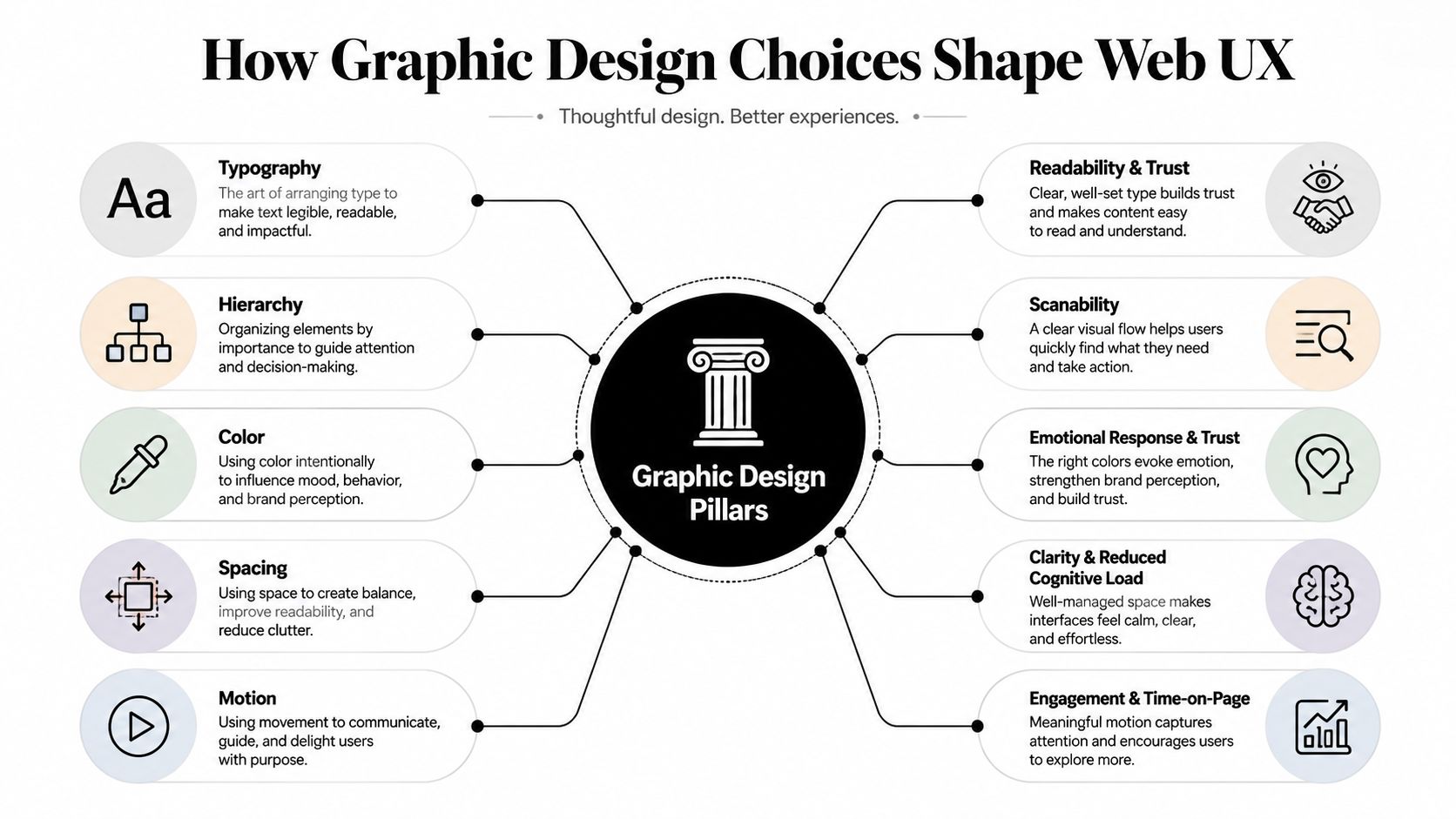
Graphic design and user experience aren't separate lanes. Typography changes reading behaviour. Hierarchy changes what a visitor notices first. Colour changes perceived confidence and action visibility. Spacing reduces mental effort, while motion can either clarify interaction or distract from it.
Typography sets the reading threshold
A small typeface can make a website feel difficult to use. A larger body size, generous line height and restrained line length usually give mobile readers a clearer path through dense service explanations. The design question isn't whether 18px looks better than 16px. It's whether the visitor can understand the offer without pinching, squinting or abandoning the page.
Use typography to create a deliberate reading order:
headline for the commercial promise
subheading for audience, location or outcome
short paragraphs for context
proof blocks for risk reduction
one primary action for commitment
Hierarchy decides what gets remembered
A page with six equally prominent buttons has no primary action. It asks the visitor to choose between a brochure download, contact form, newsletter, case study, phone number and social profile before they understand the offer.
Give the page one dominant route. Secondary actions can remain available, but they should look secondary. This is especially important for brokers, legal practices and buyers agencies, where a discovery call is often the valuable conversion rather than an immediate transaction.
Colour should direct attention
A controlled palette usually performs better than a page where every section introduces a new visual accent. Use the core brand colours to create recognition, then reserve one contrasting accent for the action you most want visitors to take.
That choice improves more than visual consistency. It helps a returning visitor identify the booking path quickly, especially when the page contains maps, testimonials, service cards and long-form explanations.
Spacing and motion need a job
Whitespace creates room for a prospect to process an unfamiliar offer. It also separates proof from claims, making a page easier to scan. Motion should clarify state changes, such as showing that a form has submitted or that a menu has opened. Decorative animation that delays the first useful message adds cost without adding confidence.
The Australian Government's digital guidance now treats accessibility, inclusion and performance as core web requirements. From 1 January 2025, new government websites must meet three standards, while the Digital Performance Standard guidance requires measurement, monitoring and continuous improvement.
That direction matters beyond government. A service-business design system should define readable states, keyboard-visible focus, contrast, responsive behaviour and performance budgets before the visual language is locked. Graphic design decisions become UX decisions the moment a prospect has to read, move through content, or act.
A Buyers Agency Redesign in Practice
Consider a hypothetical Sydney buyers agency with a polished but enquiry-light website. The logo was clean, the gradients were soft and an animated testimonial carousel added movement. The enquiry form sat three scrolls below the hero, while the homepage spoke broadly about property expertise without giving visitors a strong reason to book.
The rebuild didn't begin with a new colour palette. It began by asking what a prospective buyer needed to know before speaking with the agency.
A tighter typographic system gave the main headline a clear 64px desktop scale, with supporting copy answering the likely concern around how the service works and who it suits. One primary CTA replaced the rotating banner, so the page stopped presenting several competing routes at the moment of highest attention.
The agency owner's portrait replaced generic property imagery. That made the service feel accountable and local rather than anonymous. Locality signals appeared across the page, including Sydney, the Inner West and the Eastern Suburbs, supported by relevant photography and subheadlines.
Before vs After Graphic Design Decisions for the Buyers Agency Redesign
Element | Original Site | Rebuilt Site |
|---|---|---|
Hero message | Broad property expertise | Clear service promise with pricing context |
Primary action | Several rotating banner options | One prominent booking CTA |
Imagery | Generic property stock | Owner-led, locality-specific photography |
Social proof | Animated testimonial carousel | Trust strip listing six recent suburbs transacted |
Enquiry form | Long form several scrolls down | Four focused fields near the decision point |
The design changes supported specific UX outcomes. The hero answered a pricing concern before the visitor had to search for it. The trust strip made local experience visible without requiring interaction. The shorter form reduced the commitment required to start a conversation.
The buyers agency website project demonstrates the kind of journey this work should produce, but the example here is a planning model, not a claim about a client result. The important lesson is that the same traffic can behave differently when the graphic system supports the decision path instead of competing with it.
The agency stopped presenting itself as a generic property website and started presenting itself as a local specialist. That distinction is often more valuable than another round of visual refinement.
Designing for Google and AI Answer Systems
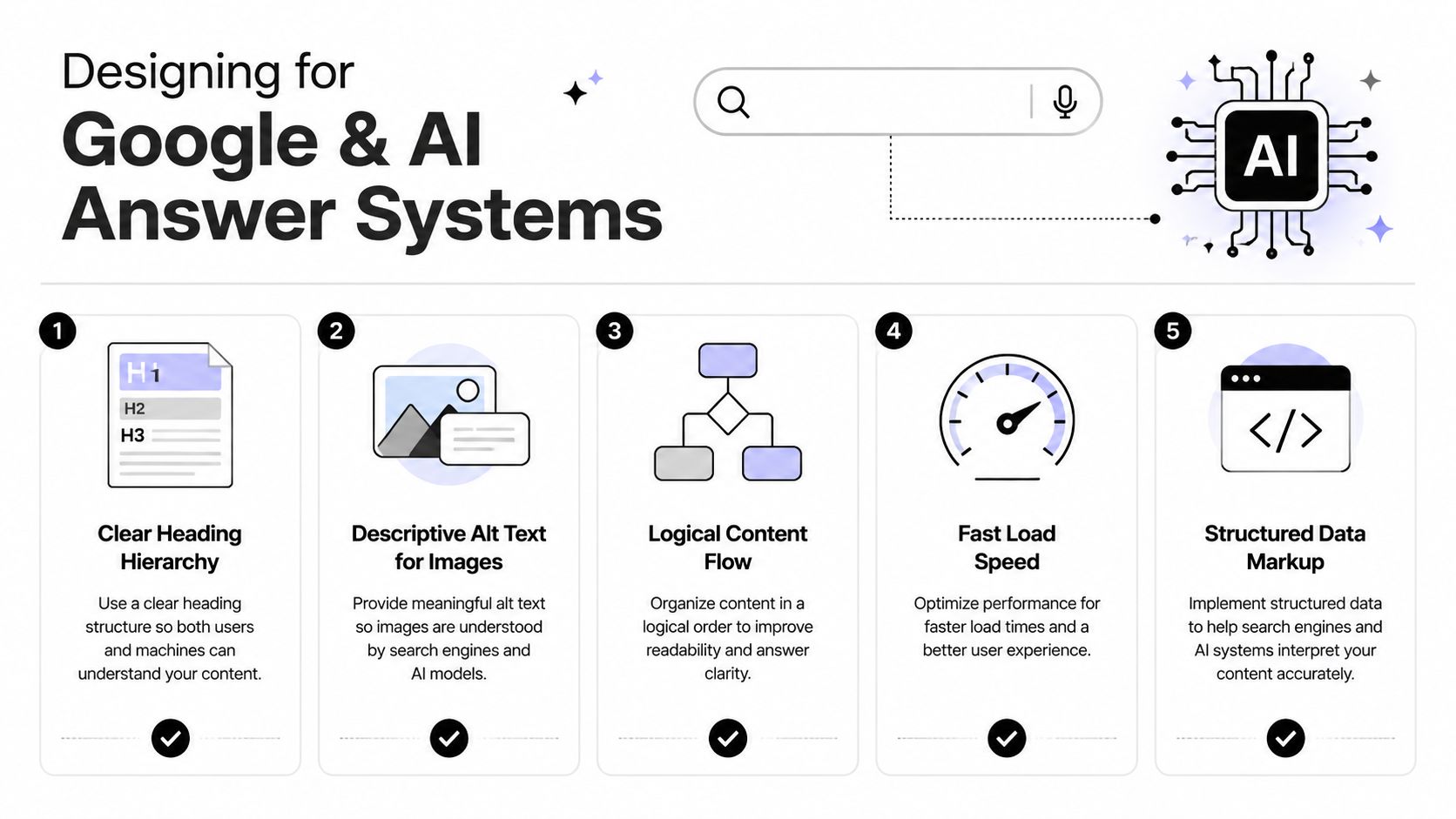
A page can look polished and still fail to explain the business to Google or an AI assistant. Treat graphic design as a commercial system. Every layout decision should help a prospect understand the offer, trust the firm and book an enquiry. Search systems need explicit language, logical structure and accessible content. They cannot reliably interpret a service promise trapped inside a hero image, carousel or decorative SVG.
Put the entity in the page structure
Give each important page one clear H1 naming the business category and service in natural language. Follow it with subheadings based on real customer questions:
What does the service cost?
Which suburbs or regions are covered?
Who is the service for?
What happens during the first call?
What evidence supports the recommendation?
Keep answers in visible HTML text. A visual designer can still produce a refined layout, but the content must remain selectable, readable and organised for people and machines.
Remove visual shortcuts that hide meaning
Australian service sites commonly create these problems:
Text baked into images: Search systems and screen readers may miss the offer, location or call to action.
Content hidden in carousels: Important proof depends on interaction and may receive less attention.
Decorative SVG headings: A visual heading appears, while the page lacks a meaningful semantic heading.
Vague alt text: “Blue house image” says little about the service or place represented.
Write alt text that identifies the subject and its commercial context where appropriate. A buyers agency image might describe a Sydney property consultation, rather than only the colour of the room.
Add a structured FAQ block near the bottom using genuine client questions, then support it with valid schema where it fits. Keep pages fast. Ongoing measurement and improvement should remain part of the design process, consistent with the Australian government's digital performance guidance.
These choices improve the chance that a page is understood for suburb-specific searches, quoted in an AI answer or surfaced for a request such as a recommended Sydney buyers agent. A guarantee isn't what this approach offers. What it does provide is clearer evidence for search and AI systems to interpret.
Read why Generative Engine Optimisation matters-matters) for the broader shift. AI referral traffic can be measured. The SEO Company Australia reports traffic from ChatGPT, Perplexity, Gemini and Copilot ranging from under 1% to around 4% of organic-equivalent sessions, and recommends GA4 referral tracking alongside citation and crawler monitoring.
What Most Redesigns Get Wrong
A service firm can launch a polished website and still lose enquiries. The redesign looks finished in a portfolio screenshot, while nobody can connect its pages to calls, forms, booked consultations or CRM outcomes. Graphic design website design is a commercial system. Every layout decision should support a booked enquiry.
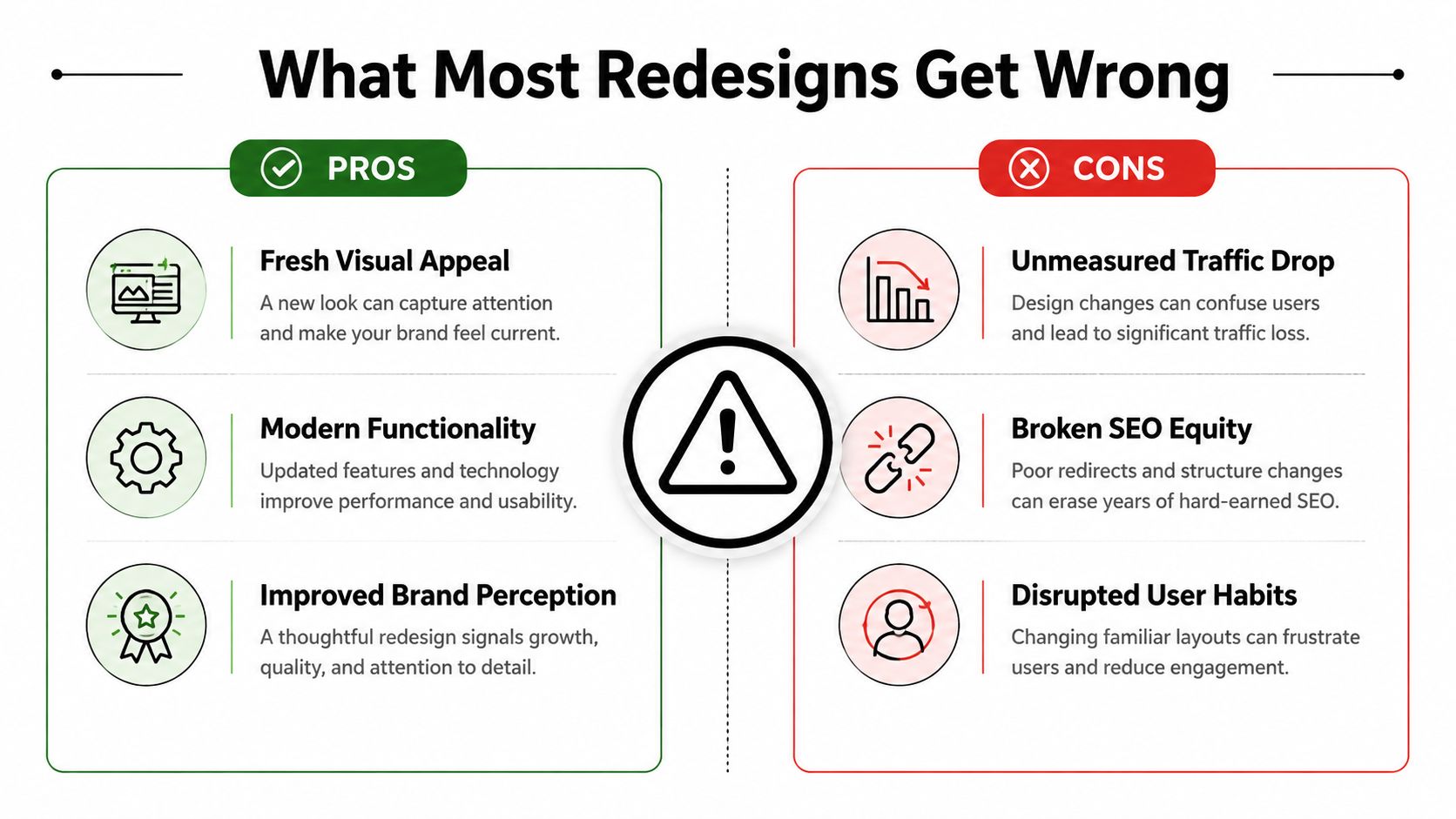
The operational gaps usually sit underneath the visual work:
CTA tracking: GA4 records page views, but the team cannot see which service, form or booking actions matter.
Call attribution: Phone enquiries remain disconnected from the campaign, page or source that generated them.
URL protection: Old pages return soft 404s or lose their relevance after launch.
CRM stages: A form submission reaches a shared inbox without a dependable qualified, booked or lost status.
Baseline reporting: The business changes the experience before recording its existing enquiry pattern.
Business.gov.au advises businesses to examine visitor sources, viewed pages and actions that lead to sales or enquiries. Its digital performance measurement guidance applies directly to service firms. Raw traffic is a weak success measure. The useful chain runs from source to enquiry to commercial outcome.
Treat the redesign as an experiment
Before launch, document the current journey. Record important page paths, form completions, phone clicks, booking events and lead statuses. Write a clear hypothesis, such as: “A clearer service-specific homepage and shorter booking path will produce more qualified calls from existing search traffic.”
After launch, compare the new journey with that baseline. Ignore a session spike or a handful of positive comments unless the business can identify what changed, where leads came from and which opportunities reached the CRM.
Australian service websites often turn only a small share of visits into contacts. One benchmark reports an average conversion rate of 2.3% for Australian service businesses, cited by Odin Digital's Australian benchmarks. SCIT Solutions' conversion optimisation benchmark reports 1.97% across 22 Australian businesses. Both figures support a practical priority: improve existing journeys before assuming additional traffic will fix weak commercial performance.
The agency's responsibility continues beyond the Figma file. The final system needs measurement, attribution and a reliable handoff, so the firm can prove whether the new design improves its pipeline.
A Pre-Redesign Checklist for Service Businesses
A redesign briefing should start with commercial evidence, not a moodboard. Run this checklist before appointing a designer. It shows which parts of the website must produce more qualified enquiries, booked calls and usable customer data.
Commercial baseline
Create one page that records:
Current demand: Monthly enquiries, their sources, and the pages or channels involved.
Lead quality: Which enquiries become sales-qualified opportunities.
Commercial value: Close rate and average job value, taken from your own systems rather than guessed benchmarks.
This baseline gives the design team a clear commercial target. It also prevents attractive layouts from receiving approval without proof that they address a business problem.
Conversion plumbing
Trace the full path from action to follow-up:
CRM tagging: New leads receive source, service and status fields.
Call tracking: Phone enquiries can be associated with their acquisition source.
Booking flow: The calendar, confirmation page and reminders work on mobile.
Follow-up sequence: A new enquiry receives a timely, relevant response.
Thank-you state: The visitor knows what happens next.
Test the journey yourself. Confirm that a CTA click becomes a CRM record, the right team member receives the enquiry, and a booked call remains visible in the pipeline.
Content inventory
Gather the information that reduces buyer uncertainty:
Priority pages: Identify the services and locations that deserve dedicated journeys.
Proof assets: Collect reviews, credentials, project examples and outcome-led case material.
Human evidence: Prepare founder or adviser photography where trust depends on personal accountability.
Commercial answers: Document questions about process, suitability, pricing and timing.
Assign an owner to every missing asset. A designer cannot create a credible service journey from incomplete evidence.
Technical baseline
Review the current site before changing its interface:
Core Web Vitals: Note performance issues and mobile constraints.
Search Console coverage: Identify indexed pages, exclusions and important queries.
GA4 events: Confirm that forms, CTA clicks, phone clicks and bookings are recorded.
Sitemap and schema: List the URLs and structured data that must survive launch.
This sheet protects search visibility and measurement during development. It should be shared with the designer, developer and SEO specialist before work begins.
Decision guardrails
Put the commercial agreement in writing:
Success metric: Tie the project to qualified enquiries or booked calls.
Single-page brief: Define the audience, offer, priority journey and exclusions.
Launch date: Set a fixed date with time reserved for testing and redirects.
Review points: Schedule commercial reviews after 30 and 90 days, then decide what to iterate.
Government benchmark data reinforces the value of disciplined measurement. Australia's national digital performance score rose from 58.8 in 2022 to 68.4 in 2023, with a reported 33% uplift in digital social equity and a 14-point improvement for myGov after redesigning around life events, according to the Australian government benchmark reporting. Better structure and clearer pathways can improve access and usability when teams measure the outcome.
Use this checklist as a vendor-neutral brief. If it exposes gaps in attribution, CRM handoff, content or AI-search structure, address them before a new visual layer hides the problem.
Raffine Studio builds conversion-focused websites and graphic design systems for Australian buyers agencies, brokers and professional services firms, connecting search visibility, clear enquiry paths, booking flows and CRM follow-up. Visit Raffine Studio to review your current website and discuss a redesign built around qualified calls rather than visual polish alone.