insurance lead generation website, insurance website design, lead generation funnels, AI search visibility, conversion optimisation
Building an Insurance Lead Generation Website That Converts
by raffiné studio

An insurance buyer doesn't land on your site looking for branding. They land because they need cover, fast, and they're deciding whether your business looks capable of handling the risk, the paperwork, and the follow-up. If your site makes them hunt for proof, wait for a quote form, or guess what happens next, you've already lost the enquiry.
That's the insurance lead generation website job. Not to look polished. Not to sound reassuring. It has to convert intent into a booked conversation, and it has to do that on mobile, in search, and increasingly inside AI answers where buyers are now starting their research.
Why Most Insurance Sites Quietly Lose the Lead
A small business owner lands on a broker site after a recommendation for commercial property cover. The homepage looks clean enough. There's a hero image, a vague headline about protecting what matters, and a navigation menu full of broad terms. Forty seconds later, they're gone.
That's the normal failure pattern. The visitor had intent, but the site gave them friction. The copy didn't name the buyer. The proof wasn't visible. The form was buried. The page felt like a brochure, not a commercial system. A polished homepage that doesn't qualify a lead is just expensive decoration.

The hidden cost is pipeline, not aesthetics
Most owners judge the site on visual quality because that's the easiest thing to see. The issue is whether the site creates enough booked calls to keep the team busy. A weak conversion path doesn't just waste traffic, it turns a good month of visibility into a thin calendar.
A site that looks trustworthy but doesn't move a buyer to action is usually the most expensive kind of underperformer, because it hides the problem behind design polish.
The usual culprits are predictable:
Generic hero copy that never says who the site is for or what cover it handles.
Stock imagery of families, houses, or smiling handshakes that tells the buyer nothing about specialisation.
No visible expertise around product lines, claims help, or industry experience.
Forms placed too late in the journey, after the visitor has already lost momentum.
Slow mobile pages that make the first meaningful interaction feel optional.
Many insurance businesses get stuck. They want the site to “feel credible”, but credibility without conversion is just theatre. Raffine Studio approaches these sites as lead systems, not visual assets, because the commercial outcome is the only thing that matters.
What an Insurance Lead Generation Website Is Actually For
An insurance lead generation website has four jobs. If it misses even one, the whole system leaks.
Core Function | What It Means | Common Failure |
|---|---|---|
Capture intent | Turn search and referral traffic into a real enquiry | Broad homepage copy that doesn't match what the buyer searched |
Qualify demand | Separate the right enquiries from the wrong ones | One generic form for every product and audience |
Route fast | Get the lead to a human while the enquiry is still warm | Inbox-only handling that waits for someone to check email |
Reinforce authority | Prove expertise before and after the enquiry | Thin service pages with no decision support |
The site has to fit the market structure
Australia's insurance market is not purely direct-to-consumer. APRA's Intermediated General Insurance Statistics for the six months to June 2025 show that around 50% of gross written premium written by APRA-authorised general insurers was placed through intermediaries, while Australia's online insurance comparison platforms market was valued at $1.1 billion. That mix matters, because it means digital referral and comparison pathways are part of the market structure, not a side channel. The same coverage also noted that consumer attention is increasingly shaped by comparison platforms and data brokers, which is exactly why visibility and booking flow matter so much in this category. Insurance Business coverage of comparison sites and data brokers
That's why the site can't behave like a brochure. It has to do commercial sorting. A visitor searching for professional indemnity, cyber, or niche business cover needs a different path from someone browsing general home insurance. If you make all of them walk through the same flat homepage, you force the wrong people to bounce and the right people to work too hard.
Search traffic is already telling you what to build
Australian insurance sites have shown how specific the demand can be. SimilarWeb-based reporting found that insurance sites in Australia saw 17% growth in traffic during the pandemic year, and search engines generated 55% of all traffic to insurance websites. The same report showed sharp keyword shifts, including motorcycle insurance, professional indemnity insurance, pet insurance, and home insurance, which tells you the searcher is often arriving with a precise need, not a broad curiosity. Australian insurance search traffic and keyword demand reporting
That means the site has to mirror intent. The homepage should quickly route visitors into line-of-business pages. Those pages should answer the question, “Is this the right cover and the right adviser for me?” If they can't answer that within a few seconds, you're paying to attract traffic that never becomes pipeline.
Designing the Page Architecture and Messaging
Most insurance sites lose money because they organise pages around internal structure, not buyer intent. The homepage talks in generalities, the service pages are grouped by carrier, and the quote page is treated like an afterthought. That's backwards.
Build pages around the buyer's decision path
The homepage should say who you help, what kind of cover you handle, and what happens next. Not in fluffy language, in plain commercial language. If you specialise in business cover, say that. If you work with specific industries, name them. If the next step is a discovery call, make that obvious.
Service pages should be segmented by line of business, not just by product catalogue. A visitor comparing business insurance needs different decision support from someone looking for personal lines. A comparison page should help the buyer choose, not just list features. That means framing trade-offs, underwriting considerations, and suitability, instead of relying on premiums as the only signal.
The quote page needs to behave like a funnel. Short forms work when the intent is hot, but many buyers need a light qualification step first. Ask only what you need to route the enquiry properly, then move them to a booking option or a managed follow-up flow.
Stop using weak copy as a substitute for clarity
Three messaging mistakes show up again and again:
Regulatory language first. If the opening line reads like compliance text, most visitors stop reading.
Anonymous branding. If the site hides the broker or adviser behind abstract claims, it kills trust.
“Cover” as a headline. That phrase is not a benefit statement. It's filler.
Use micro-copy that reduces uncertainty. Tell the visitor what the response time is, what sort of enquiry you handle, and whether they can book directly or expect a callback. Put trust signals where the decision happens, not buried in the footer. That includes credentials, insurer panels where relevant, testimonials if they're genuine, and practical proof of process.
The strongest insurance pages don't sound more persuasive. They sound more specific.
A useful internal reference here is Raffine Studio's branding and web design article, because page architecture and brand clarity are linked. A visitor can forgive a simple design. They rarely forgive a confusing one.

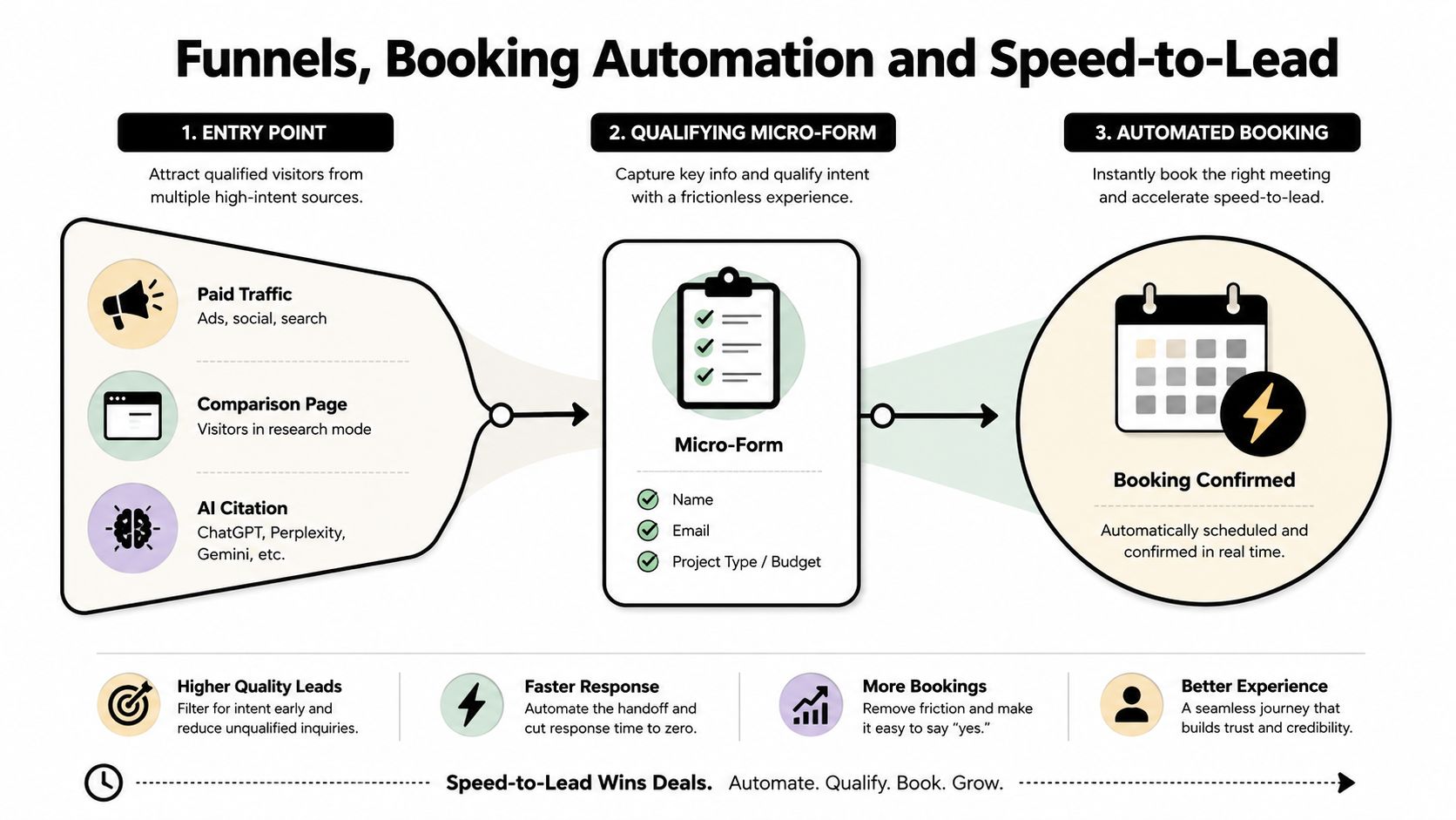
Funnels, Booking Automation and Speed-to-Lead
A form is not a funnel. A funnel is a controlled path from interest to contact to booking, and every insurance product line needs its own version of that path.
The handoff has to happen before the lead goes cold
A good structure is simple. A visitor comes in through a paid ad, an organic page, a comparison article, or an AI citation. They meet a short qualifying form or a calendar widget. The enquiry routes automatically to the right person based on cover type and location. A CRM record is created, a task is assigned, and the lead gets an instant reply before the page finishes loading.
That is the minimum standard. Anything less leaves money on the table.
For Australian service funnels, speed-to-lead is the benchmark. Responding within 5 minutes rather than 30 minutes makes a business about 21x more likely to qualify the lead, while the average company takes 42 hours to reply and 23% never respond at all. Fast follow-up wins the work. Prime Leads speed-to-lead benchmark
Booking needs rules, not just a calendar link
A booking tool should not be a random “book now” button. It needs:
Round-robin assignment when multiple advisers handle the same line of cover.
Buffer rules so the calendar doesn't create impossible back-to-back meetings.
SMS and email confirmations so the lead knows the booking is real.
CRM sync so the deal stage and task are created instantly.
Conditional routing so different product lines go to the right owner without manual sorting.
Email alone does not run the lead system. It only sends notifications. The core system is the routing logic behind it. If a lead arrives on Friday afternoon and sits until Monday morning, the site has already lost urgency.
See Raffine Studio's examples of automated follow-up systems for a practical view of how routing, booking, and follow-up should work together.
Raffine Studio builds this kind of connected booking and follow-up setup as part of the website system, not as a bolt-on. The website, the calendar, and the CRM should behave like one pipeline, not three disconnected tools.
Here is the rule for principals and directors:
Track the number of qualified conversations booked, not just the number of form submissions. A full inbox with no booked calls is not growth.
Engineering the Site for Mobile Speed and Conversion
If the mobile experience is slow, the lead generation system is already weakened before a buyer reads a word. Australian and New Zealand Google benchmarking shows the average mobile-site speed score in the region is only 55%, and Google's page-speed guidance notes that more than three seconds of load time is enough to lose visitors. For an insurance site, that's not a technical footnote, it's lost enquiry volume. Google mobile benchmarking for AUNZ
Build for the first meaningful interaction
The technical target should be blunt. Keep the mobile page under 3 seconds wherever possible, and treat the first meaningful interaction as a conversion event, not a design milestone. The site needs to feel usable immediately on a phone, because that's where a lot of insurance research now starts.
The concrete build decisions are usually boring, and that's the point:
Compress images aggressively and avoid oversized hero files.
Use caching and an edge CDN so repeat loads aren't punished.
Defer third-party scripts unless they're necessary on page load.
Isolate quote engines in iframes when the embedded tool is heavy.
Load fonts carefully so text appears fast and doesn't shift.
Keep server response times tight, with a response budget under 400ms wherever possible.
A slow hero image, chat widget, or script-heavy layout can trim enquiries because the buyer never gets far enough to trust the page. That's not a cosmetic issue. It's a direct hit to pipeline protection.
Cut before you add
Most homepages need subtraction, not addition. Before you add another banner or testimonial slider, remove anything that delays the load or distracts from the main action. That includes oversized videos above the fold, unnecessary animations, duplicate calls-to-action, and widgets that compete with the quote or booking path.
The engineering principle is simple. Protect the interaction that creates revenue. Everything else is secondary. If a feature doesn't help a buyer decide, contact, or book, it's probably costing you more than it's worth.
Winning Visibility in Google and AI Search
Classic SEO still matters, but it's no longer enough on its own. Insurance buyers are increasingly getting answers from systems that summarise and cite a small number of pages, which means the site has to be understandable to both search engines and AI tools.
Make the site citeable, not just rankable
Recent Australian insurance research found 70% of specific AI search questions produced no insurer brand at all, while another study found 58% of responses from ChatGPT and Claude named no Australian business at all. That's a visibility gap, and it matters because a brand can be well known in the market and still be absent from AI answers. AI search visibility research for Australian insurance Generative engine optimisation gaps in Australian business answers
The practical answer is structure. A page should carry clear entity signals, a concise canonical answer near the top, and schema markup that helps machines understand what the page is about. Use LocalBusiness, InsuranceAgency, and FAQPage schema where relevant. Add author attribution, plain definitions, and short explainer videos with transcripts so the page has text and context, not just a visual pitch.
The old SEO checklist was mostly keywords, backlinks, and content length. The new one is broader. You still need relevance and authority, but you also need source trust, page clarity, and answerability.
Focus on the pages AI systems can understand
The pages most likely to win AI citations in an Australian insurance context are usually the ones that answer specific commercial questions well:
Service pages with a clean definition and buyer fit.
Comparison pages that explain decision criteria.
FAQ pages with direct, non-salesy answers.
Local pages that signal geography and availability.
Author-led explainers that show human expertise.
Don't chase AI visibility with thin content. That's a dead end. Build pages that are useful enough to be quoted because they settle a buyer's question.
For businesses serious about this shift, Raffine Studio's guide to generative engine optimisation-matters) is relevant because the same site architecture that helps ranking also helps citation. Search and AI are now sharing the same trust problem.
A Practical Roadmap for the Next 90 Days
If the site is underperforming, don't start with a redesign brief. Start with a pipeline brief. The order of operations matters because the fastest gains usually come from fixing the basics before rebuilding everything.

Sprint 1 fix the foundation
Rebuild the homepage, the main service pages, and the quote entry points. Tighten mobile performance, add the right schema, and make sure calls and forms route to real owners. If the site can't answer the buyer quickly, nothing else matters yet.
Sprint 2 install the funnel
Add multi-step forms where needed, calendar booking, instant SMS or email replies, and CRM tagging. Make speed-to-lead a hard rule, not a best-efforts process. The system should be able to recognise the enquiry, assign it, and notify the team without anyone manually moving a lead around.
Sprint 3 add authority and visibility
Publish case-led service pages, comparison content, and strong FAQ blocks. Add citation signals for ChatGPT, Gemini, and Perplexity by making the site clearer, more quotable, and more obviously expert-led. That's how the site moves from traffic capture to trusted source.
Watch these metrics weekly:
Qualified discovery calls booked
Form-to-call speed
Mobile Core Web Vitals
Branded search lift
AI citation frequency
Pick one measurement habit and stick with it. If the business can't see what's producing booked conversations, it'll keep spending on redesigns that make the site prettier but not better.
If your insurance site is generating traffic but not enough booked conversations, Raffine Studio can audit the page architecture, funnel logic, mobile performance, and follow-up flow against the benchmarks in this guide. Visit Raffine Studio to review your site and map the conversion gaps before you spend more on another redesign.