accountant website design, accounting web design, conversion focused websites, professional services websites, lead generation websites
Accountant Website Design: Turn Visitors Into Booked Calls
by raffiné studio

A lot of accountant websites still fail at the most basic commercial job. In a 2023 UK benchmark, 98% did not offer online appointment booking, 94% did not offer a callback option, only 10% displayed a phone number very clearly, and 92% lacked live chat. That is not a branding issue. It is a conversion problem, and it explains why so many firms attract visitors but don't turn them into enquiries (accountancy website benchmark).
For Australian firms, the commercial lesson is simple. A polished homepage that talks about trust and experience still won't book calls if visitors can't quickly see what to do next, who the site is for, and how to contact the firm without friction. The strongest accountant website design treats the website as a lead system, not an online brochure.
Why Most Accountant Websites Fail at Conversion
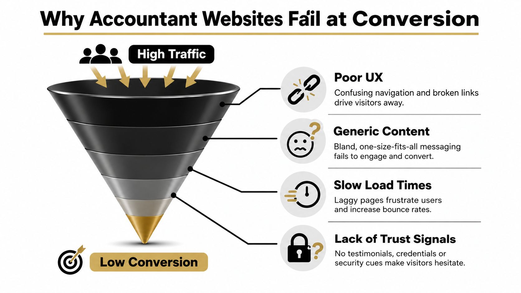
The failure usually begins with a simple mistake, treating credibility as if it were enough to generate enquiries. For an accounting firm, trust matters, but only after the visitor can immediately see where to go next and what happens if they take that step.
The conversion problem is usually visible in the page structure itself. Visitors land on a homepage that looks polished, yet still have to work out whether the firm serves their type of client, which service to choose, and how to make contact without delay.
The real leak is not traffic, it's direction
If someone lands on an accountant homepage and has to think too hard, the site starts losing them straight away. Professional services buyers want reassurance, relevance, and a quick path to action, not a page that makes them decode the firm's offer.
Generic service pages are a common reason that happens. They list information, but they do not guide visitors by need, so someone looking for tax help, bookkeeping, business advisory, or property-related advice still has to translate a broad menu into a real next step.
Practical rule: if the homepage does not answer “what do you do, who is this for, and how do I book?”, the site is asking visitors to do the hard part.
The commercial effect is easy to miss because the site can still rank well, still pick up referrals, and still look credible. Even so, it becomes a bottleneck instead of a booking channel, because attention arrives without a clear route into the right service page or enquiry path.
A clean visual identity still matters, and branding and web design for service firms can strengthen trust. That only pays off when the page structure turns attention into intent, with clear service routing, visible calls to action, and a booking flow that does not make the visitor work for it.
Building Service-Specific Landing Journeys
Generic service lists create decision paralysis. A visitor reading about tax returns, bookkeeping, BAS support, advisory work, and entity structuring on one page has to do the mental sorting the website should have done for them. That's where leads go cold.
Route people by need, not by your internal org chart
The better structure is separate pages for each core service, each with its own message and call to action. Xero's guidance is blunt about this kind of architecture, service pages should be specific, contact details should be visible without scrolling, and online booking should reduce friction in the consultation path (Xero website guidance).
That means building pages around how people search and decide. A small business owner wants a page that speaks to cash flow, compliance, and time pressure. A property investor wants a page that addresses tax treatment and document handling. A founder needs a page that reflects growth, structure, and the first real finance decisions.
What each landing page needs to do
A strong service page usually carries four jobs at once:
State the problem quickly. The visitor should recognise their situation in the first screen or two.
Explain the outcome. Not “we provide accounting services”, but what changes for the client when the firm helps.
Show why this firm is relevant. Use practical proof, such as specialisation, process, industry focus, or credentials.
Offer a direct next step. Make booking, calling, or making an enquiry obvious on the page itself.
The best pages are not long for the sake of it. They are specific. They remove the burden of interpretation.
Here's the useful test. If someone arrives from a search like “small business accountant” or “property investment tax advice”, do they land on a page that feels built for them, or do they land on a generic services summary and have to figure it out? That question exposes most conversion problems immediately.
A video can help if it explains the firm's approach plainly and quickly. But the booking path still has to sit beside the content, not after it.
Technical Performance and Mobile-First Requirements
A site can carry strong messaging and still lose the lead before the first paragraph finishes loading. In a benchmark of 385 accounting and tax websites, average Largest Contentful Paint was 8.49 seconds, well above Google's 2.5-second threshold, and only 51.3% of sites passed every Core Web Vital on mobile (technical accounting site benchmark).
That gap matters commercially because impatient visitors do not wait through technical delay. They back out, compare another firm, or tap the phone number on a competitor site that works better on mobile.
Speed is part of conversion, not a side issue
A slow accountant website creates two separate problems. First, it weakens user confidence. Second, it makes the page harder to reach on the device most prospects use when they are in a hurry.
The technical checklist for accountant website design should include one primary keyword per page, keyword-aligned title tags and meta descriptions, internal linking, schema markup, fast page speed, and mobile-first layouts (technical checklist for accountant sites). One industry source also recommends page load under three seconds and mobile responsiveness, because mobile now drives most visits in this category.
What good technical performance looks like in practice
A high-functioning site usually does a few simple things well.
Loads the primary content early. The key message and booking action appear quickly.
Uses mobile-first layouts. Buttons, forms, and navigation work cleanly on a phone.
Keeps pages focused. Large pages with too many scripts, oversized images, and cluttered modules drag conversion down.
Supports search visibility. Structured page titles, internal links, and schema help search engines understand the site.
The technical side is not glamorous, but it is commercial. If the site is slow or unstable, even good content underperforms. For many firms, website redesign for SEO is the point where speed, structure, and search intent finally line up.
Low-Friction Booking and Contact Architecture
The shortest path to an enquiry usually converts best. Every extra click, field, or decision lowers the odds that a busy business owner will bother to continue. That's especially true in accounting, where the prospect is often trying to solve a time-sensitive problem, not browse for entertainment.
Make contact visible before the visitor starts hunting
Independent accounting-web guidance consistently recommends contact forms on key pages, click-to-call phone numbers, clear calls to action throughout the site, and mobile-responsive design. It also points to online booking, secure document upload, and client portal access as ways to reduce friction in the enquiry process (accountant website contact mechanics).
The practical rule is straightforward. Don't make people visit a separate contact page just to take the next step. Put the action where the interest is strongest, on service pages, on the homepage, and at natural decision points after trust and relevance have been established.
Design the booking path for a busy owner
Australian SME owners are usually time-poor. They'd rather book quickly than fill in a long form or wait for a back-and-forth email chain. That's why the contact flow should feel light.
A strong setup usually includes:
Click-to-call in the header. Especially useful for urgent leads.
A booking button near the main message. The user shouldn't have to scroll around to find it.
Short forms. Ask only for what helps qualify the lead and prepare the conversation.
A clear action label. “Book a consultation” is more useful than “Submit”.
Repeat the pathway on service pages. Interest usually builds there, so that's where the CTA should be obvious.
A well-designed contact system doesn't just collect enquiries. It filters them. That saves the firm time and gives the prospect a clearer experience. If you want to compare booking flows, automated lead follow-up systems show how the handoff can continue after the form is submitted, which is where many firms still leak leads.
Trust Signals and Accessibility Standards
In accounting, trust isn't abstract. It's built from specific, visible proof, qualifications, memberships, specialisations, and signals that the site is secure and easy to use. If those cues are hidden or scattered, the visitor has to work too hard to feel comfortable.
The best approach is to place trust cues where doubt usually appears. That means above the fold, near service explanations, and next to booking actions. The site should reassure without turning into a wall of badges and claims.
Trust should support the decision, not interrupt it
Good trust signals feel integrated. A page can mention professional credentials, relevant client types, years in practice, or industry focus without turning into a brag sheet. The point is to answer the unspoken question, “Why should I trust this firm with my numbers?”
Accessibility is part of the same commercial story. CPA-focused web guidance says keyboard navigation must work without a mouse, images need alt text, text colour contrast should be at least 4.5:1 for normal text and 3:1 for large text, and forms should have clear input labels and a logical heading structure (CPA accessibility guidance).
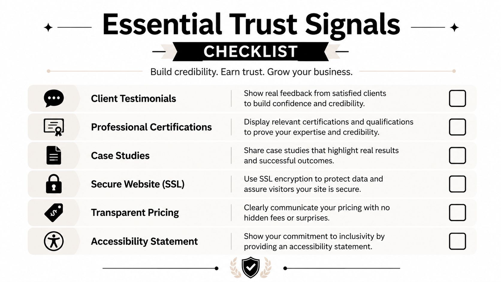
A useful trust and accessibility checklist
Client testimonials. Use them near decision points, not buried in a footer.
Professional certifications. Make them visible and current.
Case studies or service examples. Keep them practical and relevant.
Secure website signals. SSL should be obvious, not assumed.
Transparent pricing cues. Even ranges or “how pricing works” reduce hesitation.
Accessibility statement. This matters both ethically and commercially.
Accessibility also broadens who can use the site without friction. That's not a niche concern. It's part of making sure the website works for more potential clients, not fewer.
Your Accountant Website Audit Checklist
A useful audit starts with a blunt question. Can a visitor understand what you do, find the right service, trust you quickly, and book without friction? If the answer is shaky anywhere in that chain, the site is underperforming.
Pass or fail areas to review
Homepage clarity. Does the page say who the firm helps and what it does in plain English?
Service routing. Does each core service have its own page, or is everything compressed into one broad summary?
Booking visibility. Can a visitor book or call from every major page without searching?
Mobile behaviour. Are buttons, menus, and forms easy to use on a phone?
Load speed. Does the site feel quick enough that a busy prospect stays on it?
Trust placement. Are credentials, testimonials, and proof points visible where they matter?
Accessibility basics. Can the site be used with a keyboard, read clearly, and accessed by more than one kind of visitor?
What to fix first
Start with the leaks that block enquiries, not the cosmetic issues. If the site is slow, confusing, or hidden behind a weak contact flow, design polish won't move much. If the structure is sound but the page lacks proof, then the trust layer needs work next.
Priority rule: fix the thing that makes a qualified visitor hesitate, not the thing that just looks unfinished.
For many firms, the highest-return changes are the same ones repeatedly missing from accountant website design, dedicated service pages, clearer booking actions, stronger mobile flow, and visible trust signals. If those pieces are already there, then conversion optimisation becomes a lot more surgical. If they're missing, that's where the enquiry loss is happening.
Raffine Studio designs accountant websites as lead-generation systems, not digital brochures, with conversion-focused structure, SEO, and booking flows built around real buyer behaviour. If you want a clearer view of where your site is leaking enquiries, visit Raffine Studio and start with a practical review of what's working, what isn't, and what should change first.