consulting firm website design, professional services website, lead generation website, website design australia, conversion focused design
Consulting Firm Website Design That Books Calls
by raffiné studio

Your consulting website looks polished, but it isn't producing qualified enquiries. The homepage describes your capabilities, the services are listed neatly, and the contact page works. Yet prospective clients still leave without booking a conversation, or the few enquiries you receive come from people who aren't a fit.
That isn't primarily a visual-design problem. Consulting firm website design is a commercial system, connecting positioning, proof, search visibility, conversion paths, booking, and follow-up. If one part fails, the website behaves like an expensive brochure instead of a reliable source of discovery calls.
For Australian professional-services firms, the gap matters. Australian businesses converted at 1.78% in September 2024, below the global average of 1.88% and the APAC average of 2.76%, while high-intent service journeys performed substantially better. Legal services reached 7.4% website conversion, and financial services reached 5.01%, according to the Australian conversion-rate benchmark. The lesson is clear. Your website needs to guide a specific buyer towards a specific action.
Why Most Consulting Websites Fail to Generate Leads
The common assumption is that a consulting website is a digital business card. It introduces the firm, lists its services and provides contact details. That model is too passive for a high-value professional-services business.
A prospective client isn't only checking whether your firm exists. They're deciding whether you understand their situation, whether you've solved comparable problems and whether the people behind the business are credible enough to trust with a serious commercial issue. A website that says “we provide strategic advice” forces the visitor to do all the interpretation.
The symptoms are familiar:
Low-quality traffic: Search visitors arrive on broad pages that don't match their intent.
Weak enquiries: The site attracts people looking for free advice, employment or services outside your commercial focus.
Unclear differentiation: The firm sounds interchangeable with competitors.
Invisible proof: Case evidence, sector experience and consultant expertise are buried or absent.
No next step: Visitors finish reading without knowing whether to call, book or submit an enquiry.
Australian consulting websites are often treated as conversion pages rather than proof-of-expertise systems. That misses how professional-services buyers make decisions. Founders may want a fast sense of commercial fit, while procurement-style evaluators may need detailed case evidence, consultant biographies, industry experience and credibility signals before they recommend a provider internally. The opportunity is to structure the site around that decision complexity, a point also raised in guidance on conversion websites for professional-services firms.
Commercial rule: If the website makes visitors investigate your relevance, proof and process on their own, it isn't doing enough sales work.
Replace brochure thinking with system thinking
A brochure has pages. A lead-generation system has routes.
A visitor who finds a sector-specific service page should be able to move to a relevant case study, then to the consultant responsible for that work, then to a booking page. Someone arriving through an educational article may need a diagnostic offer or a lower-friction enquiry before they're ready for a call. The homepage shouldn't be expected to serve every audience equally.
Your website also needs to connect with what happens after the form is submitted. If enquiries sit in an inbox, the design is incomplete. Booking, CRM handoff, confirmation and follow-up belong in the same commercial conversation as layout and copy.
Review your website design and SEO strategy together, not as separate projects. A page that ranks but doesn't clarify the offer wastes attention. A page that converts but can't be found has limited reach. The job is to make the full path work.
Structure Your Site to Build Trust and Guide Visitors
Information architecture should reflect how a buyer evaluates a consulting firm. Start with the questions they need answered, then build pages that answer those questions in a sensible order.
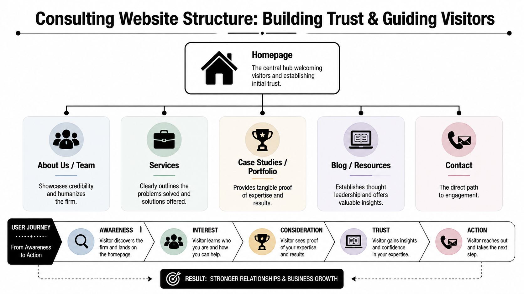
The core structure is straightforward:
Homepage
The homepage should establish relevance quickly. State who you help, what problem you solve and what action the visitor should take next. It can introduce your positioning, featured services and selected proof, but it shouldn't try to explain every offer in equal detail.
A strong homepage routes visitors. A founder with an urgent growth problem should reach the relevant service. A procurement evaluator should find your credentials and case studies. A returning referral should be able to book without navigating through a long brand story.
Service pages
Each significant service or commercial problem deserves its own page. A generic “Services” page makes buyers sort through your internal structure. A focused page can speak directly to the situation that brought them to the site.
Describe the problem, your approach, the expected engagement shape, relevant proof and the next step. If your firm serves multiple sectors, create routes for those sectors where the buying context significantly changes.
Case studies and proof
Case studies reduce perceived risk. They should show the client context, the problem, your intervention and the resulting business change. Avoid vague claims such as “we delivered excellent outcomes”. Explain what made the situation difficult and what your team did.
Testimonials work best beside the relevant service or case evidence, not only on a standalone page. The True Local Digital Reputations Report found that 64% of consumers are more likely to trust a local small business if it has online reviews, while 32% say good reviews are a definitive trust-builder, as reported in the Australian digital reputation research.
About, team and contact
The About page should explain how the firm thinks and who delivers the work. Consultant bios need more than job titles. Show relevant experience, areas of judgement and the type of client situations each person handles.
The Contact or Booking page should make engagement feel concrete. Include the primary action, what happens after submission and enough context to reassure a cautious buyer. Don't make every visitor search for an email address hidden in the footer.
A useful site map looks like this:
Homepage: Positioning, priority routes and primary action.
Services: Focused pages organised around buyer problems.
Case studies: Evidence that supports each major offer.
About and team: Expertise, people and working style.
Resources: Useful insights that support search and authority.
Contact and booking: A direct route into the sales process.
The navigation should be restrained. Too many choices dilute attention and make it harder to identify the intended path. Read the practical principles in web design for professional-services firms before approving a sitemap that reflects your internal org chart instead of your buyer's questions.
Crafting Messaging That Converts Visitors into Clients
A director lands on your site after a margin problem, a failed project or a difficult growth decision. If the first screen only says “We provide strategic consulting services to support business growth,” the visitor has no clear reason to continue. The copy must identify the situation, show the commercial consequence and make the next action obvious.
Use a statement such as:
For Australian construction businesses losing margin through weak project controls, we build practical reporting and governance systems that give directors earlier visibility over risk. Book a discovery call.
It names the audience, problem, value and action in one place. That is the standard your homepage and service pages should meet.
Write for the decision, not the department
Every key page should answer four questions:
Who is this for?
What problem brings them here?
What changes after we help?
Why should they trust this firm?
Use the language clients use in meetings and search queries. “Operational inefficiency” sounds like an internal category. “Your leadership team is making decisions from outdated reports” describes a recognisable situation. Buyers respond to specific pressure, not a list of consulting disciplines.
Translate activities into consequences:
“Strategic planning” becomes a practical plan for choosing priorities and assigning ownership.
“Digital transformation” becomes a clearer operating model for replacing disconnected tools and manual handoffs.
“Organisational advisory” becomes support for leaders managing a restructuring, succession or growth decision.
Make the promise specific enough to assess and restrained enough to believe. Explain what you change, how the work is delivered and what evidence supports the approach. Case studies, named consultants and concrete deliverables carry more weight than broad claims about expertise.
Give every page one commercial job
A service page should create enough confidence to prompt a booking. A case study should remove doubt by showing the situation, work and result. An insights article should answer a defined question and point readers to a relevant next step. The homepage should direct different audiences to the right route without becoming a catalogue.
Write for the buying situation, not just the industry. A founder seeking a rapid commercial review needs different proof from a larger organisation assessing governance capability. Create separate landing pages when the audience, problem, evidence and action differ. This improves the information architecture and gives each visitor a clearer route through the site.
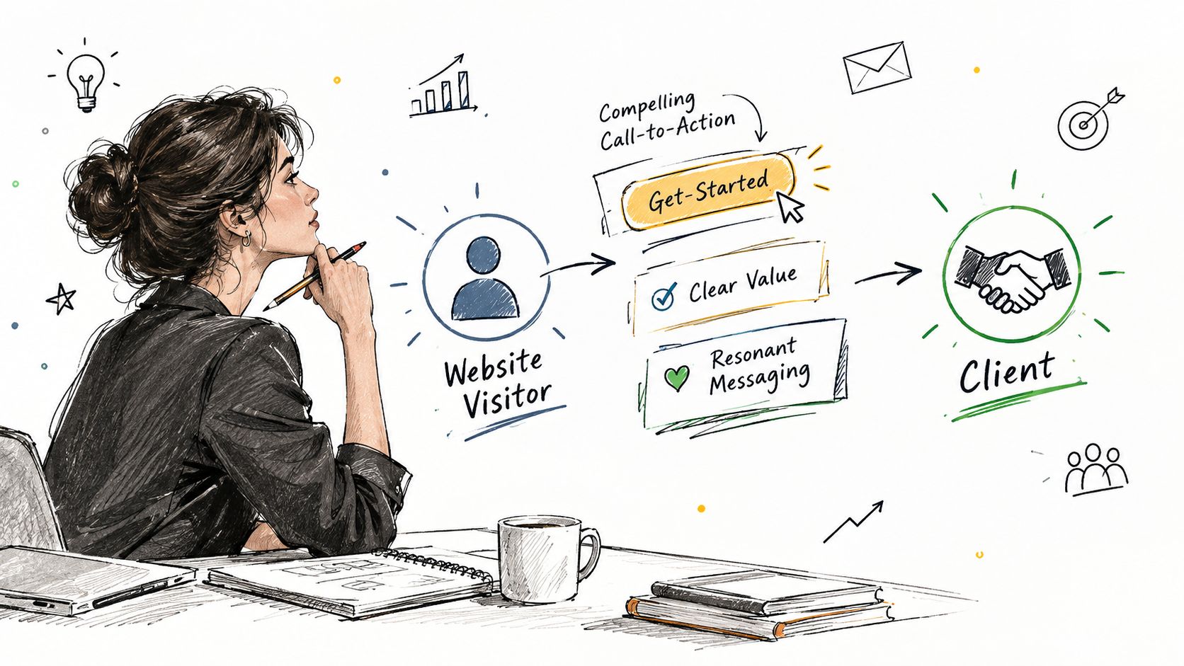
Keep one primary CTA across the journey. “Book a discovery call” sets a clearer expectation than rotating between “Contact us”, “Learn more”, “Get in touch” and “Submit”. Secondary actions can serve visitors who need more evidence first, such as a relevant case study or practical insight.
For an Australian professional services firm, messaging should connect expertise to a decision that has commercial weight. The website then works as a lead-generation system, with each page preparing the visitor for a suitable conversation rather than merely describing the firm.
Designing the Path from First Click to Booked Call
The booking path should feel like a continuation of the conversation, not a handoff to an administrative maze.
Start with one primary action. Put it in the header, within relevant service sections and at the end of proof-led pages. Use language that describes the commitment accurately. “Book a discovery call” is clearer than “Get started” because the visitor knows what will happen.
Build the flow in a deliberate sequence
Match the CTA to intent. A visitor on a high-intent service page can be invited to book. Someone reading an introductory article may need a relevant resource or diagnostic first.
Keep the form short. Ask for the information your team needs to prepare, not every detail you might eventually want in the CRM.
Explain the next step. Tell the visitor when they'll hear from you, what the conversation covers and whether the call is exploratory.
Offer direct scheduling. Tools such as Calendly can remove unnecessary email exchanges by showing available times immediately.
Confirm the booking. Send a confirmation with the meeting details and a short preparation prompt.
Route the lead internally. Push the submission and booking data into your CRM so the team can see source, service interest and status.
A direct booking route suits qualified prospects who already understand the problem and want to assess fit. A form-first route can work better where the engagement requires careful qualification, such as regulated, technical or multi-stakeholder work. You don't need one universal path. You need the right path for each intent level.
Speed belongs inside the design brief
Lead handling affects conversion after the visitor has already taken action. Research cited by Prime Leads on speed to lead says contacting a new lead within 5 minutes makes a business about 21 times more likely to qualify that lead than waiting 30 minutes, while the average company takes 42 hours to respond to a web enquiry.
You don't need to rely on a person being available every moment. Automate the immediate confirmation, offer a booking link, notify the responsible consultant and create a follow-up task. The automation should feel useful, not robotic.
Practical rule: A form submission without an immediate, visible next step is an unfinished conversion.
The video below can help your team think about the movement from initial interest to a booked conversation.
Test the entire journey as a buyer. Submit the form on mobile, check the confirmation message, book a time, inspect the calendar invitation and confirm that the CRM receives the right information. A beautiful interface can't compensate for a broken handoff.
Key Page Templates for Consulting Firm Websites
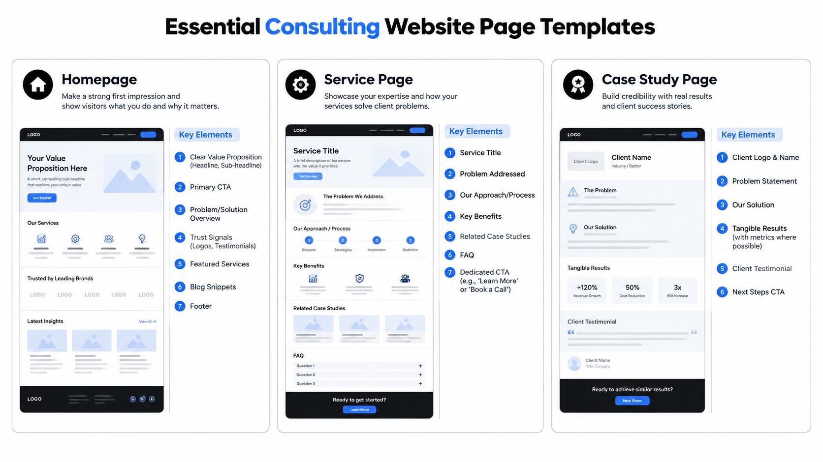
A practical template gives the design team a commercial sequence to work from. It doesn't mean every consulting firm should look the same. It means each page earns its place by answering a buyer question.
The homepage earns attention and creates direction
A strong homepage opens with a clear proposition, a supporting explanation and a primary CTA. It then gives visitors enough evidence to choose the next path, without forcing them to consume your entire business model.
Use this order as a starting point:
Hero: State the audience, problem and value.
Recognition: Describe the situations your clients are facing.
Service routes: Send visitors to focused offers.
Proof: Show relevant testimonials, sectors, credentials or case evidence.
Method: Explain how an engagement begins and progresses.
People: Introduce the consultants who will deliver the work.
CTA: Make booking or enquiry the obvious next step.
The homepage shouldn't carry every claim. Its job is to create confidence and direction.
The service page turns a need into an engagement
A service page should read like a useful first consultation. Open with the problem, then explain the consequences of leaving it unresolved. Show your approach in plain language, add relevant proof and describe what the first conversation covers.
For example, a finance advisory page might start with reporting uncertainty, explain the decisions it affects, outline the diagnostic process and link to a case study involving a comparable business. The CTA should sit beside the proof, not only at the bottom.
Include FAQs where buyers repeatedly hesitate. Address fit, engagement scope, preparation and likely next steps. Don't use FAQs as a dumping ground for search terms.
The case study proves that your method works in context
Case studies need a narrative. Begin with the client's situation and constraints. Explain the work performed, the decisions made and the practical result. If you have approved metrics, include them accurately. If you don't, describe the operational or strategic change without inventing a number.
End with a clear next step, such as viewing a related service or booking a conversation about a similar problem. A case study that ends with no action leaves the reader interested but stranded.
Local credibility also deserves attention. auDA's 2026 Why .au? research reports that 80% of Australians are more likely to trust an Australian business if it has a .au website, and 51% will only purchase from a business with a .au website, according to auDA's research on .au trust. For an Australian consulting firm, domain choice, local language, contact details and evidence of Australian market understanding should reinforce the same signal.
Your Pre-Launch Checklist and Post-Launch Strategy
A consulting website can look finished and still lose qualified enquiries. Before launch, test it as a commercial journey from first visit to booked call.
Pre-launch checks
Positioning: Can a suitable buyer identify their situation and problem immediately?
Navigation: Do the main routes follow buyer intent rather than internal departments?
Services: Does each priority offer have a focused page, relevant proof and a clear CTA?
Evidence: Can visitors quickly find case studies, testimonials and consultant bios?
Booking: Do the form, calendar, confirmation and internal notifications work together?
Mobile experience: Can someone read, browse and book without awkward scrolling or small controls?
Search foundations: Are titles, headings, internal links and useful resources organised around real buyer questions?
Local credibility: Does the site clearly present the firm as an Australian business, with appropriate contact and professional details?
Measurement: Can you separate traffic, enquiries, qualified leads and booked calls?
Ask someone outside the project to complete the main journey without assistance. Internal teams know where everything sits. Prospective clients do not.
Post-launch improvement
Launch marks the start of optimisation. Review which pages attract qualified visitors, where people abandon the journey and which sources generate booked conversations. Use those findings to refine copy, proof placement, form fields, calendar availability and follow-up.
For Australian professional-services websites, 1.5% to 2.5% is a practical average conversion range, 2.5% to 4.0% indicates good performance, and 4.0% to 6.0% or more indicates excellent performance, according to Australian conversion benchmarks for professional-services websites. Treat these figures as measurement bands, not promises. The quality of booked calls matters more than a rise in form submissions.
Australia's web-design services market grew at a 1.4% compound annual growth rate between 2021 and 2026, according to IBISWorld data reported by Uprise Digital. The market reflects a broader shift toward websites that support discovery, credibility and lead generation, rather than static brand presentation.
Map the response to every enquiry with these automated system examples for lead handling. Set clear ownership for notifications, qualification, scheduling and follow-up, so the website gives your team the context required for a useful first conversation.
Raffine Studio designs consulting websites and connected funnel systems that align messaging, proof, SEO, AI search visibility, booking, CRM handoff and follow-up around qualified discovery calls. Visit Raffine Studio to assess how your current site could become a more dependable lead-generation system.