web design for professional services, professional services websites, lead generation website, conversion focused design, discovery call booking
Web Design for Professional Services That Books More Calls
by raffiné studio

A redesign can leave you with a sharper logo, better photography and a website your team is proud to show clients. It can also leave your calendar just as empty.
That's the problem with most web design for professional services. Firms optimise for credibility in the abstract, then wonder why visitors read a few pages and disappear. A law firm, accounting practice, buyers agency or consultancy doesn't need a digital brochure. It needs a clear path from qualified visitor to enquiry to booked discovery call.
Australian businesses have long had room to improve their customer-facing digital systems. The Australian Treasury's Small Business Digital Taskforce reporting found that over 50% of Australian businesses had a web presence, while many small firms had adopted internal software such as accounting and invoicing tools without translating that maturity into websites, lead capture or online engagement.
Raffine Studio approaches the problem commercially. Every page, message, form and booking prompt should earn its place by helping the right buyer take the next step.
Why Sharper Redesigns Still Miss Discovery Calls
A partner at a professional services firm approves a redesign after weeks of reviews. The new site looks cleaner. The old stock photography is gone, the typography feels more considered, and the services are arranged in tidy cards.
A few weeks later, the same question comes up in the leadership meeting: where are the enquiries?
The redesign failed because it changed the surface without changing the decision path. Visitors still can't tell who the firm is for, which problem it solves, why they should trust it, or what happens after they enquire. The site looks more expensive, but it doesn't make the buying decision easier.
The difference between polish and persuasion
A typical underperforming homepage opens with a vague statement such as “strategic advice for a changing world”. It follows with a team photo, a list of services, a generic About page and a Contact link hidden in the navigation.
A commercially useful version starts with the buyer's situation. It identifies the sector, the issue and the next step. A Sydney accounting firm might lead with advisory support for growing businesses, then route visitors towards tax, virtual CFO or succession planning pages. A mortgage broker might separate first-home buyers, investors and refinancers before offering a booking option suited to each audience.
The homepage elements that influence the decision are straightforward:
A specific hero message: State who you help and what you help them achieve.
A visible next action: Offer a discovery call, assessment or phone conversation without making visitors hunt for it.
Relevant proof: Put industry experience, reviews, memberships, licences or case evidence near the claims they support.
Clear service routes: Let visitors self-select the service or problem that brought them to the site.
A defined process: Explain what happens after the form, call or booking.
Human credibility: Show the actual experts who will lead the relationship.
Commercial rule: A homepage should be judged by the quality of the conversations it starts, not by how impressed the internal team feels during the design review.
A beautiful website still underperforms when it asks every visitor to follow the same generic route. The redesign should instead reduce uncertainty, answer the buyer's immediate question and make booking feel like a sensible continuation of the visit.
The Website as a Lead Pipeline, Not a Digital Brochure
The brochure mindset assumes the website's job is to explain the firm. That's incomplete. The website should explain the firm and move suitable visitors through a measurable commercial process.
Australian digital adoption data shows why this distinction matters. An nbn Co small business report recorded 43% of small businesses with a website and 34% receiving orders online. CPA Australia's 2024–25 small business survey found only 39.3% of Australian small businesses generated more than 10% of revenue from online sales. The opportunity for professional services isn't to establish a web presence. It's to connect discovery, trust, enquiry and scheduling.
Assign every page a pipeline job
A service page might attract search traffic and answer a high-intent question. An insight article might build familiarity with a buyer who isn't ready to speak yet. A case study might remove the final credibility objection. A booking page should reduce friction and capture enough information for a useful first conversation.
That logic creates a pipeline:
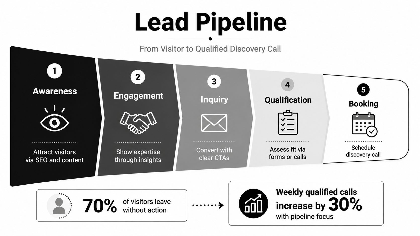
Australian service businesses convert at about 2.3% overall, while service-focused lead generation pages can reach 5% to 15% enquiry rates from high-intent paid traffic when the offer, audience fit and page hierarchy align, according to Australian digital marketing benchmarks. These figures aren't promises. They're a useful warning that average traffic and tightly designed intent-led journeys behave differently.
Find the leak before buying more traffic
If visitors reach your site but don't enquire, more traffic won't solve the commercial problem. You need to identify whether the leak sits in:
Relevance: The page doesn't match the visitor's query or referral context.
Confidence: The firm makes claims without enough evidence.
Clarity: The visitor can't tell which service fits their situation.
Friction: The form, phone path or calendar creates unnecessary work.
Follow-up: The firm receives the enquiry but responds too slowly or inconsistently.
A lead pipeline gives the redesign a job. Instead of asking whether the website feels modern, ask whether each stage creates a sensible reason for the right visitor to continue.
Designing the Homepage to Route, Not Just Impress
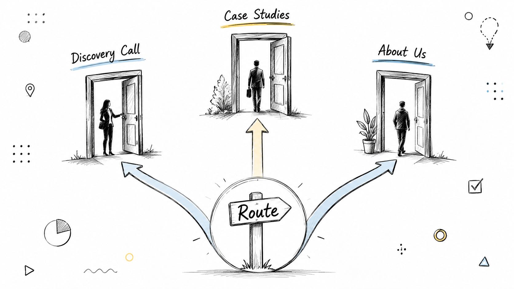
A homepage should behave like a reception desk with good judgement. It should help different visitors find the right person, service or action without forcing everyone through the same script.
Start with the visitor's decision
The hero section needs more than a service category. It should name the buyer's job, stage or sector. “Commercial property finance for experienced investors” gives a visitor more to work with than “finance solutions for your future”. “Legal advice for property developers facing planning and construction disputes” gives the reader a reason to continue.
Build the page hierarchy around the questions a prospect is already asking:
Can this firm help with my situation?
Has it worked with people like me?
What exactly does it offer?
What will happen if I make contact?
What should I do now?
A practical sequence is:
Hero: A specific promise and one primary booking action.
Proof strip: Relevant client types, memberships, reviews or credentials.
Service routes: Short modules with individual buttons where the buyer's needs differ.
Expertise: Insights, FAQs or explanations that demonstrate useful thinking.
Case evidence: A relevant example placed near the claim it supports.
Process: A plain-language explanation of the first conversation and next steps.
Booking block: A direct invitation to schedule, call or submit a qualified enquiry.
Use one dominant action, such as Book a discovery call, and support it with secondary options such as View services or Read insights. Those secondary paths matter for cautious buyers, but they shouldn't compete visually with the commercial action.
The booking prompt should appear at the top, after the first major proof section and near the bottom. It doesn't need to be identical each time. A header button, a contextual service CTA and a final calendar block can serve different levels of intent while keeping the route obvious.
The relationship between branding and web design matters here. Visual identity should reinforce the positioning and make the action feel credible, not distract from it.
Grade the current homepage
Ask someone unfamiliar with the firm to answer these questions after a quick visit:
Who is this firm for?
What problem does it solve?
Which service should I choose?
Why should I trust it?
What happens after I book?
Can I take the next step without searching?
If they hesitate, the design problem is probably a routing problem, not a colour problem.
Landing Pages vs Homepages for Booking Conversions
A mid-tier accounting firm sends SMSF campaign traffic to its generic homepage. Visitors then pass through unrelated services, broad positioning and several navigation choices before they find a relevant next step. The firm has paid for attention, then made the visitor do the routing.
A campaign-specific landing page keeps the message focused on SMSF structure, relevant risks, the firm's experience and one booking path. That focus matters when the website is measured as a booking system rather than a brochure.
Match the page to the traffic intent
Branded search, direct visits and referrals from people still assessing the firm usually suit a homepage. These visitors may want to review the team, services, locations and insights before booking. Give them enough context, then make the route to a conversation obvious.
Paid traffic, event traffic and referral links tied to a specific problem need a more focused page. Repeat the visitor's context in the headline. Use proof connected to that service. Ask only for the information the team needs to qualify the conversation.
Attribute | Homepage | Dedicated Landing Page |
|---|---|---|
Primary role | Navigation and firm-wide orientation | One campaign or service conversion |
Hero message | Broad positioning for several audiences | Specific problem, audience and offer |
Navigation | Full navigation is useful | Reduce exits and competing routes |
Proof | Broad credibility across services | Evidence matched to the campaign |
Form | General enquiry or route selection | Focused qualification for one action |
CTA | Multiple controlled pathways | One dominant booking or enquiry action |
Best traffic fit | Branded, direct and exploratory | Paid, referral and high-intent traffic |
Australian benchmarks place overall service-business conversion at about 2.3%, while high-intent paid traffic to aligned lead-generation pages can reach 5% to 15%, according to Australian conversion benchmark data. Treat those figures as directional, then compare pages with similar traffic intent. A broad homepage and a focused landing page have different commercial jobs.
Use a hybrid architecture
Keep the homepage as the firm's central routing layer. Create landing pages when a traffic source, audience or service raises a distinct question and has a clear commercial reason for its own journey.
A restrained sticky booking widget can keep scheduling accessible without overpowering the page. Place trust signals beside the form, where they support the decision, instead of hiding them in the footer. Keep the first form short, with qualification fields that help the team prepare without turning the enquiry into an interrogation.
Decision rule: Send visitors with a specific problem to a page built around that problem. Send visitors who are assessing the firm to a homepage that routes them intelligently.
Mobile First, Speed First, Booking First
Mobile design isn't a smaller desktop layout. It's a prioritisation exercise. The visitor may be between meetings, checking a referral while commuting or trying to call from a search result. If the first screen gives them a dense navigation menu and a slow hero animation, the opportunity is already weakening.
Google recommends a mobile website load time of 5 seconds or less on 3G connections, according to Deloitte's Australian digital trust guidance. Google's mobile speed guidance also uses a 10-point speed score, where 1 is very slow and 10 is extremely fast, as described in website analysis guidance.
Protect the booking journey
Start by designing the mobile version of the booking path before styling desktop layouts. The minimum viable journey should include:
A visible Book a call or Call now button.
Tap-to-call phone numbers for services where urgency is high.
A calendar that fits the screen without awkward horizontal scrolling.
A short form with clear field labels and an explanation of what happens next.
Confirmation messaging that sets expectations for response and scheduling.
A persistent but unobtrusive CTA within easy thumb reach.
Compress large images, use modern formats and lazy-load media below the initial viewport. Don't lazy-load the primary hero image if doing so delays the content that establishes relevance. Test the whole journey, not just the homepage. Mobile speed measurement guidance recommends assessing the entire mobile site, which is critical when a prospect moves from a service page to a form or calendar.
Make content readable to people and search systems
AI search visibility starts with useful, well-structured information. Use descriptive headings, clear service definitions, expert biographies, location context and FAQs that answer real buyer questions. Structured data can help search engines interpret professional services, people, organisations, services and FAQs, but it can't compensate for vague copy.
Mobile-first design also affects accessibility. Give controls enough space, maintain readable contrast, use descriptive labels and ensure forms work with keyboards and assistive technologies. A booking route that excludes users with different access needs is a commercial and reputational weakness.
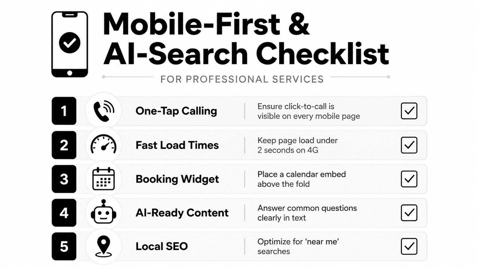
On launch day, test on real phones, measure page performance across the full site, submit forms, complete bookings and call every displayed number. A site can look perfect in a design review and still lose leads through a broken calendar embed or an unreadable mobile form.
Industry Specific Patterns Across Law, Accounting, Broking, and Consulting
There isn't one professional services template worth copying. A conveyancing firm, accounting practice, mortgage broker and management consultancy may all need a booking button, but their trust barriers and buying questions differ sharply.
Vertical | Primary Trust Lever | Booking Flow Style | Highest-Converting Page Type |
|---|---|---|---|
Law | Practice expertise, credentials, relevant matter experience | Matter-focused form, phone or consultation booking | Practice area page |
Accounting | Service-line clarity, adviser expertise and practical guidance | Route by compliance, advisory or business stage | Service or sector page |
Buyers agency | Local knowledge, property outcomes and client evidence | Qualification call with location and brief details | Suburb or property strategy page |
Broking | Loan scenario clarity, responsiveness and lender knowledge | Tap-to-call, short enquiry or calendar booking | Loan-purpose landing page |
Consulting | Founder credibility, point of view and detailed case evidence | Longer discovery call with context capture | Industry or capability page |
Law firms need relevance before reassurance
A law homepage shouldn't make visitors decode a long list of practice areas. Group services by the problems clients face, then show the relevant solicitor or team. Regulatory information, professional memberships and clear contact options should appear where credibility friction is highest, especially near the first booking invitation.
Accountants must separate urgency from relationship building
Compliance visitors may want a direct answer about tax or reporting. Advisory prospects need to understand the firm's thinking, process and fit. Service pages should route these audiences differently rather than pushing every visitor towards one generic enquiry form. Firms reviewing their structure can compare it with a focused accountant website design approach.
Buyers agencies and brokers sell confidence under uncertainty
Buyers agencies benefit from location and property-strategy pathways, while brokers need pages organised around borrowing situations. Both should make qualification feel useful rather than invasive. Explain what information helps the first conversation, then provide a clear call or booking route.
Consultancies need more room for expertise. Put founder or partner thinking where prospects can find it, and use case studies to explain the problem, method and commercial relevance. The design lever isn't visual similarity to another firm. It's the evidence type that answers this sector's most expensive objection.
Measure, Automate, and Book the Next Conversation
A website becomes a pipeline only when the firm can see where prospects enter, hesitate, enquire and book. Page views alone won't tell a partner whether marketing is producing viable conversations.
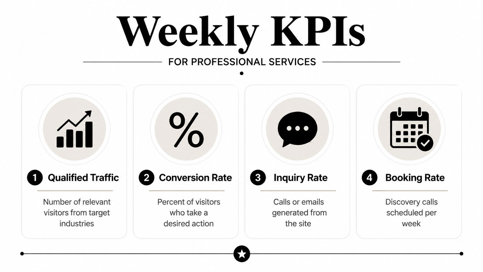
Track these weekly:
Qualified visitors: Relevant people arriving from target industries, services and locations.
Booking-page conversion rate: The share of visitors who take the intended booking action.
Show-up rate: How often booked prospects attend the scheduled conversation.
Cost per booked call: The acquisition cost attached to a completed booking, not merely a form submission.
Australian website conversion benchmarks range from 1% to 3% across industries in one Australian-focused dataset, while another benchmark cites 2.3% as the average Australian website conversion rate, as summarised by Australian web design trend guidance. Use those figures as context, not as a substitute for your own qualified-lead data.
Build a measurement stack your team will use
GA4 should record clicks on booking buttons, phone links, form starts, form completions and calendar confirmations. Call tracking can separate search, referral, paid and direct enquiries. A CRM should move contacts through stages such as new enquiry, qualified, booked, attended, no-show and won.
Use a consistent UTM convention across paid campaigns, social posts, partner referrals and event links. The point isn't to create a complicated reporting project. It's to connect source, action and commercial outcome.
Follow-up deserves the same design attention as the page. Set a clear response rule, send useful confirmation details, and use a short nurture sequence for prospects who enquire but don't book. Reminder emails and messages should explain the meeting purpose, who they'll speak with and what to prepare.
The automated system examples should be judged by whether they remove delay and uncertainty, not by how many tools the firm has connected.
Run a weekly audit against five questions: Is the headline specific? Is booking visible? Is the form proportionate? Is follow-up fast and clear? Are new reviews, credentials and case evidence being added where they matter?
Raffine Studio designs professional services websites, landing pages and booking systems around qualified discovery calls, then connects them with SEO, AI search visibility, CRM handoff and follow-up automation. Visit Raffine Studio to review your current website pathway and start a practical conversation about where enquiries are being lost.