landing page design services, conversion optimisation, web design Australia, lead generation, CRO
Landing Page Design Services: How to Choose Right
by raffiné studio

You've paid for a polished landing page, sent qualified visitors to it, and still watched the enquiry numbers sit stubbornly near your existing website baseline. The page looks credible. The copy sounds professional. Your agency says the campaign is generating leads. Yet your sales team says most submissions aren't suitable, and the few worthwhile prospects aren't being contacted quickly enough.
That's the core problem with many landing page design services. They optimise the visible page, then stop before the visitor becomes a qualified conversation. For an Australian buyers agency, broker, law firm, accountant, construction business or B2B provider, lead quality, booking rate and follow-up speed matter more than raw form volume.
Australian benchmarks illustrate why the page deserves serious commercial attention. Average service-business website conversion is cited at 2.3%, while another Australian summary places average website contact conversion at 1.97%. Dedicated landing pages have a cited median conversion rate of 6.6%, with the top 10% exceeding 11.45% in broader landing-page datasets. These figures come from Australian digital marketing benchmark coverage, but they shouldn't become a vanity target. The right question is whether your page produces the right enquiries and moves them into booked discovery calls.
Why Most Landing Page Projects Underperform
An Australian founder pays $4,000 for a beautifully designed page. The typography is sharp, the animations are tasteful, and the brand system looks more expensive than before. After launch, the page converts at 1.2%. That figure is the founder's actual example, not an industry benchmark, and it exposes the flaw in the project. The team designed an attractive asset without defining the visitor's intent, the offer, the qualification rules or the follow-up path.
Most underperforming projects fail in four predictable places.
The page answers the wrong question
Google Ads visitors searching for a specific service often land on homepage-style copy. They see company history, broad service categories and several routes through the website. The page may explain the business, but it doesn't confirm that the visitor has found the exact solution advertised.
The form creates unnecessary work
Long forms punish mobile visitors before they submit. Every extra field asks the prospect to make another decision, disclose more information or interrupt their browsing. For many professional and B2B services, the form needs enough detail to qualify the enquiry, not enough to recreate the entire sales discovery process.
Every lead looks identical to sales
A form submission from a high-value commercial prospect shouldn't look the same as a general information request. Without qualification logic, source attribution and structured CRM fields, your team can't prioritise properly. Marketing reports “leads”, while sales inherits an unorganised list.
The handoff breaks after submission
The page might capture the form, but the notification lands in a shared inbox. Nobody owns the response. The prospect waits, the buying conversation cools, and the business blames the landing page for an operational failure.
Australian lead-response guidance cites a five-minute response benchmark, and one Australian source reports that responding within five minutes makes a business up to nine times more likely to qualify a lead than waiting thirty minutes. The source is Salesmasters' lead follow-up guidance. Your provider should be able to explain how the page supports that response process.
Failure mode | What it looks like | Typical impact |
|---|---|---|
Traffic-source mismatch | An ad promising a specific outcome sends visitors to generic website copy | Visitors hesitate or leave before understanding the offer |
Friction-heavy forms | Too many fields, poor mobile layout or unclear error handling | Interested prospects abandon before submission |
No qualification logic | Every enquiry enters the same queue with no context | Sales spends time sorting weak leads from genuine opportunities |
Broken CRM or booking handoff | Notifications rely on manual inbox management | Response slows and qualified prospects become harder to reach |
Commercial rule: A landing page hasn't done its job when it captures a name. It has done its job when the right prospect enters a fast, trackable path to a useful conversation.
The rest of your brief should be built around closing the gap between lead volume and qualified pipeline.
What Landing Page Design Services Actually Deliver
A landing page is not a shorter website page. It's a controlled decision environment built around a defined visitor intent. That distinction separates a brochure page, a generic website page and an intent-matched landing page.
A brochure page supports brand awareness and general credibility. A generic website page serves mixed audiences and often offers several navigation paths. An intent-matched landing page aligns the traffic source, offer, message and CTA around one action.
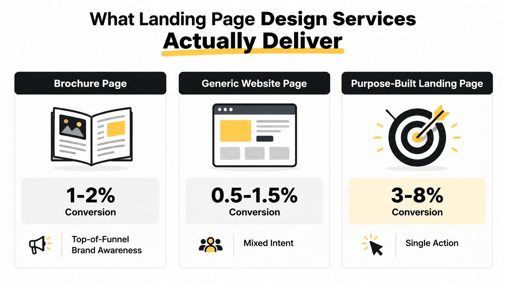
The benchmark figures in the visual are useful as categories, not promises. Australian service-business guidance places average lead-generation conversion around 2% to 3%, while strong professional and B2B service pages can reach roughly 4% to 8%, with top-performing broader datasets exceeding 10%. Those figures are outlined in Australian conversion-rate optimisation benchmarks. Traffic source, offer strength, audience awareness and sales friction will determine where your page sits.
What competent scope includes
A serious provider should deliver more than a Figma file.
Conversion architecture: One primary action, a clear page hierarchy and deliberate objection handling.
Offer-led copy: Headlines and supporting sections should explain the commercial outcome, not repeat your About page.
Stage-appropriate proof: Testimonials, client examples, credentials and process evidence should appear where buyer scepticism rises.
Mobile-first structure: The form, CTA and key reassurance must remain usable on a small screen.
Measurement mapping: Events should connect visits, CTA interactions, form starts, submissions, bookings and source data to pipeline reporting.
Cheap packages often omit the work that determines whether the page keeps improving. Form routing, speed optimisation after the initial build, CRM mapping and post-launch analysis may be treated as someone else's responsibility. That creates a page that looks complete but has no feedback loop.
The structural lesson is clear. Australian guidance cites 13.5% conversion for single-CTA pages, compared with 11.9% for pages with multiple competing CTAs, as reported in Australian CRO statistics and industry benchmarks. A single action doesn't guarantee qualified pipeline, but competing actions make the visitor's decision harder.
Briefing a Landing Page for Real Conversion
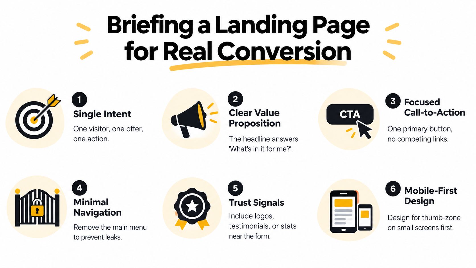
Your provider can't solve a vague commercial brief. “We need more leads” sounds reasonable, but it doesn't define the audience, offer, qualification standard or next step. A useful brief specifies what the visitor should believe, do and trigger after clicking.
Start with one intent
Choose one visitor, one offer and one action. A mortgage broker might target first-home buyers requesting a borrowing conversation. A buyers agency might target property investors seeking an acquisition strategy call. A law firm might focus on an initial matter assessment.
Don't place “Book a Call”, “Download the Guide”, “View Services” and “Contact Us” at equal prominence. If the campaign needs education before conversion, build that sequence deliberately. Don't turn one landing page into a miniature website.
Make the value proposition concrete
Generic statements such as “personalised service” or “trusted advice” rarely carry enough weight on their own. Explain what the prospect receives, how the process works and why taking action now makes sense.
A price anchor can clarify fit where appropriate. A guarantee can reduce perceived risk if your business can honour it. A time-sensitive driver can create momentum, but manufactured urgency damages trust with high-consideration buyers.
Keep form friction proportional
For many B2B services, start with name, email, phone and one qualifying question. The question should help your team understand fit, such as service need, project stage or approximate requirement. Don't ask for information your sales team won't use.
Place proof beside doubt
A cautious buyer needs different evidence from a ready-to-book visitor. Put relevant proof near the claim it supports. A specific testimonial that mirrors the reader's industry or situation is more useful than a collection of vague compliments.
Design the mobile decision path first
Mobile hierarchy means the headline, offer, reassurance and CTA remain obvious without pinch-zooming or awkward horizontal movement. The primary CTA should sit within comfortable thumb reach, and the form should be easy to complete with a phone keyboard.
Define the post-submit SLA
Your brief should name the CRM fields, routing rules, booking process and ownership of the first response. The internal target may be a first touch within fifteen minutes, while the Australian benchmark expectation for rapid response is under five minutes, as covered in Australian lead-generation benchmark guidance. Set the operational standard before launch, not after leads begin arriving.
A practical brief should also show where the page sits in your wider funnel. A sales funnel landing page template can help you map the relationship between traffic, message, action and follow-up before a designer starts laying out sections.
Choosing an Engagement Model That Fits
The right engagement model depends on where the bottleneck sits. A business testing one offer needs a different arrangement from a business with reliable traffic and a backlog of conversion problems.
Model | Typical Cost (AUD) | Control Level | Best For | Pipeline Outcome |
|---|---|---|---|---|
Fixed-scope build | Varies by brief and deliverables | Moderate | Founders testing one offer or campaign | A focused page and measurement foundation |
Monthly conversion retainer | Monthly fee based on scope | Shared, with ongoing agency ownership | Businesses already generating traffic | Continuous testing, copy refinement and integration improvements |
In-house hybrid | Internal salary or contractor arrangement | High | Teams with senior internal marketing capacity | Faster internal control, if the team can brief and ship consistently |
Fixed-scope build
Choose a fixed-scope project when you need one credible page for one service, audience and offer. A realistic delivery window for this type of engagement is three to six weeks, depending on approvals, copy input, development and integrations. It suits an early campaign or a founder who needs to validate a proposition before committing to ongoing optimisation.
The danger is treating launch as the finish line. A page without traffic, tracking and a review process produces a design opinion, not a conversion decision.
Monthly conversion retainer
A retainer fits a business that already has meaningful traffic but remains near its baseline conversion performance. The provider should own a prioritised backlog covering hypotheses, copy refinements, form changes, speed work, analytics and CRM integration.
Don't buy a retainer that your business can't feed with traffic or internal decisions. Without sufficient visitor intent and timely approvals, the agency can produce activity without producing useful learning.
In-house hybrid
A senior external designer working alongside an internal marketer gives your team more control over context, brand and prioritisation. It also demands real internal bandwidth. Someone must brief the provider, approve copy, coordinate developers and release changes.
Before comparing quotes, understand website design pricing factors, particularly what's included beyond visual design. The cheapest proposal often becomes expensive once copy, development, tracking and post-launch changes appear as extras.
How to Vet a Landing Page Design Provider
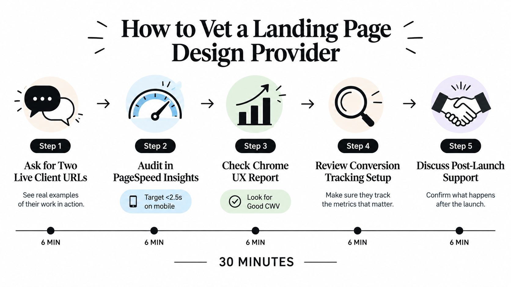
You can remove most agency theatre in thirty minutes. Don't judge the provider by a polished moodboard or a portfolio carousel. Judge the questions they ask, the evidence they can show and the operational details they're willing to own.
Ask for live evidence
Request two live client URLs, not only a slide deck. Review the pages on mobile and desktop, then inspect their performance in PageSpeed Insights and the Chrome UX Report. The mandatory vetting visual identifies under 2.5 seconds on mobile as a target and recommends looking for Good Core Web Vitals, but treat those as audit criteria rather than verified performance claims for every provider.
Ask how the pages were measured. A provider who reports conversion improvement should be able to explain the baseline period, traffic context and sample size. If the answer is vague, the tracking may not have been configured properly.
Identify who does the important work
Ask who writes the copy. Is it a senior strategist who understands your sales process, an in-house conversion writer or an outsourced generalist? Copy determines whether the page connects the visitor's problem to your offer, so it shouldn't be hidden behind a generic “creative team”.
Confirm who handles form-to-CRM wiring, booking logic and server response issues. A provider that sends those tasks back to your developer may still be suitable, but the handoff needs an owner, deadline and acceptance criteria.
Vetting question: “Show me the event map and tell me what happens after a qualified form submission.”
Your analytics plan should include source attribution, CTA clicks, form starts, validation errors, submissions, booking actions and downstream qualification where possible. Without those events, you can't distinguish a persuasive page from a page that collects low-value contacts.
Red flags include templated portfolio work, refusal to share live URLs, pricing that changes without a clear scope explanation and a pitch centred on aesthetics before conversion hypotheses. Competent providers answer direct questions without defensiveness.
The Layer Behind the Page That Decides ROI
The page is the visible asset. The operational layer underneath it determines whether a submission becomes pipeline. A provider can improve the headline and layout, but the commercial result still depends on speed, mobile usability, response handling, routing and measurement.
Speed is a conversion requirement
Australian benchmark material links a one-second load delay with about a 7% conversion drop, according to Australian landing page conversion guidance. Compress media, remove unnecessary scripts and test the page on the devices your audience uses.
Another Australian summary reports that pages loading in under two seconds can convert at roughly twice the rate of pages taking five or more seconds. That figure appears in Australian conversion-rate optimisation statistics. Use it as a reason to demand performance testing, not as a guaranteed outcome.
Mobile creates a structural gap
Australian benchmark summaries place mobile ecommerce conversion around 1.1% to 1.8%, compared with 2.9% to 3.6% on desktop, as reported in Australian mobile and ecommerce benchmarks. Service-business behaviour differs, but the gap is a warning. If the mobile form is cramped, the CTA is buried or the first screen is unclear, you may have a design problem rather than a traffic problem.
Response and routing must be immediate
A form submission should create a record in the right pipeline, attach the source and offer, assign ownership and offer a booking path where appropriate. It shouldn't sit in a shared inbox waiting for someone to remember it.
Raffine Studio includes landing pages within a broader funnel approach that connects offer positioning, lead capture, booking pathways and follow-up systems. You can review examples of automated system workflows when assessing how the back end should support the page.
Measurement closes the loop
Track the journey from source to qualified outcome. A high conversion rate with poor qualification is not success. Your dashboard should help answer which campaign produces suitable enquiries, which page section creates hesitation and which follow-up route produces booked conversations.

A beautiful landing page attached to a slow CRM handoff is still a leaking bucket.
Demand evidence for each layer before signing. Ask to see the test plan, field mapping, response workflow and reporting format, not just the proposed layout.
Your Next Step and What to Brief First
You don't need another round of abstract advice. You need a short buying process that forces the commercial decisions before design opinions take over.
Start with the offer
Write one sentence that names the audience, problem, offer and action. If you can't do that, don't contact providers yet. A brief built around “more leads” will usually produce a page with too many messages and no agreed definition of success.
Record your baseline
Capture your current conversion rate, cost per enquiry, mobile and desktop split, speed score, source mix and qualification rate. The benchmark ranges discussed earlier can provide context, but your own starting point is what makes a proposal accountable.
Run a disciplined shortlist
Choose three providers and give each the same commercial brief. Use the vetting questions above, then score their responses against:
Message quality: Do they understand the buyer's problem and decision stage?
Conversion mechanics: Have they defined one action and sensible form friction?
Operational ownership: Can they explain CRM routing, booking and response handling?
Measurement: Will they document events, attribution and qualification outcomes?
Iteration: What happens after launch when real visitor behaviour challenges the original hypothesis?
Pay for discovery where the conversation requires strategy. A free call focused entirely on colours and layouts won't reveal whether the provider understands your sales process.
Pilot one focused page
Commission a fixed-scope pilot for one service, one audience and one offer. Keep CRO as a follow-on decision after thirty days of real traffic, provided the traffic is relevant and the tracking works. This keeps the first investment focused while preserving a path to evidence-led optimisation.
Connect the back end before launch
Test the full journey. Submit the form on mobile, confirm the CRM record, check field values, verify the notification recipient, test the booking link and measure the first-response process. A page without those systems is a brochure with a form attached.
For buyers agencies, mortgage brokers, professional firms and B2B providers, this sequence is the practical starting point for building landing pages that book useful work rather than merely collecting names.
Raffine Studio builds conversion-focused landing pages and funnel systems for Australian service businesses, connecting page strategy with SEO, AI search visibility, CRM handoff and automated booking. Visit Raffine Studio to review the approach and start a conversation about turning your next landing page into a qualified discovery-call pathway.