landing pages examples, landing page inspiration, conversion optimisation, lead generation, web design
7 Landing Pages Examples Worth Borrowing
by raffiné studio

Landing pages that merely match a benchmark aren't enough. In Australia, median landing page conversion sits at 6.6% across industries, while top performers clear 10%, so the examples worth borrowing are the ones that make the offer obvious, cut friction, and move a qualified visitor to a clear next step.
Most advice on landing pages examples is too visual. It over-rewards polished galleries and under-examines the sales job the page needs to do. For buyers agents, brokers, accountants, legal firms, and other professional services businesses, a landing page isn't there to win design awards. It's there to qualify interest, build trust quickly, answer obvious objections, and produce a measurable enquiry or booked call.
That changes how examples should be judged.
The strongest landing pages examples aren't attractive pages. They make the offer clear, reduce decision friction and create a measurable next step. The seven resources below are most useful when assessed against audience fit, proof, CTA clarity, mobile flow and follow-up readiness.
This isn't a screenshot roundup. It's a working list of research tools and example libraries that are useful when you need to build or improve an enquiry funnel. Some are better for structure. Some are better for section-level pattern research. One is better if you want the strategy, copy, follow-up and booking path connected into a single system.
1. Raffine Studio
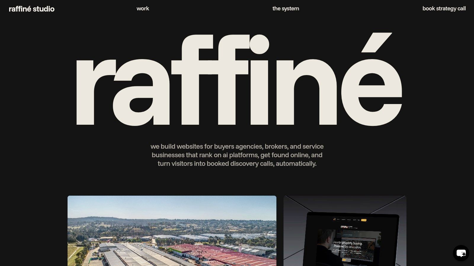
Raffine Studio earns a place on this list for a different reason than the gallery sites that follow. It is a Sydney studio that builds landing pages for buyers agents, brokers, and professional services firms, with the booking flow, CRM handoff, search visibility, and follow-up path considered at the same time.
That makes it more useful as an operating model than a swipe file.
For firms selling a high-trust service, the page rarely fails because the design is plain. It fails because the offer is broad, the proof is weak, the form asks the wrong questions, or the next step after submission is unclear. Raffine is useful because it treats those issues as funnel decisions, not styling decisions.
Why it matters for qualified enquiry
A buyers agent does not need more form fills from casual browsers. A broker does not need a hero section that looks modern but attracts rate shoppers with no intent to proceed. An accountant does not need a long page if the first screen still leaves the visitor unsure who the service is for.
Raffine's value in this research set is that it frames the landing page as part of a booked-call system. The practical question shifts from “Which layout looks current?” to “Which page structure gets the right prospect to take the next step, and what happens after they do?”
That is a better filter for Australian service businesses with long consideration cycles and uneven lead quality.
Useful strengths and real limits
The upside is strategic fit. This is one of the few resources in the list that reflects how service firms buy growth. Offer clarity, qualification, trust, booking logic, and follow-up all affect enquiry quality.
The trade-off is just as clear. You are not browsing a huge public library of examples across every category. You are looking at a studio approach. That makes it less useful for broad visual exploration and more useful if the commercial problem is poor-fit leads, low call bookings, or weak conversion from traffic you already have.
Another practical limitation is scoping. Pricing and fixed packages are not published, so comparison-shopping is harder at the start.
How to turn this into a repeatable research method
Use Raffine as a funnel audit framework:
Start with the conversion event: define whether the page should drive a booked call, assessment request, or qualified form enquiry.
Review message match: compare the promise in the ad, Google result, referral source, or email with the first screen of the page.
Check qualification logic: decide which fields screen for fit and which ones create unnecessary drop-off.
Inspect proof placement: move testimonials, case evidence, accreditations, or market-specific trust signals closer to the CTA if hesitation is high.
Trace the post-submit path: confirm whether the user sees a calendar, a clear next-step message, or disappears into a generic thank-you page.
I would use this method when a service business is already getting traffic but sales still says the leads are weak. In that situation, copying prettier landing pages examples is usually a waste of time. Tightening the enquiry path is the higher-return move.
2. Landingfolio
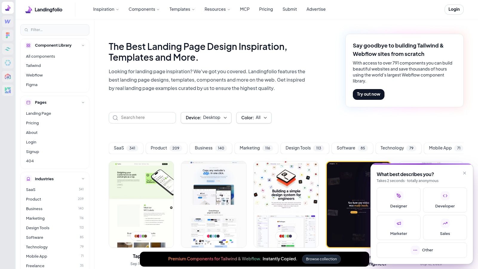
Landingfolio is strong when you need to research sections fast. It includes full landing pages, component-level inspiration, template indexes, and saved collections. That makes it useful for teams rebuilding specific parts of a page without replacing everything.
For service businesses, that section-level view is more valuable than a gallery of finished pages. You might only need a better hero, stronger FAQ block, cleaner testimonial layout, or a more credible pricing section. Landingfolio helps isolate those pieces.
Where it helps and where it doesn't
Its main advantage is speed. You can compare multiple implementations of the same page component without digging through complete websites. That's helpful when a mortgage broker needs a better enquiry form layout or a buyers agent needs a trust-focused hero section.
The limitation is obvious. It won't tell you which examples produce qualified enquiries, and it won't fix weak positioning. You still need to judge whether the example fits a local Australian audience and a high-consideration service sale.
A better approach is to pair visual research with funnel logic. Raffine's own sales funnel landing page template is a good example of how to turn sections into a sequence instead of a mood board.
Good inspiration libraries shorten design research. They don't replace message strategy.
Turn Landingfolio into a testing method
Use it as a section-comparison tool, not a copy source:
Hero research: Save examples that identify audience, problem and next step above the fold.
Proof research: Compare how testimonials, logos, certifications and outcomes are presented.
CTA research: Look for low-friction button language and booking prompts.
FAQ research: Pull objection-handling patterns, not filler questions.
For Australian service firms, I'd build a swipe file by problem type. Trust gap. Offer clarity gap. Form friction gap. Mobile layout gap. That makes the resource commercially useful instead of just visually interesting.
3. Lapa Ninja
Lapa Ninja is useful for one job. Speed.
If I'm reviewing options for a buyers agent, broker, or accounting firm, I use Lapa Ninja to spot recurring page patterns fast, then decide which ones deserve proper testing. The value is not inspiration for its own sake. The value is seeing what keeps showing up across high-intent service pages, especially around heroes, proof sections, sticky calls to action, and contact prompts.
That speed comes with a trade-off. Lapa Ninja gives you volume, not verdicts. It helps you collect patterns, but it does not tell you whether those patterns will produce qualified enquiries, reduce wasted calls, or improve show-up rates after booking.
For professional services, that distinction matters. A polished page can still attract the wrong lead type if the offer is vague, the trust cues are generic, or the form asks for too little context. Service firms with longer sales cycles need pages that pre-qualify as well as convert.
How to use Lapa Ninja without wasting the session
Skip casual browsing. Run it like a research sprint.
Start with a narrow question such as: how are other service businesses introducing credibility above the fold, or how are they handling contact friction on mobile? Save examples into three folders only:
Audience and offer clarity: Pages that state who the service is for, what problem they solve, and what the next step is.
Trust and qualification: Pages that use testimonials, credentials, process steps, or case evidence to screen serious buyers in.
Call-to-action flow: Pages that push to a form, booking call, or consultation request without creating unnecessary hesitation.
Then review the folder, not the individual pages. The point is to find patterns you can test.
For an Australian broker, that might mean comparing a short form against a booked-call CTA with stronger qualification copy. For a buyers agent, it might mean testing whether suburb expertise, fee transparency, or a clear acquisition process should appear before the first CTA. For a law firm or advisory business, it often means replacing broad claims with proof that reduces perceived risk.
Lapa Ninja works best as the top of the research funnel. Use it to gather hypotheses quickly, then bring those ideas back to the commercial question: will this page attract better-fit enquiries and help the sales team spend less time on poor leads?
4. Land-book

Land-book is useful for one specific job. It lets you review a high volume of page sections fast enough to spot recurring layout choices before internal opinion takes over.
That matters if the page already has a clear goal and the team is stuck on execution details. A buyers agent deciding how to present suburb expertise. A broker weighing calculator-first versus consultation-first above the fold. A law firm trying to fit authority, specialisation, and a contact action into one opening screen. Land-book helps compare those formats side by side.
The risk is obvious. It is easy to collect polished examples that solve a different sales problem from your own.
I use Land-book as a pattern library, not an answer sheet. The method is simple. Pick one page component that is affecting enquiry quality, capture 10 to 15 examples of that component only, then sort them by what job they are doing.
For service businesses, the useful sorting groups usually look like this:
pages that push immediate action
pages that build trust before action
pages that explain process before action
pages that screen out poor-fit leads before action
That last group is often underused in Australian professional services. Higher enquiry volume looks good in a report, but it creates sales drag if the form invites every casual browser to submit. For brokers and buyers agents, a stronger page sometimes converts fewer visitors and still produces more booked appointments that hold.
A practical research sprint inside Land-book might focus on only one question: what has to appear before the first CTA for a qualified prospect to keep going? Review hero sections, proof blocks, pricing cues, and FAQ treatments through that lens. Ignore industries that rely on impulse purchase behaviour. Save examples from businesses selling considered, trust-heavy services.
Then turn what you found into a test plan.
Test a proof-led hero against a process-led hero. Test fee transparency against deferred pricing. Test a short form against a booked-call CTA with stronger qualification copy. For accountants, advisers, and legal firms, test whether named specialists and outcome-based case examples should appear before the first button, not halfway down the page.
Land-book is strongest in the middle of the research process. Use it after broad inspiration, and before copy and wireframe decisions, when the job is to choose a section pattern that improves lead quality without slowing serious buyers down.
5. One Page Love
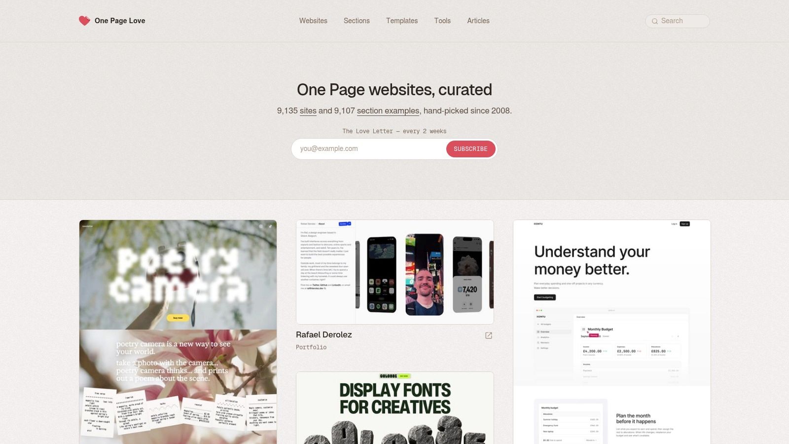
One Page Love is ideal when you're building a single-scroll narrative. That makes it useful for focused campaigns, service launches, lead magnets, webinar pages, and direct-response service pages where one audience, one offer and one CTA need to stay tightly aligned.
A lot of Australian service businesses should pay more attention to this format. One-page flows often work well when the service is easy to explain, the trust signals are strong, and the goal is one booked call or one enquiry action.
When a one-page structure works
It works best when the page can move in a clean order:
audience problem
service promise
proof
process
objections
CTA
That sounds simple, but many firms ruin it by adding homepage clutter. Extra navigation. mixed audiences. vague service descriptions. too many offers.
Australian guidance on conversion repeatedly highlights trust signals like ABN display, Australian phone numbers, recognisable local client logos, certification marks and visible Google review evidence, according to Uprise Digital's landing page guidance for conversion elements. That fits one-page service funnels perfectly because trust can be layered naturally through the scroll.
If you're planning a single-scroll page, Raffine's landing page design services article is a useful next step because it connects structure to commercial outcomes rather than just style.
How to research with One Page Love
Use it to study narrative flow, not just visual taste.
What usually works: one clear promise, visible trust early, repeated CTA access, and no dead-end footer after the form.
For professional services, I'd review where the first proof appears, how quickly the page clarifies audience fit, and whether the CTA asks for a commitment that matches visitor intent. If the first action feels too big, test a softer transition before the booking step.
6. SaaS Pages by Versoly
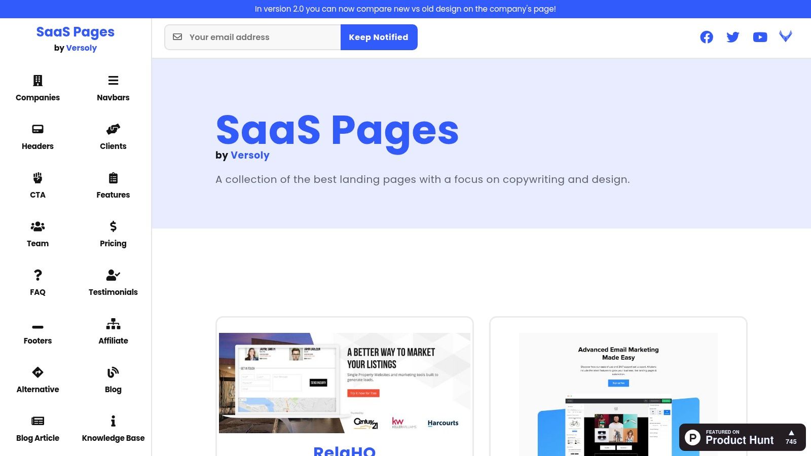
SaaS Pages by Versoly is one of the better research libraries for service firms because SaaS teams are usually stricter about page logic than local agencies are. They have to explain an offer, reduce friction, and push a cold visitor toward a booked demo. Buyers agents, brokers, accountants, and advisory firms are solving a similar funnel problem, even if the service is delivered by people instead of software.
The value here is not the design style. It is the discipline in how these pages sequence information.
A strong SaaS page usually answers four commercial questions fast. Who is this for? What problem gets solved? Why trust this provider? What is the next step? That makes the gallery useful for qualified enquiry funnels, where the goal is not more form fills at any cost, but more calls from people who fit the brief.
One practical translation example. A mortgage broker can borrow a SaaS comparison-page structure and turn it into a service decision page for first-home buyers versus investors. Instead of feature tables, use lender-panel breadth, turnaround expectations, borrowing strategy, and document complexity. Then test whether a segmented CTA such as "Book a first-home buyer call" outperforms a generic "Get in touch" button by producing more booked appointments from the right audience.
There is also a measurement point worth keeping in view. Campaigns You Love's conversion rate guide explains that conversion rate depends on how visits and actions are tracked in the same period. That matters here because a paid-search landing page for a broker should be judged against paid landing page traffic, not against a blended site-wide average that includes branded and returning visitors.
For service firms, I would not copy the pages wholesale. I would strip them for patterns and rebuild them around sales friction:
Use-case sections for different client types, such as upgrader, investor, or expat borrower
Pricing-style framing to explain scope, engagement model, or fee structure without forcing full public pricing
FAQ blocks that handle timing, eligibility, risk, and process objections before the form
Persistent CTA placement for visitors who need more scroll depth before they commit to a call
If you want examples that sit closer to advisory and lead-gen models, Raffine's B2B landing page examples for service businesses article is a better bridge.
My preferred method with Versoly is simple. Save 10 to 15 pages in one service pattern, label the sections that repeat, then turn those repeats into a test plan. For a buyers agent, that might become three experiments: add suburb-specific proof above the fold, split the CTA by buyer type, and replace a generic process section with a short "how we shortlist and negotiate" sequence. That is how this resource becomes useful. It stops being inspiration and starts feeding a booked-call funnel.
7. Landing Page Gallery

Pretty galleries are overrated if the page does not produce qualified enquiries. Landing Page Gallery is useful because it behaves more like a working swipe file than a design showcase. The filters are practical, the annotations are brief, and the archive gives you enough range to compare how real teams handle one section at a time.
That makes it more valuable for buyers agents, brokers, and professional services firms than a gallery built around polish alone. If a booked-call funnel is underperforming, you rarely need 50 full-page ideas. You need 8 to 10 credible examples of one thing, such as sticky mobile CTAs, shorter forms, testimonial placement, or FAQ structure, so you can decide what to test next.
I use this resource after the diagnosis is already clear. If enquiries are dropping after the hero, search headline and above-the-fold layouts. If form starts are healthy but submissions are weak, review field count, spacing, and reassurance copy. If booked calls are soft despite lead volume, compare how pages qualify prospects before the CTA.
A practical method is to score one page against four checkpoints, then pull examples only for the weakest area:
Message match. Does the page reflect the ad, search term, or referral intent clearly enough for a high-value service?
Friction control. Does mobile layout make the form, CTA, and proof easy to use without hesitation?
Trust timing. Does credibility appear before the visitor is asked to commit?
Lead quality filter. Does the CTA language attract the right enquiry, or just more enquiries?
That last point matters more than gallery users often admit. A mortgage broker does not need a page that gets more clicks on "Get Started" if those clicks turn into low-intent form fills. A buyers agent may be better served by testing "Book a strategy call" against "See if we're the right fit" if the second option reduces volume but lifts consult quality.
Mobile review is where Landing Page Gallery earns its place. Earlier benchmarks already made the broader point that device friction can materially change conversion outcomes. For service firms, the commercial question is simpler. Can a prospect read the offer, trust the operator, and take the next step comfortably from their phone?
Used that way, this gallery becomes a research method, not a mood board. Find the weak section, collect 10 examples of that section, identify the repeated patterns, and turn those patterns into one controlled test on your own enquiry path.
Top 7 Landing Page Examples Comparison
Tool | Implementation complexity 🔄 | Resource requirements ⚡ | Expected outcomes 📊 | Ideal use cases 💡 | Key advantages ⭐ |
|---|---|---|---|---|---|
Raffine Studio | High 🔄 agency-led integration (site + funnels + CRM) | Medium–High ⚡ scoped projects; agency fees; ongoing analytics & tooling | High 📊 measurable booked discovery calls; conversion & pipeline uplift | Buyers agents, brokers, professional services needing automated qualified calls | End-to-end conversion system; GEO/AI SEO; automation and attribution ⭐⭐⭐⭐ |
Landingfolio | Low 🔄 browseable library and component collections | Low ⚡ free browsing; Pro for organization and templates | Medium 📊 faster design decisions; reusable UI patterns | Designers/PMs benchmarking sections (hero, pricing, testimonials) | Deep section + component coverage; template indexes across stacks ⭐⭐⭐ |
Lapa Ninja | Very low 🔄 quick visual curation and tagging | Very low ⚡ free tier (ads); inexpensive Pro for saves/boards | Low–Medium 📊 rapid visual inspiration; limited analysis | Freelancers/agencies needing fast discovery and saves | Large, frequently updated gallery; budget-friendly Pro features ⭐⭐⭐ |
Land-book | Low 🔄 extensive searchable examples and filters | Low–Medium ⚡ Pro for boards, mobile previews, screenshots | Medium–High 📊 strong section-level pattern research (pricing, heroes) | Designers comparing many UI patterns across industries | Huge example/section catalog with advanced filters ⭐⭐⭐⭐ |
One Page Love | Low 🔄 curated one-page site focus (single-scroll flows) | Low ⚡ browse & templates; minimal setup | Medium 📊 excellent for one-page narratives and launch pages | Single-page landing pages, launches, product/service one-pagers | Focused editorial curation for single-scroll funnels; template roundups ⭐⭐⭐ |
SaaS Pages (Versoly) | Low 🔄 SaaS-specific blocks and page examples | Low ⚡ browse by section/company; email updates | Medium 📊 relevant SaaS copy/layout patterns for pricing & CTAs | B2B/SaaS product pages and pricing/demo flows | SaaS-focused blocks library; easy section-level browsing ⭐⭐⭐ |
Landing Page Gallery | Low 🔄 high-volume catalogue with element tags | Low ⚡ daily updates; optional paid revamp service | Medium 📊 pragmatic example pulls; element taxonomy for implementation patterns | Quick pulls for specific elements (sticky CTA, pricing, FAQs) | Filterable catalogue with element annotations; practical for comparisons ⭐⭐⭐ |
Turn Inspiration Into a Testable Enquiry Path
The biggest mistake with landing pages examples is treating them like templates to copy whole. That usually produces a page that looks current but doesn't fit the offer, sales process, or audience. Galleries give you inputs. They don't give you a finished enquiry system.
A better workflow is simpler and more commercial.
Start with one business goal. For most buyers agents, brokers and professional services firms, that's not “more traffic”. It's a qualified enquiry, booked discovery call, or application from the right type of prospect. That goal changes what the page should say, what proof it needs, and how much friction the CTA can carry.
Then collect patterns by section, not by full-page imitation. Pull three strong hero options. Three testimonial layouts. Three FAQ structures. Three CTA treatments. Rewrite each around one specific Australian audience and one specific service promise. Add local proof. Make trust visible early. Keep one primary CTA.
The follow-up path matters just as much as the page. If the form goes nowhere, if the booking confirmation is weak, or if CRM handoff is messy, the landing page will still underperform even when the design looks solid. Australian lead-generation benchmarks also show why this matters. One local source notes that 5% to 10% of website visitors can become MQLs, 20% to 30% of those can become SALs, and 10% to 20% of SALs can progress to SQLs, according to 3P Digital's Australian lead generation benchmark summary. A landing page is the first measurable step in a larger acquisition system.
There's also a newer consideration. Pages now need to be clear enough for AI search systems to interpret and cite. Australian guidance notes fragmented AI visibility, with only 33% of businesses considered AI-ready and 12% effectively invisible, according to Skyscale's guide to AI SEO for Australian businesses. That pushes landing page structure further toward clarity, entity consistency, location signals and unambiguous service descriptions.
If your current site gets traffic but not booked calls, or your landing pages examples research keeps producing pages that look better than they perform, the issue usually isn't inspiration. It's the missing system behind the page.
Raffine Studio builds landing pages, funnel paths, SEO and booking systems for buyers agents, brokers and professional services firms that need more qualified enquiries, not just better-looking pages. If you want your website reviewed through the lens of offer clarity, conversion friction, follow-up and AI search visibility, visit Raffine Studio and start a conversation about a measurable discovery-call pathway.