lead generation landing page, landing page design, conversion optimisation, lead capture forms, booking automation
Lead Generation Landing Page Design for Services
by raffiné studio

Most professional service businesses are told they need more traffic. That advice is usually backwards. If your website sends a buyer, borrower, developer or legal client to a page with six possible next steps, more visitors only create more opportunities to lose them.
A lead generation landing page has one commercial job: turn a specific, high-intent visitor into a qualified enquiry or booked conversation. It isn't a miniature homepage, a brand brochure or a dumping ground for every service your firm offers. It should connect the promise made in search, advertising, social content or an AI search result to one clear action, then hand the lead into a system that responds quickly and records what happened.
Australian benchmarks show why focus matters. General website conversion performance is often benchmarked at 1.78% sitewide and 2.76% across APAC, while Australian reporting places the median landing-page conversion rate at 2.35%. The same benchmark summary places the top 25% at 5.31% or higher and the top 10% at 11.45% or higher. These figures are reported in Australian conversion optimisation benchmarks, and they point to a practical conclusion: a focused page can perform in a very different environment from a general website.
For a Sydney buyers agency, mortgage broker, law firm, accountant or B2B consultancy, the page is only one part of the pipeline. The form, calendar, CRM, follow-up workflow, attribution and search visibility determine whether the page produces revenue or just submissions.
Why Most Professional Service Landing Pages Fail
More traffic will not fix a page that cannot support the next commercial decision. Professional service landing pages fail when they behave like brochures instead of working parts of a sales operation.
Firms often send visitors to a page with full navigation, several service cards, a long company history and competing calls to action. A prospective buyers agent client does not need a tour of the business. They need evidence that the firm can help them buy the right property, explain the process and arrange the next conversation.
The same principle applies to commercial lawyers, mortgage brokers and financial advisers. Search intent is usually narrow and commercially loaded. The visitor may already know which category of help they need, so the page must confirm relevance immediately. It should also make the handoff clear, whether that means submitting a form, booking a calendar slot or requesting a callback.
Commercial rule: More choices make a high-intent visitor work harder. Give them one clear decision.
The homepage problem
A homepage serves several audiences. It introduces the business, supports current clients, distributes attention across services and gives undecided visitors multiple routes. A lead generation landing page has a narrower job: qualify interest, capture the enquiry and pass accurate context into the CRM.
Remove or reduce:
Competing navigation: Keep only links required for trust, privacy or legal information.
Unrelated services: Do not place conveyancing, commercial leasing and residential buying on one page when the campaign targets a single audience.
Generic history: Replace company biography with proof that answers the visitor's immediate concern.
Multiple primary CTAs: Choose one action, such as booking a discovery call, requesting a quote or checking eligibility.
Pages with a single call to action have been reported to convert at up to 13.5%, compared with 11.9% for pages with multiple competing CTAs, according to Australian conversion rate optimisation statistics. Those figures are not a forecast for every firm. They support a practical design choice: reduce competing decisions when the visitor arrives with a specific need.
Match urgency with relevance
A visitor from a broad informational search may need education before speaking with someone. A person searching for a commercial lawyer after receiving a contract may be ready to discuss the matter immediately. Match the offer, wording and capture method to that level of intent.
For professional services, Australian lead-generation pages commonly sit between 2% and 8%, depending on offer quality and traffic intent. Warm traffic can reach 5% to 8% or higher in the same benchmark set. High-intent Australian landing pages are also reported in the 5% to 20% range, with dedicated B2B pages reaching 8.8% to 18.2%, according to Australian landing page guidance.
Do not chase a benchmark as the strategy. Build the page around one audience, one problem and one action, then connect the submission to booking automation, CRM ownership and prompt follow-up. Make the offer easy for search engines and AI tools to interpret as well. A page that wins the click but loses the handoff is not a lead-generation asset. It is a broken pipeline entry point.
Structuring Information Architecture and Persuasive Copy
A strong page answers the visitor's questions in the order they arise. Is this for me? Can you solve my problem? Should I trust you? What happens next? Information architecture should make those answers easy to find without forcing the reader to work through a brand presentation.
Start with the first screen. The hero should contain:
A specific headline: Name the audience and the outcome, such as “Buy the right Sydney property with an independent buyers agent”.
A supporting sentence: Explain who the service helps and what the first step involves.
One action: Use a clear button such as “Book a buying strategy call” rather than “Learn more”.
A relevant trust cue: Include a concise credential, service area, professional membership or process reassurance if it helps the decision.
Avoid headlines such as “Advice that moves your business forward”. They may sound polished, but they don't confirm relevance. A mortgage broker's visitor wants to know whether the firm can help with their borrowing situation. A law firm visitor wants to know whether the firm handles the matter in question.

Build the narrative around objections
After the hero, name the problem in the visitor's language. A buyer may be worried about overpaying or missing suitable properties. A B2B director may be tired of enquiries that don't meet the firm's service criteria. A business owner seeking an accountant may want clear advice, not another generic compliance provider.
Then show the solution as a method, not a list of features. Explain the stages of the engagement, what the firm handles and what the client can expect from the first conversation. Here, a complicated service becomes easier to evaluate.
Use proof close to the claim it supports. A testimonial about communication belongs near the process explanation. A relevant result figure, where it can be verified, belongs near the outcome it demonstrates. Don't place every logo and testimonial in one block at the bottom and expect visitors to connect the evidence themselves.
A practical page sequence
A useful sequence for a service landing page is:
Hook: Confirm the search intent and state one promise.
Problem: Describe the cost, risk or frustration the visitor is experiencing.
Solution: Explain the service and how it works.
Proof: Provide two or three concise, relevant trust signals.
Offer: State what the visitor receives from the first call, assessment or quote request.
Risk reduction: Address fees, confidentiality, eligibility, timing or obligations.
Call to action: Repeat the same action with clear micro-copy.
The page shouldn't hide essential information to manufacture suspense. It should remove uncertainty progressively. Strong web design for professional services treats copy, hierarchy and conversion mechanics as one commercial system, not separate design tasks.
Designing Frictionless Forms and Booking Integrations
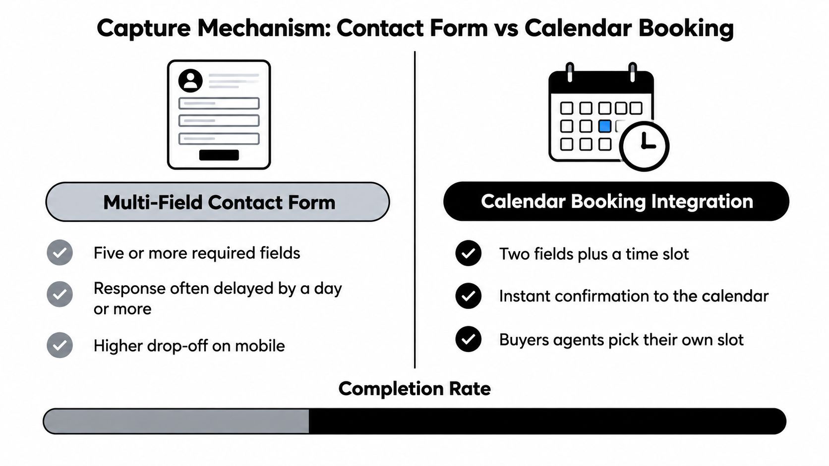
The capture mechanism should match the visitor's intent and the value of the next step. A short form isn't automatically better, and a calendar isn't automatically more advanced. The right choice depends on how much commitment the service requires and how quickly the firm can qualify and respond.
A multi-field form gives the team more information before contact. That can help a commercial law firm route matters or help a broker understand a borrowing enquiry. But every additional question creates another point at which a visitor can abandon the process, particularly on mobile.
A calendar booking flow asks the visitor to take a more committed action. It can work well when the page has already established value and the discovery call is a familiar first step. It can be the wrong choice for a sensitive legal issue, an early-stage property enquiry or a visitor who wants to ask one question before selecting a time.
Choose based on qualification needs
Use a short form when:
The visitor needs a low-commitment first step: Ask for name, email, phone and one useful context question.
The matter is sensitive: Let the visitor make contact without forcing them to disclose detailed information.
The service needs manual triage: Route the enquiry to the right person before offering a meeting.
Use calendar booking when:
The offer is a defined conversation: Examples include a buying strategy call, finance assessment or B2B discovery meeting.
Your team has reliable availability: An empty or inaccurate calendar damages trust quickly.
Speed matters commercially: The visitor can choose a suitable time without waiting for a reply.
Progressive profiling is often the sensible middle ground. Ask for the information needed to start the relationship, then collect qualification details through the confirmation page, booking questions or a follow-up conversation. This protects completion while still giving the team useful context.
Remove uncertainty beside the action
Micro-copy should answer the questions that stop people submitting:
“You'll receive a reply from a member of our team.”
“Your details are used to respond to this enquiry.”
“Choose a time that suits you, and you'll receive a calendar confirmation.”
“No obligation to proceed.”
Only use statements your business can honour. If your team usually takes several hours to respond, don't promise an immediate personal call. You can still acknowledge the enquiry automatically and give the visitor a clear expectation.
A booking workflow should also account for failed bookings, time-zone settings, rescheduling and staff availability. The online booking system guide is useful for evaluating the operational requirements before adding a calendar to the page.
Automating Lead Follow-Up and Tracking Conversions
A submitted form isn't a conversion system. It's an event that needs to trigger a reliable operational response.
At minimum, the page should record the original source, campaign or search context, landing-page interaction, form submission, booking completion and later sales outcome. Without that chain, a firm may celebrate lead volume while sending budget towards traffic that produces weak enquiries.
Create one record, not several disconnected notifications
The handoff should work like this:
Capture: The visitor submits a form or selects a meeting time.
Acknowledge: The system confirms receipt and explains the next step.
Create: The CRM creates one lead record with contact details and source information.
Route: The enquiry reaches the right adviser, broker, solicitor or sales owner.
Follow up: Automated reminders and human tasks keep the lead moving.
Measure: The booked call and eventual outcome connect back to the original source.
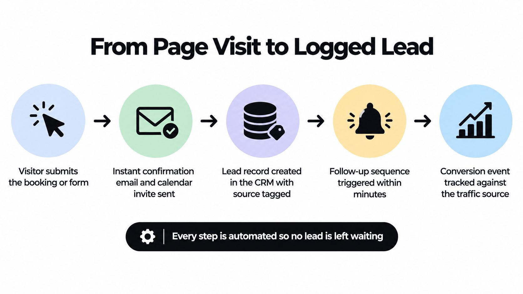
This structure prevents the common failure where a form sends an email to a shared inbox and nobody owns the next action. It also lets the business distinguish a raw enquiry from a qualified opportunity, a booked call and a client.
Response speed deserves operational attention. Research summaries reported for 2026 state that the odds of contacting a lead can fall by as much as 100 times between five and 30 minutes, with best-in-class response time under 60 seconds and generally under five minutes, according to lead response time benchmarks for Australia. Treat those figures as a reason to design fast acknowledgement and routing, not as a guarantee of a particular sales result.
Response standard: Confirm instantly, route automatically and make human ownership visible.
A useful automation sequence might send a confirmation email, attach the booking details to the calendar, notify the assigned team member and deliver a short pre-call questionnaire. If the visitor doesn't book, a reminder can offer the calendar again without forcing them to restart the process.
The video below demonstrates the role automation can play in a lead journey.
Track meaningful outcomes, not just clicks. GA4 events, CRM stages and booking records should answer whether a traffic source generated a qualified conversation. Automated system examples can help teams map the handoffs before selecting tools.
Running A/B Tests to Improve Landing Page Performance
Conversion testing becomes useful only when the page already has clean tracking and enough relevant behaviour to compare. Don't start by changing button colours. Test the parts that alter the visitor's interpretation of the offer.
For a buyers agency, the central question might be whether the page should lead with certainty, local expertise or time saved. For a mortgage broker, it might be whether the first action should be an eligibility check or a strategy call. For a B2B consultancy, the offer could shift from a general consultation to a focused review of a defined business problem.
Test in commercial priority order
Headline angle: Compare a direct benefit with pain-point phrasing. Keep the audience and offer consistent so the result says something useful.
Call-to-action text: Test “Book a call” against a more concrete action such as “Get my shortlist”. The stronger option will depend on what the visitor receives next.
Hero image: Compare an adviser or agent headshot with a local property image. The test should measure whether the image improves trust and relevance, not whether it looks more attractive.
Form length: Compare a short form with a longer qualification path. Review both completion and lead quality.
Social proof placement: Put relevant reviews near the decision point, then compare that placement with proof lower on the page.
Trust signal: Test a licence, fee statement, confidentiality note or process reassurance close to the button.
The first two tests usually deserve attention because they change the visitor's understanding before the visitor reaches the form. Lower-priority visual tests can still matter, but they shouldn't distract the team from a weak offer or unclear headline.
Make each test answer one question
Write a hypothesis before publishing a variation:
“If we state the specific client outcome in the hero, more qualified visitors will begin the booking process because the offer will be easier to recognise.”
Define the primary event, such as a completed booking or qualified form submission. Track secondary signals such as form starts, field abandonment and booking-page exits, but don't declare a winner because one variation produced more clicks if those clicks didn't become useful enquiries.
Statistical significance matters because short tests can produce misleading swings. Set a decision rule in advance, avoid changing multiple major elements at once and allow the test to gather enough comparable behaviour to support a conclusion. If traffic is limited, prioritise message research, call reviews and qualitative feedback instead of pretending a small sample proves a universal winner.
The benchmark context is useful here. Australian reporting places the median landing page at 2.35%, with the top quartile at 5.31% or higher and the top 10% at 11.45% or higher, as described in Australian conversion rate optimisation benchmarks for 2025. Use those ranges as context, not as a target you can reach by testing a button colour.
Turning Your Landing Page Into a Predictable Pipeline
The best landing page isn't the one with the most impressive visual treatment. It's the one that connects search visibility, intent-matched messaging, conversion design, booking, CRM ownership and follow-up into a measurable path to revenue.
That changes how the page should be planned. SEO should bring the right audience to a page that answers a specific commercial question. Content should reinforce the same promise across search, social posts and the website. AI search visibility should make the business easier to understand when prospects ask tools such as ChatGPT, Gemini or Perplexity for recommendations. The landing page then needs to make the next action obvious when those prospects arrive.
The operating model is straightforward:
Traffic: Attract a defined audience through organic search, paid campaigns, social content and relevant AI search visibility.
Message: Match the page to the problem and intent that generated the visit.
Conversion: Offer one clear next step, with a form or calendar suited to the service.
Follow-up: Acknowledge, route and nurture the lead without relying on a shared inbox.
Measurement: Connect page activity to booked calls, qualified opportunities and sales outcomes.
Audit the current journey from the visitor's perspective. Search the service you want to sell, inspect the first screen, count the competing actions, submit the form yourself and check what happens next. Then compare the CRM record with the original traffic source. Most leaks become obvious when someone tests the complete journey rather than reviewing the page in isolation.
Raffine Studio can map that journey across conversion-focused web design, landing-page architecture, SEO, AI search visibility, booking automation, CRM handoffs and conversion reporting. Visit Raffine Studio to review how your current website can become a more accountable source of qualified enquiries and booked calls.