conversion design, lead generation, A/B testing, landing pages, booking automation
Website Design for Conversion That Books Calls
by raffiné studio

Most advice about website design for conversion starts in the wrong place. It begins with a homepage headline, a button colour, or a shorter form, as if qualified buyers appear on the page by magic. For Australian service businesses, conversion starts earlier, with whether Google, ChatGPT, Gemini and Perplexity can understand the business, extract the right answer and include it in a shortlist before the buyer ever visits the website.
It also ends later than most designers admit. A visitor can submit a strong enquiry and still disappear if the form feeds a generic inbox, nobody responds promptly, or the booking path creates uncertainty. A website that books calls is a connected pipeline, from AI search visibility and information architecture through to proof, page-level persuasion, calendar routing and follow-up.
The Australian context makes this commercially urgent. Australian ecommerce conversion benchmarks commonly sit around 1.5% to 2.5%, with 2.0% to 3.0% often treated as a strong target and top-quartile performance usually described as 5% or higher (Australian conversion rate benchmarks). Service businesses have different journeys, but the lesson is the same. Small improvements to clarity, trust, mobile usability and friction can produce materially more enquiries without requiring more traffic.
Why Most Conversion Advice Stops Before the Real Problem
Conversion design doesn't start when someone lands on your homepage. It starts when a potential client asks an AI assistant, “Who should I speak to about this?” and the system decides whether your business is clear, credible and relevant enough to mention.
That upstream layer is now part of the funnel. Australian-focused coverage reports that AI Overviews appeared in roughly 39% of Australian search queries by mid-2025, while nearly half of AI Overview-triggered searches produced no click and top organic positions experienced click-through-rate declines (AI Overviews and Australian organic traffic). The exact outcome varies by query and industry, but the commercial problem is straightforward. A buyer may form an impression, create a shortlist or receive an answer without ever seeing your landing page.
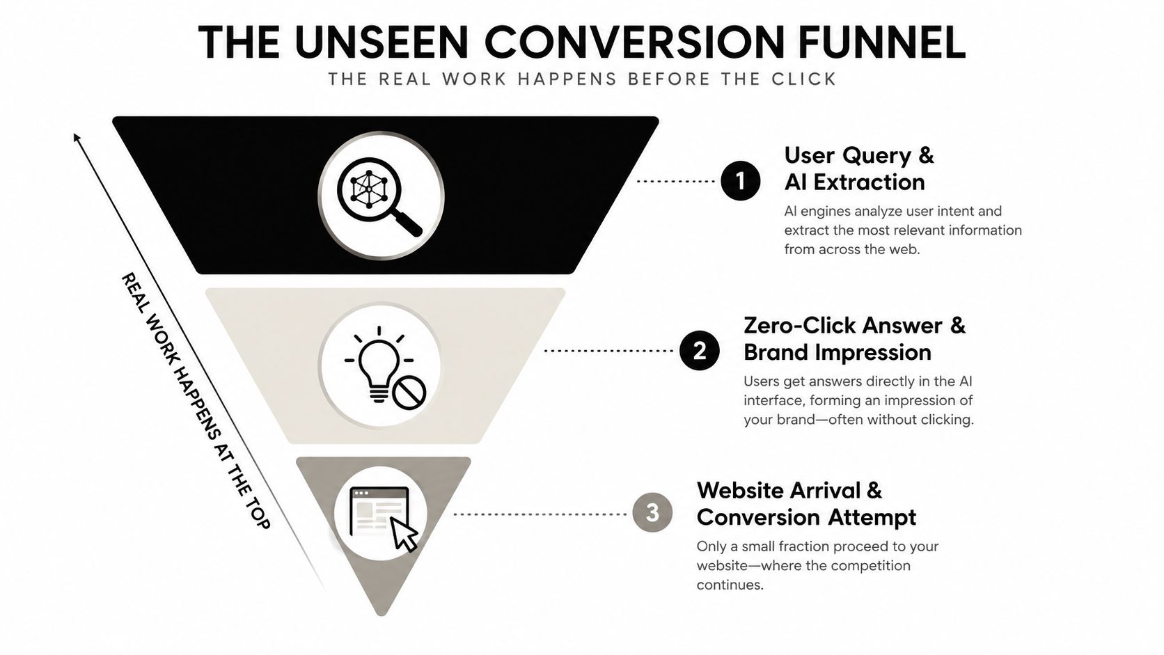
The funnel begins before the click
Most CRO playbooks still treat search as a traffic source and the website as the conversion environment. That model is incomplete for a Sydney buyers agency, a mortgage broker or a specialist law firm. The site needs a legible entity structure, clear service relationships, useful answer blocks, appropriate schema markup and evidence that helps both crawlers and people understand who the firm serves.
This doesn't mean writing for machines instead of buyers. It means making the business easy to interpret. A page that clearly states its audience, location, service, process and relevant proof gives an AI system more usable material to extract, while giving a human buyer less work to do.
The downstream leak matters too
A visitor who reaches the site still needs a coherent route. The journey should move from a relevant answer to a segment-specific page, then to a credible offer, then to a simple booking or enquiry action. After submission, the experience needs confirmation, routing and follow-up.
Strategic rule: Fix the capture layer before polishing the button. A perfect CTA can't convert demand that never reaches the site.
A useful way to think about the whole system is the funnel-building framework for connected customer journeys. It puts the page in context rather than pretending the page is the entire commercial asset. Button copy still matters, but changing “Learn More” to “Book a Call” won't repair weak search interpretation, vague positioning or a broken post-form handoff.
Information Architecture That Compresses the Decision
A visitor shouldn't have to reverse-engineer your business from an About page and a generic Services menu. Information architecture for conversion should reflect the decision the buyer is trying to make, not the internal structure of your company.
Start by mapping the buyer's job to be done. A professional services buyer may be trying to choose a specialist, understand risk, compare approaches or decide whether a conversation is worthwhile. Those jobs should shape the site hierarchy.
Build around buyer intent
A practical structure usually has two organising layers:
Who you help: Buyers agencies, property investors, construction businesses, medical practices or professional services firms.
What outcome you deliver: Acquisition advice, dispute resolution, tax planning, project delivery or qualified discovery calls.
This is stronger than the familiar About, Services, Blog template because it gives visitors a reason to enter the site and a next step that matches their intent. It also creates clearer content relationships for search engines and AI systems.
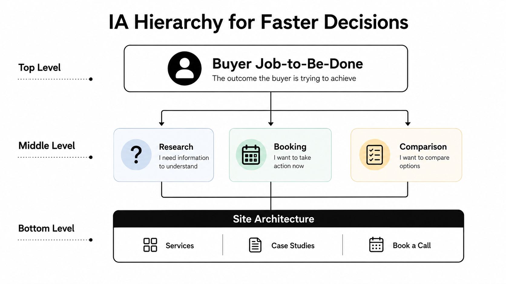
Consider a Brisbane conveyancer. One generic Property Law page forces first-home buyers, investors and downsizers to interpret the same content. Separate pathways can address the questions, risks and proof relevant to each group. The conversion logic is simple. When visitors recognise themselves quickly, they spend less time deciding whether the firm understands their situation.
Use a deliberate page hierarchy
A strong sitemap normally combines three page types:
Pillar pages explain a major service or outcome in enough depth to earn visibility and establish a clear commercial category.
Evidence pages support the pillar with FAQs, process explanations, comparison content, location relevance and proof by buyer segment.
Conversion endpoints give each priority audience a focused route to book, enquire or request a defined next step.
A category page can target comparison intent, such as choosing between buyer's agents or evaluating accounting support for a growing business. It should then route visitors to a vertical-specific landing page rather than leaving them at a dead end. The landing page carries the specific proof, offer and CTA.
The right question isn't “What pages do we need?” It's “What decision must each page make easier?”
Audit every navigation item against that question. If a page doesn't answer a buyer question, build confidence or move someone towards a qualified action, it probably belongs in a lower-priority content area, not the primary navigation.
Persuasive Copy and CTAs That Move Australian Service Buyers
Strong service-business copy doesn't persuade by sounding enthusiastic. It reduces uncertainty for a buyer who has real commercial, financial or professional risk attached to the decision.
Australian benchmark summaries commonly place ecommerce conversion around 1.4% to 2.1%, with performance above roughly 2.5% often treated as top-quartile in many retail categories (Australian CRO statistics and methodology). Service enquiries aren't directly comparable, but low-single-digit performance still makes every improvement in relevance and trust valuable. The page needs to answer three questions quickly: Is this for me? Can this business solve my problem? What happens if I take the next step?
Replace broad promises with recognisable outcomes
“Helping businesses grow” is empty. A stronger headline names the buyer, the situation and the useful outcome. For example, a mortgage broker might lead with guidance for self-employed buyers navigating complex applications. A law firm might address a specific dispute type and jurisdiction. A buyers agency can make the location and acquisition objective explicit.
The subheading should handle risk, not repeat the headline. Clarify the process, the type of conversation offered, the geographic expertise or the information a prospect will receive.
CTAs should describe the decision being made. “Book Now” creates needless ambiguity. “Book a property strategy call” or “Discuss your acquisition brief” tells the visitor what happens next without pretending the buyer is already ready to purchase.
Put proof where doubt appears
Proof shouldn't sit on a distant testimonials page. Place relevant evidence beside the claim it supports:
Above the fold: Clear identity, relevant credentials, location and a concise reason to trust the firm.
Mid-page: Segment-specific examples, process evidence or explanations of specialist experience.
Near the form: Answers to practical objections about fees, response times, scope, confidentiality and what happens after submission.
For Australian firms, locally recognisable cues can help people make sense of the offer. Depending on the industry, that may include an ABN, professional registrations, relevant CPA or AHPRA details, jurisdictional expertise, suburb names or clear office information. These are not decorative badges. They help remove doubt.
Keep the CTA hierarchy disciplined
Use one primary action per page. Support it with two secondary routes, such as an explanatory service page, a relevant case-study path or a lower-commitment contact option. Multiple competing buttons force the visitor to choose your preferred action architecture instead of choosing the action itself.
The requested benchmark data for specific inquiry lifts by CTA pattern isn't verified here, so don't publish a fabricated ranking. Test your own variants against qualified calls, not clicks alone.
Forms, Speed and Proof Architecture Compared
Form design is a trade-off between completion rate and lead qualification. A short form reduces effort, but it may give the team less context. A long form can collect useful detail, but it asks for information before trust has been earned.
The evidence supports cutting unnecessary fields. One landing-page benchmark reports that three-field forms convert at 10.1%, while nine-field forms convert at 3.6% (landing-page form benchmarks). Those figures come from a benchmark summary, not a guarantee for every Australian service business, but the direction is commercially clear. Ask only for information needed to route, qualify or prepare for the next conversation.
Compare the choices directly
Dimension | Low-Conversion Setup | High-Conversion Setup |
|---|---|---|
Form fields | Collects every possible detail before a first conversation | Requests only the information needed to understand intent and route the enquiry |
Qualification | Uses a long form to compensate for unclear positioning | Uses copy, service pathways and a focused question to pre-qualify |
Response process | Sends submissions to a shared inbox with no owner | Routes the lead to a named person, CRM stage or booking workflow |
Proof placement | Hides testimonials and credentials on separate pages | Places relevant proof beside claims and near the form |
Form expectation | Gives no indication of what happens after submission | Explains the next step, response expectation and available booking route |
Treat speed as part of the interface
Lead response speed is a conversion mechanic, not merely a sales preference. Australian-facing research summaries say contacting a lead within 5 minutes makes a business 21 times more likely to qualify that lead than waiting 30 minutes, while a one-hour delay is associated with sharply reduced contact success (lead follow-up timing).
That changes the form brief. If your team can't respond quickly, the page should prioritise direct calendar booking, clear availability and automated confirmation. If immediate human contact matters, the submission must enter a monitored queue with ownership and alerts.
Build proof in layers
Above-the-fold proof establishes legitimacy. Mid-page proof demonstrates competence in the buyer's category. Near-form proof handles the final hesitation, such as “Will they understand my situation?” or “What happens after I enquire?”
Don't build a generic wall of testimonials. Match proof to the audience entering the page. A construction company needs different evidence from an accounting firm, and a downsizer needs different reassurance from an investor. Relevance beats volume.
Landing Pages and A/B Testing for Booked Discovery Calls
A landing page shouldn't be a shortened homepage. It should be a controlled decision environment with one audience, one offer and one primary action.
Start with a hero that states the buyer, the problem and the outcome. Put one CTA above the fold, then earn the click with supporting blocks that answer the questions preventing action.
Build the page around a single decision
A practical sequence looks like this:
Hero promise: Identify the audience and the commercial outcome in plain language.
Problem framing: Show that you understand the trigger, risk or frustration causing the search.
Mechanism: Explain how the service works, without burying the reader in internal process.
Proof: Add relevant credentials, examples, testimonials or local expertise.
Offer: Define the discovery call, review, quote or assessment clearly.
Risk reversal: Explain what the visitor can expect, including scope and next steps.
Final CTA: Repeat the action with context, not pressure.
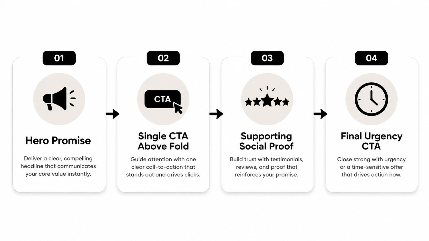
For a law firm, test whether the offer is a defined initial assessment or a broad consultation. For an accounting practice, test clarity around the business situation served and whether pricing expectations are addressed early. For an agency, test a specific audit or scope conversation against a vague “let's talk” invitation. Suburb-level relevance can also matter when the buyer values proximity or local market knowledge.
Test evidence, not opinions
Use GA4 funnel events, form analytics, session recordings and heatmaps to identify the largest point of drop-off. Then change one high-impact element per cycle. A useful rotation is:
Cycle one: Hero headline and subheading.
Cycle two: CTA wording and offer framing.
Cycle three: Form length or field order.
Cycle four: Proof location and objection handling.
Don't change the headline, form, testimonials and page layout together. You won't know which decision improved or weakened the journey. Measure completed enquiries, qualified calls and booked meetings, not just button engagement.
Testing discipline: One meaningful change per cycle creates learning. Five simultaneous changes create a new page and a guessing game.
For a useful starting structure, compare the sales funnel landing page template against the actual decision your buyers need to make.
The following video provides another visual explanation of the landing-page sequence.
Booking Automation and Speed to Lead as Design Requirements
Booking automation belongs in the website brief, not in a post-launch operations meeting. The choice of calendar tool, routing rules and CRM handoff affects the page hierarchy, CTA placement, form fields and thank-you experience from the beginning.
A buyer who completes a form has crossed a meaningful threshold. The site should immediately confirm receipt, explain what happens next and offer the most appropriate route to a conversation. If the business requires human qualification, the lead needs an owner and a clear response queue. If the offer is suitable for self-scheduling, the calendar should appear without forcing the visitor to wait for an email.
Design the handoff before the form
A five-minute response target only works when the page submits into a functioning workflow. Australian lead-handling guidance recommends a first contact attempt within 5 minutes and says high-performing businesses respond to web-generated leads within 5 to 10 minutes (Australian speed-to-lead guidance).
The workflow should define:
Routing: Which person or team receives the lead based on service, location or urgency?
Notification: Which CRM alert, email, SMS or internal task appears immediately?
Booking: Does the visitor see a calendar, receive a scheduling link or wait for a callback?
Confirmation: Does the thank-you page reinforce the next step and reduce uncertainty?
Follow-up: What happens if the lead doesn't book or respond?
A service-business example
A Sydney accounting firm might use a focused form to identify business type and enquiry intent, send the submission into its CRM, trigger an internal notification and present a Calendly booking option. An SMS confirmation can reduce uncertainty while the CRM records the source, service interest and follow-up status.
That example isn't about a particular tool stack. The principle is that each component should support one conversion path. A calendar that doesn't reflect team availability, a CRM that loses source data or an SMS that sends the wrong message can undo a carefully written landing page.
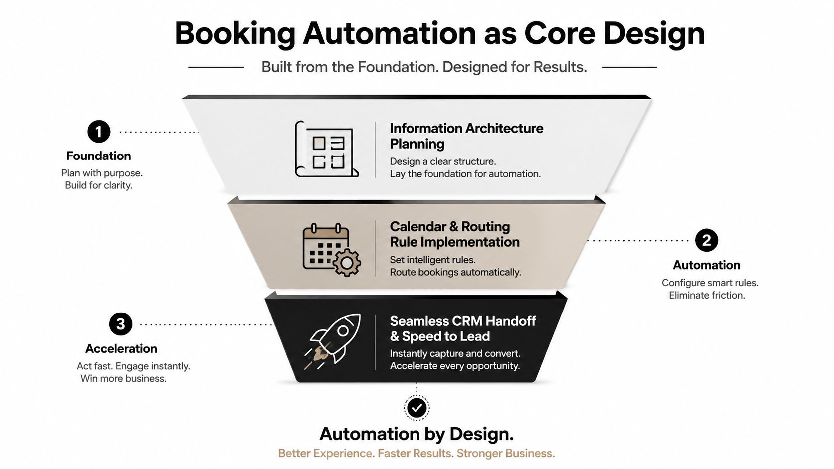
Post-form experience is part of the design system. Resources on automated system examples can help teams think beyond the submit button and map what should happen after intent becomes visible.
A 90-Day Operating Rhythm for a Conversion-First Website
A conversion-first website isn't a launch deliverable that gets ignored until the next redesign. It needs an operating rhythm that connects measurement, page decisions, experimentation and lead handling.
Days 1 to 15 establish the baseline
Instrument GA4 events for key actions, form starts, form completions, booking clicks and completed bookings. Add scroll-depth review, form analytics, current page-speed checks and a record of speed-to-lead. Capture booking show rate as well, because a booked call that never happens isn't the same commercial outcome as a qualified conversation.
Australian service-business guidance recommends using GA4 funnel analysis, session recordings and heatmaps to identify drop-off, while building a baseline from your own Australia-filtered analytics rather than relying only on broad global averages (Australian SEO benchmarking guidance). That approach gives the team a defensible starting point.
Days 16 to 45 fix structure and evidence
Redesign the information architecture around priority audiences and buyer jobs. Rewrite the key pages so each one has a clear promise, relevant proof and a defined next action. Add measurement to every shipped component, including navigation paths, CTA clicks, form interaction and booking completion.
This phase should also address mobile performance. More than 60% of Australian website visits come from mobile devices, and 57% of users say they won't recommend a business with a poor mobile site (Australian website design statistics). Mobile layout, readable hierarchy, visible trust cues and short paths to booking are core conversion requirements.
Days 46 to 75 run focused experiments
Test one high-impact variant per cycle. Prioritise the element with the strongest evidence of friction, whether that's the hero promise, offer specificity, form length, proof placement or CTA wording. Track the effect on qualified calls rather than celebrating a superficial increase in clicks.
A useful weekly cadence keeps the work moving:
Monday metric review: Check inquiry rate, qualified-call rate, show rate and cost per booked call.
Wednesday experiment build: Ship the agreed page or funnel change with tracking in place.
Friday copy and offer sync: Review lead quality, objections and sales feedback.
Days 76 to 90 audit the handoff
Review calendar routing, CRM stages, notifications, confirmation messages and follow-up timing. Compare what the website promises with what the sales team delivers. If the baseline shows structural gaps, the next step is a scoped conversion audit rather than another cosmetic redesign.
The requested figures for a 2.1% median inquiry rate and 5.6% top-quartile rate aren't present in the verified data, so they shouldn't be used as Australian benchmarks. Use your own baseline, then improve the weakest stage in the pipeline.
Raffine Studio builds conversion-focused websites, landing pages, AI search visibility systems and booking workflows for Australian buyers agencies, brokers and professional services firms. Review your website's path from search impression to booked call, then visit Raffine Studio to start a practical conversation about the gaps holding qualified enquiries back.