lead generation website design, conversion focused websites, lead generation funnels, AI search visibility, discovery call booking
Lead Generation Website Design That Books Discovery Calls
by raffiné studio

Traffic is up. Your calendar isn't.
That's the position a lot of Australian service firms are in right now. An accounting practice invests in SEO and Google Ads, monthly visits climb, the agency reports clicks and impressions, and the partners still ask the same question in the pipeline meeting. Why aren't more qualified discovery calls getting booked?
The blunt answer is that most websites aren't built as lead systems. They're built as brochures with traffic bolted onto them. Good lead generation website design doesn't stop at rankings, page views or form fills. It has to carry a prospect from search, through trust, into enquiry, into booking, and then into fast follow-up while intent is still high.
Why Most Lead Generation Websites Stop Short of Booked Calls
Most firms blame traffic first. That's usually the wrong diagnosis.
Australian benchmark data puts the average website conversion rate at 1.78%, with 4.3% on desktop versus 2.2% on mobile, and professional services can range from 1.6% to 7.4% depending on the setup and page type (Australian digital marketing benchmarks compiled by Andava). That tells you two things. First, plenty of service businesses already have visitors they're failing to convert. Second, mobile friction kills enquiries.
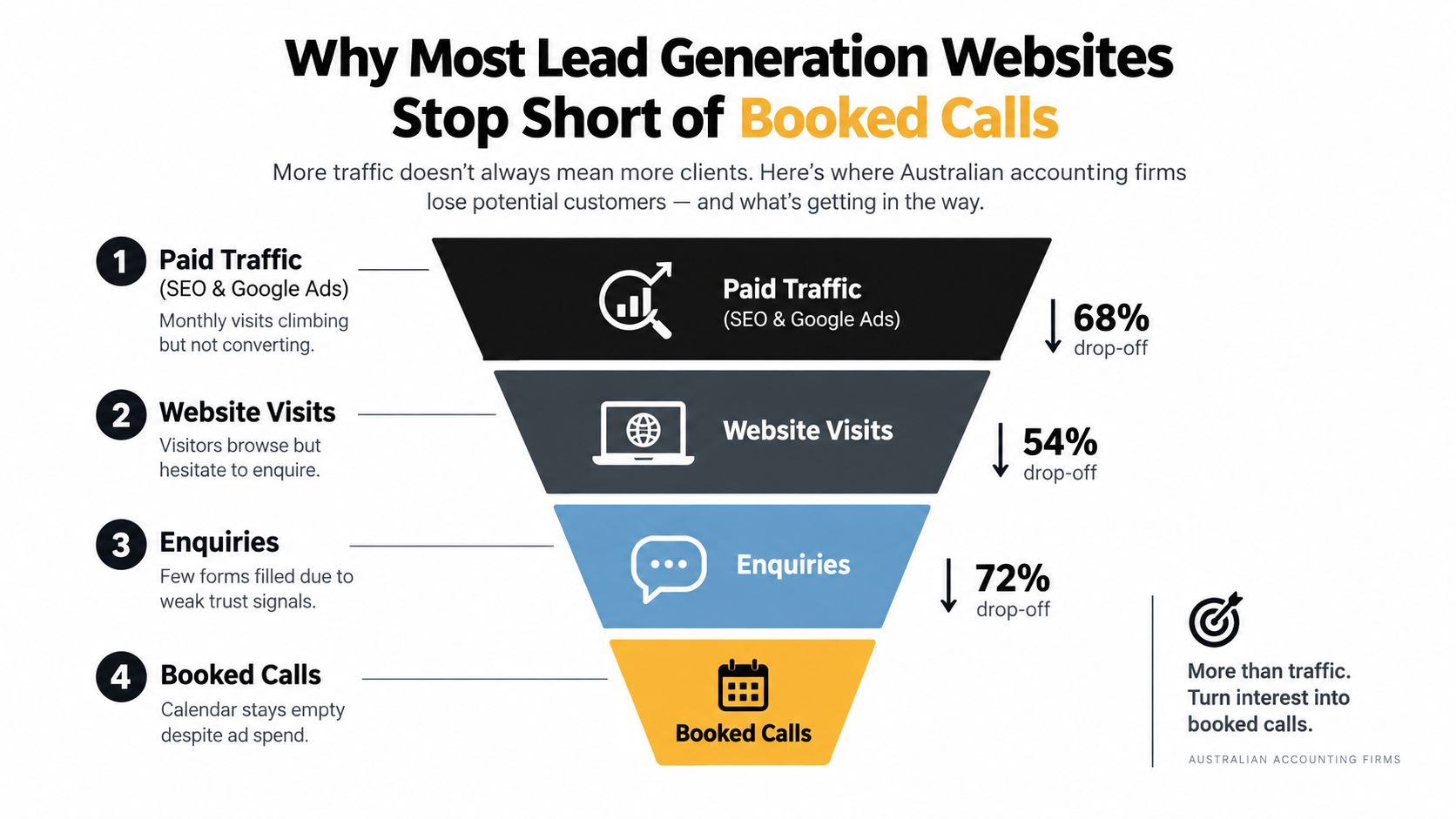
More traffic rarely fixes a weak path
If your homepage is vague, your service pages are generic, and your booking flow asks too much too soon, buying more clicks just feeds a leak.
For Australian lead-gen sites, direct visitor-to-lead conversion is often around 0.8% for B2B websites, while broader service sites are commonly modelled at 1% to 2.5%. The same benchmark material suggests 5% to 10% of website visitors can become MQLs, then 20% to 30% of MQLs become SALs, 10% to 20% of SALs become SQLs, and 25% to 30% of SQLs progress to opportunity (Australian CRO benchmarks from 3P Digital). That's why the job isn't “get more traffic”. It's reduce friction at each stage of qualification.
Most service websites don't have a traffic problem. They have a progression problem.
A prettier redesign won't rescue a broken funnel
The second mistake is treating redesign as a visual exercise. New layout. Better colours. Nicer photography. None of that matters much if the route from first click to booked call is clumsy.
Lead generation website design should be treated as one pipeline:
Search visibility: Google, maps, referrals, and AI answer engines
Arrival page: a page matched to intent, not a generic homepage
Trust layer: proof, specificity, clear outcomes
Action layer: form, call, or booking path
Handoff layer: confirmation, CRM routing, and immediate follow-up
When firms stop at page design, they miss the commercial bottleneck. A site can “convert” on paper with a form fill and still fail in practice if the booking step is awkward or the enquiry sits untouched for hours.
That's where most of the waste lives.
The Four Decisions to Make Before You Touch the Design
A redesign without strategy usually produces a tidier version of the same problem.
Before wireframes, before copy, before you debate homepage sections, make four decisions. These act as filters. They stop you building pages that look polished but can't qualify or book the right work.
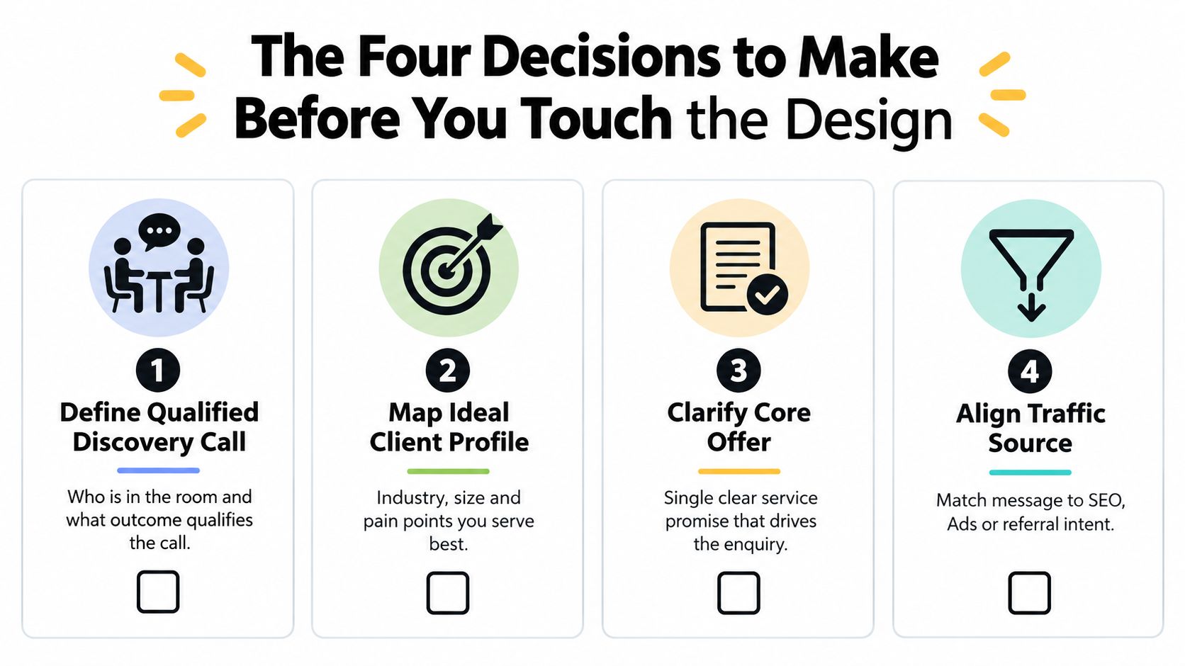
Define what a qualified discovery call actually is
If “more leads” is the brief, the website will attract noise.
Write down what counts as a qualified call. Who needs to attend. What type of problem they have. Whether they're comparing providers or actively trying to move. What level of readiness you expect. For a law firm, that might mean a business owner with a live commercial matter. For a finance broker, it might mean a borrower with a clear lending objective and documents nearly ready.
Without that definition, every CTA becomes too broad.
Choose one core offer and one promised outcome
Most service sites try to say everything at once. That dilutes intent.
A lead generation website design should centre on the main commercial entry point. Not every service you offer. The one that most reliably opens a high-value client relationship. Your page structure, ad traffic, internal links and proof should all reinforce that path.
Use this filter:
Best-fit offer: the service that attracts the right buyer
Clear outcome: the result they want, in plain English
Natural next step: the easiest meaningful commitment, usually a call or assessment
Practical rule: if your homepage could apply to five different industries, it's too generic to convert well.
Lock in scope before messaging
A Sydney commercial lawyer targeting NSW manufacturers needs a different website from a national B2B consultancy chasing inbound across multiple sectors.
Geography, industry and channel scope shape the entire build. They affect page depth, local proof, landing page strategy, and how specific your language needs to be. They also affect whether a page should rank organically, support paid traffic, or do both.
Set pipeline targets, not vanity metrics
The site needs a scorecard before it needs a moodboard.
Don't start with “we want more traffic”. Start with booked calls, qualified conversations and pipeline contribution. That forces better design decisions. A shorter form, a stronger service page, a cleaner booking path and tighter follow-up all become easier to judge when the target is commercial, not aesthetic.
Anatomy of a Conversion-Focused Service Website
The highest-performing service sites don't feel complicated. They feel obvious.
They answer the visitor's first questions fast. They show proof early. They make the next step clear. And they remove excuses to delay.
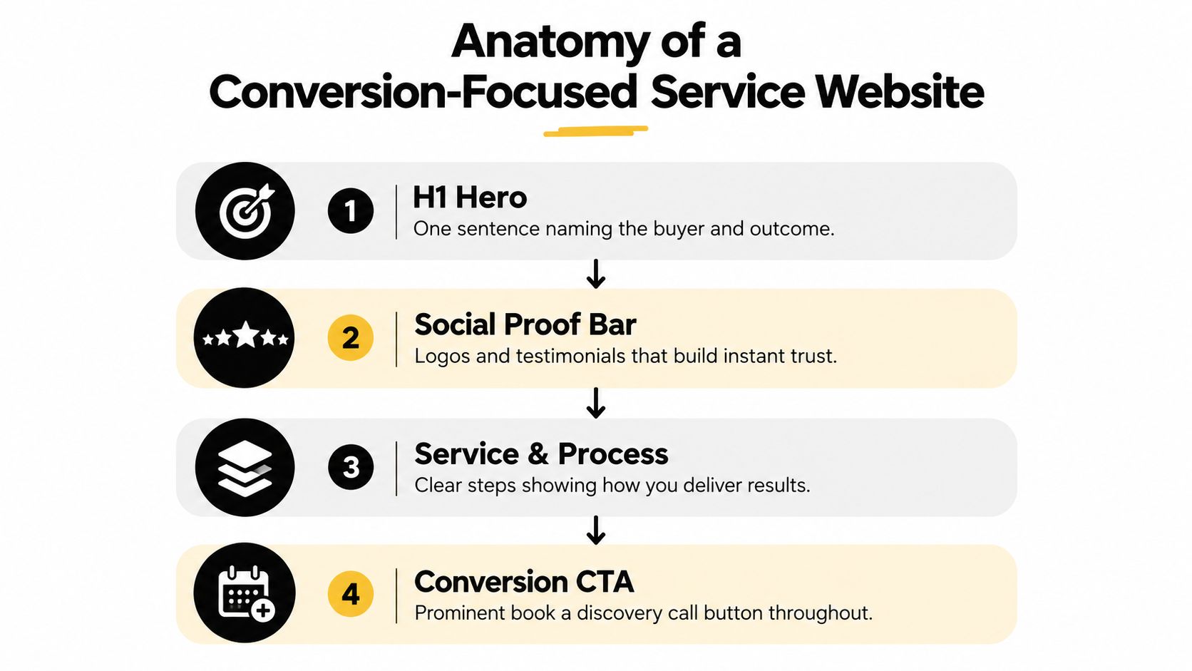
The top of the page has one job
Your H1 should name the buyer and the outcome. Not your firm slogan. Not a clever line. Not “trusted advisors since 2009”.
For service businesses in Australia, all-industry website conversion rates commonly sit around 1% to 3%, while dedicated service pages are often benchmarked around 2% to 8% depending on traffic quality and offer specificity. One AU benchmark set places average visitor-to-contact performance at 1.97% (Australian website conversion benchmarks from ROI.com.au). Specificity matters because broad pages usually underperform focused ones.
A strong above-the-fold section usually includes:
Outcome-led headline: who it's for and what they get
Proof-dense subhead: credentials, market fit, or real-world context
Primary CTA: book a call, request an assessment, or start qualification
Visible trust cues: client logos, industry focus, recognisable platforms or reviews
If your first screen doesn't answer “am I in the right place?” and “what do I do next?”, the page is already making the visitor work too hard.
Mid-page content should match real buying questions
Many sites drift into waffle.
The strongest structure is usually problem-aware copy, then a tightly grouped services overview, then proof, then process, then objections. Keep the offer set disciplined. Three to five clear services is usually easier to follow than a long list of overlapping capability pages.
If you're rethinking the relationship between visual identity and conversion structure, this guide on branding and web design is worth reading alongside the page architecture itself.
A useful design test is simple. Can a buyer skim the page and understand the problem you solve, the result you create, and the next step, without reading every block?
Here's a good example of how conversion thinking needs to be explained visually as well as verbally:
Strong pages keep the CTA close
Australian landing-page benchmarks show average landing pages convert around 2.35%, the top 25% exceed 5.31%, and the top 10% exceed 11.45%. The same benchmark notes that a 1-second delay can reduce conversion by about 7% (landing page conversion benchmarks from Apparte). That's why good service pages keep action close and pages light.
Use a repeated CTA after proof. Consider a sticky booking bar on mobile. Add an FAQ block that answers real buying questions in plain language. That last piece isn't just for humans. It also helps answer engines parse your offer more clearly.
Landing Pages and Funnel Flows That Move Visitors to Enquiries
A landing page is not a shorter homepage.
It's a separate conversion environment. Different job, different rules, different success metric.

Build one path per traffic source
Cold Google Ads traffic should land on a page built for one offer and one decision. Organic traffic from a service keyword may need a page that balances ranking depth with conversion. Retargeting traffic can handle a stronger booking ask because trust is warmer.
If you treat all of that traffic the same, conversion drops.
The standard service-firm flow looks like this:
Traffic source: ad, search, referral, email or social
Intent-matched page: one problem, one offer, one next step
Lead capture or booking step: short form or calendar
Confirmation layer: thank-you page, expectation setting, next actions
For a clearer breakdown of how these paths are built, see Raffine's article on what funnel building means for service businesses.
Know when to use one-step or two-step funnels
A one-step funnel works when the offer is simple and the visitor already has intent. A two-step funnel works better when qualification matters or the visitor needs a lighter first commitment.
Use single-step when:
Traffic is warm: branded search, referrals, email subscribers
The service is familiar: the visitor already knows what they want
Sales capacity is strong: your team can handle more direct bookings
Use two-step when:
Qualification matters: not every enquiry should hit the calendar
The service is high-consideration: legal, finance, B2B consulting
You need better routing: different services, locations or deal sizes
The page should feel like one conversation continuing, not three disconnected systems stitched together.
Design the thank-you page properly
Too many funnels end with “thanks, we'll be in touch”.
That wastes momentum. The thank-you page should either move the prospect straight into booking or make the next step explicit. Confirm what happens next. Set response expectations. Reassure them their enquiry has been received. If appropriate, offer a direct calendar link so serious buyers can lock in time immediately.
Paid traffic landing pages and SEO service pages should not be clones. One is tuned for immediate action. The other has to satisfy search intent while still moving the reader forward. But both should route into the same booking logic. Same offer. Same qualification standard. Same handoff rules.
Messaging, Social, SEO and AI Search Working as One
Most firms split these into separate workstreams. Messaging. SEO. Social proof. AI search. Different people, different tools, different agendas.
That separation is one of the reasons lead generation website design underperforms.
The buyer experiences one journey. Your channels need to support that reality.
The message has to stay stable across every touchpoint
Your core value proposition should not change dramatically between your homepage, LinkedIn profile, Google Business Profile and landing pages. The wording can adapt. The promise shouldn't.
The same goes for proof. If your site says you specialise in complex commercial property matters, but your social content talks broadly about “business support”, you weaken trust. If your landing page pushes one offer but your organic pages bury it, you create unnecessary doubt.
A good message hierarchy usually has three layers:
Core proposition: who you help and what outcome you deliver
Proof stack: reviews, named examples, credentials, process clarity
Offer: the specific next step that earns the enquiry or booking
SEO and AI search now shape the same front door
AI visibility is the likelihood a business is mentioned, recommended or cited inside answers from platforms such as ChatGPT, Gemini, Claude, Perplexity, Grok and Google AI Overviews (AI visibility definition from AIRank). For service firms, that means your website has to be understandable to both traditional search engines and answer engines.
An Australian AI visibility study reported that 67% of tested sites were only Partial or Invisible to AI, including 55% classified as Partial and 12% as Invisible. It also noted that systems rely on signals such as robots.txt access, JSON-LD structured data and real FAQ sections (Australian AI visibility study from Conversion Pro). So yes, design matters. But technical clarity matters too.
Channel | Primary Role | On-Site Impact | Risk If Isolated |
|---|---|---|---|
SEO | Capture existing search demand | Drives service pages, internal linking, metadata and topical depth | Rankings without conversion pages waste traffic |
AI search visibility | Increase mentionability in answer engines | Rewards clear entity signals, structured FAQs and direct answers | You may be omitted from shortlist-style answers |
Social proof and profiles | Build trust before and after the click | Reinforces credibility near CTAs and on service pages | Reviews and reputation sit disconnected from conversion paths |
Social content | Warm audiences and create repeated exposure | Feeds visitors into specific pages and offers | Traffic lands on weak pages with no next step |
Channel duplication wastes budget
If your SEO consultant writes one story, your paid ads say another, and your sales team qualifies on a third standard, the site becomes harder to trust.
For many Australian firms, the fix isn't “more content”. It's better alignment. Clear location signals. Consistent service language. Useful FAQs. Strong internal links. Review and profile consistency. Pages that answer the same questions buyers ask on calls.
That's also where tools and delivery overlap. A build partner such as Raffine Studio can handle the website, funnel, SEO and AI-search structure as one system, which is often more useful than managing four disconnected suppliers.
Booking, CRM Handoff and Speed to Lead as Design Choices
A booking widget isn't admin. It's conversion infrastructure.
So is CRM routing. So is the confirmation message after a form submit. If these pieces are clumsy, your website keeps losing qualified opportunities after the hardest part is already done.
Reduce booking friction on purpose
Start with the obvious question. Should the visitor book inline or be sent to a scheduler?
Inline booking usually feels smoother because the user stays in context. Redirecting to Calendly or another scheduler can work, but only if the handoff is clean and the page still feels connected. If the visual jump is sharp or the calendar loads slowly, people hesitate.
Keep forms short. Ask only what your team needs before the first conversation. Anything else can come later. For high-value service firms, the right balance is usually a small set of fields that helps qualification without turning the page into paperwork.
Useful design choices include:
Required fields only where necessary: don't force detail too early
Visible availability: let buyers see the next step is real
Expectation setting: confirm what the call is for and who it suits
Fallback options: phone, email, or request-a-callback when booking isn't possible
The handoff has to happen immediately
Responding within 5 minutes instead of 30 minutes makes a business about 21x more likely to qualify the lead. The same source says the average company takes 42 hours to respond to a web enquiry, and 23% never respond at all (speed-to-lead benchmark from Prime Leads). That's not a sales issue alone. It's a website design issue because the form, booking flow and automation decide whether fast follow-up happens by default.
Operational rule: if a form submission can sit unseen in an inbox, the system is broken.
A proper handoff should capture source data, create the contact in the CRM, assign the right owner, and trigger the next action without manual chasing. That might include email confirmation, an SMS, an internal notification in HubSpot or Pipedrive, and a task for the responsible team member.
If you're reviewing this layer, Raffine's guide to choosing an online booking system is a practical place to start.
Quiet failure points usually sit between tools
The most common losses here are boring ones. Double bookings. Missing UTM capture. Form entries that don't create CRM records. Qualified leads routed to the wrong person. Slow manual responses because nobody owns the next step.
None of that shows up in a homepage mock-up. All of it affects booked calls.
Testing, Analytics and What to Do This Week
If the reporting stops at traffic, you can't improve the part that matters.
For lead generation website design, the scoreboard is simple. Visits matter. Enquiries matter more. Booked discovery calls matter most. After that, the question is whether those calls turn into qualified pipeline.
Track the funnel as a commercial system
Your minimum stack should connect website actions to booking outcomes and CRM stages. In practice that usually means GA4 events for forms and booking clicks, scheduler tracking, CRM source attribution, and call tracking for phone enquiries.
Here's the KPI map worth using.
Funnel Stage | Primary Metric | Reporting Cadence | Lead Source Required |
|---|---|---|---|
Visitor to enquiry | Visit-to-enquiry rate | Weekly | Yes |
Enquiry to booking | Enquiry-to-booked-call rate | Weekly | Yes |
Booked call to qualified call | Qualification rate | Monthly | Yes |
Qualified call to opportunity | Opportunity progression | Monthly | Yes |
Test one meaningful variable at a time
Most firms either never test, or they change ten things at once and learn nothing.
A better rhythm is disciplined and boring:
Monthly: test one hero headline, CTA label or form presentation
Quarterly: test one landing page variant against the current control
Weekly: review speed-to-lead timing, missed calls, and broken handoffs
That cadence is enough to find the obvious friction without turning your site into a perpetual experiment.
Analytics should tell your team where intent is being lost, not just where traffic landed.
Fix these four things this week
If your site already gets decent traffic, start here:
Audit your fastest path to booking: can a qualified visitor book in a few clicks on mobile?
Check CRM attribution: are source, medium, campaign and landing page being captured?
Track the booking layer: not just form submits, but scheduler opens, completions and drop-offs
Review your top three pages: do they have a clear offer, proof, CTA and objection handling?
The firms that improve fastest treat the website, funnel and follow-up sequence as one measured system. That's the sensible way to build. It's also the only way to know whether a redesign is producing booked calls or just nicer screenshots.
Raffine Studio builds lead-generation websites as complete pipelines, from search visibility and landing pages through to booking flows, CRM handoff and follow-up automation. If your traffic is climbing but discovery calls aren't, visit Raffine Studio to see how a conversion-focused rebuild can be tied directly to qualified enquiries rather than vanity metrics.