website design construction, construction marketing, lead generation for builders, local seo australia, contractor websites
Website Design Construction: Grow Your Building Business
by raffiné studio

A construction website can look polished and still cost you real work. If it attracts browsers, tyre-kickers, and price shoppers, but not the right enquiries, it isn't an asset. It's an expensive distraction.
For construction companies, website design construction should be judged on one thing first, commercial output. The site has to explain what you do, who you do it for, and what kind of projects you'll take on. If it doesn't do that, your team ends up wasting time fielding poor-fit leads while better jobs go to competitors who make their process easier to understand.
The right mindset is blunt. Your website isn't a digital brochure, it's a lead-generation system that should make the next step obvious, fast, and credible. That matters because in the Australian market, web design construction should be run as a measurable funnel project, and guidance for high-performing B2B sites says the average conversion rate sits around 2% to 4%. If a site falls below 2%, a CRO audit usually finds friction in messaging, hero structure, or trust signals before the CTA, which is exactly where many construction sites fall over (high-performing B2B website guidance).

Practical rule: If the website isn't helping you qualify work before the phone rings, it's making sales harder, not easier.
That's why branding and design can't be treated as decoration. If you want the commercial side of this framed properly, start with the relationship between trust, clarity, and conversion in branding and web design. Once that's aligned, the website stops behaving like a static asset and starts acting like a filter.
Stop Building a Digital Brochure
A lot of construction websites are built to reassure the owner, not to convert the market. They show tidy project photos, list a few services, and leave the visitor to work out what happens next. That feels safe, but it's commercially weak.
The better model is simple. Every page should do one job, and every job should move the right visitor closer to enquiry. If your homepage tries to speak to homeowners, developers, strata managers, and commercial clients all at once, it usually says nothing clearly to anyone.
Build for one outcome per page
A good construction site makes the decision path obvious. The homepage should sort visitors into the right bucket fast. Service pages should answer the obvious commercial questions before they get asked. Project pages should prove you've handled work like theirs.
That's also why design polish alone doesn't move pipeline. You can have a clean layout, strong photography, and a decent logo, but if the messaging is vague, the hero section is generic, or the trust signals are buried, the visitor still hesitates. The conversion problem isn't usually the colour palette, it's the lack of a clear commercial argument.
Commercial truth: A beautiful site that doesn't book qualified work is just a better-looking version of the old problem.
The fix starts with a shift in purpose. The site should pre-sell your process, pre-qualify your fit, and make it easy for the right person to enquire without wasting time on the wrong one. That's especially important for builders, contractors, and specialist trade businesses where each lead can carry real delivery cost.
What to stop doing
Stop leading with vague claims. “Quality workmanship” and “trusted team” are weak unless the page explains what you build and for whom.
Stop hiding the next step. If the contact path is buried, people abandon the page before they act.
Stop treating every visitor the same. A renovation lead and a developer lead need different information, different proof, and different entry points.
A site built this way behaves more like a sales assistant than a brochure. It screens, guides, and qualifies. That's the core commercial job of website design construction.
Architecting for Enquiries Not Just Eyeballs
The structure of a construction website should follow how people buy, not how a designer wants pages to look. Visitors don't want a maze of general pages. They want a fast path to the type of work they need, proof you've done it before, and a clear way to contact you.
Split services into separate decision pages
A single overloaded services page is lazy architecture. Construction websites work better when each major discipline gets its own page, because each service has different buyer questions, different search intent, and different expectations around timeline and scope. Guidance for construction-company sites recommends separate service pages and says each one should answer cost, timeline, and what's included, while also supporting a project library that can be filtered by project type, value band, and region (construction company web design guidance).
That structure does two things commercially. First, it improves relevance, because the page matches the job the buyer already has in mind. Second, it gives you a cleaner sales conversation, because the visitor has already self-selected into the right category before they submit an enquiry.
Use a sitemap that filters before it converts
A practical construction sitemap usually needs more than a homepage and an about page. It should separate intent clearly:
Service pages. One page per core offering, not a catch-all summary.
Project library. Filterable by type, value band, and region.
Location pages. Useful where you serve distinct suburbs, regions, or corridors.
FAQ page or FAQ blocks. Handles objections before they become calls.
Contact and quote pages. Give the visitor a direct route to action.
This isn't about making the site bigger. It's about making the route to enquiry shorter and more relevant. When a buyer sees their project type reflected back at them, they're more likely to believe your business is built for that work.
Here's the commercial test. If a visitor can't tell within a few seconds whether you do their kind of project, the sitemap is doing the wrong job. Fix the path first, then worry about the polish.

A redesign only works when it changes the journey, not just the visuals. If the current structure is holding the site back, a website redesign for SEO approach is usually the right way to rebuild without losing search momentum.
Designing a Portfolio That Sells and Qualifies
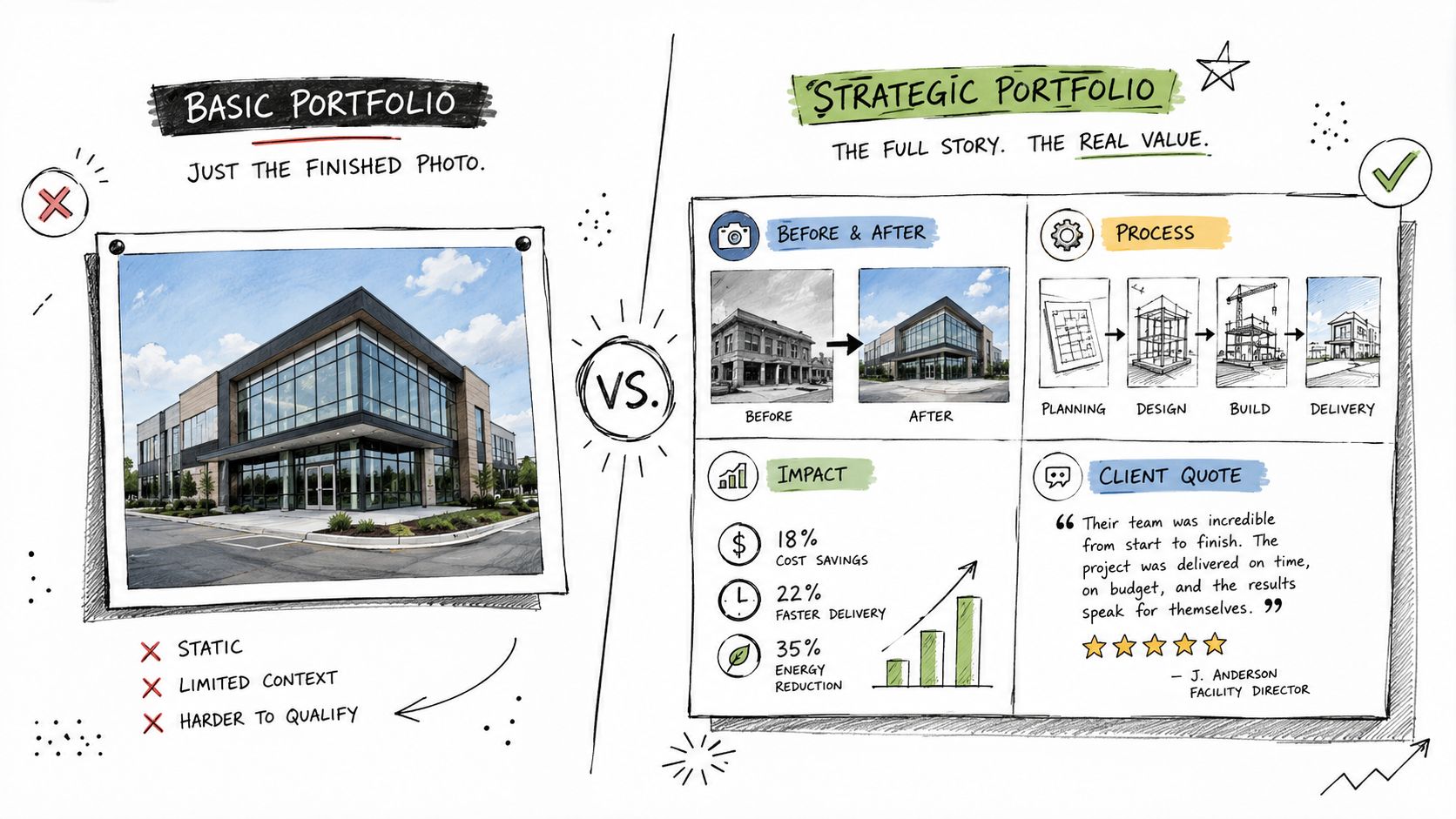
Most construction portfolios are too shallow. They show the finished result, but not enough context to help the right buyer decide whether the company is a fit. That's a missed commercial opportunity.
Show the work, then show the constraints
A strong portfolio should do more than impress. It should answer the practical question every serious buyer has, “Is this the kind of project you handle?” That's where transparency matters. One industry guide recommends including real numbers such as project square-footage ranges, typical budget ranges, schedule duration, and regions served, because that helps visitors self-select quickly and reduces unfit enquiries (common construction website design mistakes).
That approach is commercially smarter than endlessly chasing glossy hero shots. A polished image gets attention. A qualified project summary gets the right lead. When you show scope, challenge, and outcome together, you build trust without inviting the wrong expectations.
What to include on every strong project page
A useful project page doesn't need to be long, but it does need to be specific. Include:
Project type and location. Let the visitor instantly place the work.
Scope summary. State what was delivered.
Constraints or challenges. Show why the work mattered.
Relevant scale markers. Use the practical detail the buyer needs.
Outcome and finish. Keep the visual proof, but don't rely on it alone.
This is also where many firms should be more selective. A carefully curated project inventory is often better than a bloated gallery. Too many generic images create noise. Fewer, better-explained projects help the right prospects picture themselves as your next client.
The best portfolios don't just say, “Look what we built.” They say, “Here's the type of project we're built for.” That saves time for both sides, which is exactly what a commercial website should do.
For firms with design-heavy positioning, the presentation still has to work hard. If your site depends on visual credibility, it's worth checking how the layout, spacing, and project storytelling hold up against graphic designer website design standards, because the same clarity rules apply.
Integrating Local SEO From the Ground Up
Local search should be built into the site structure, not bolted on after launch. Construction buyers usually search with location in mind, which means your pages need to make geographic relevance obvious to both people and search engines.
Build local relevance into the page itself
A local construction website should do four things consistently. It should show where you work, what you build, who you build for, and how to contact you quickly. If those signals are scattered, search visibility becomes harder and the enquiry path gets weaker.
Location-specific pages help a lot here. A page for a service area or project zone can speak to the jobs you want, the conditions you work in, and the kinds of clients you want to attract. That's far better than stuffing a homepage with every suburb name you've ever heard of.
The technical side matters too. Search engines need clean signals, but buyers need speed and ease. For Australian service firms, page speed and mobile interaction design are not cosmetic choices but conversion controls. Sites loading in 1 second have reported 3.05% conversion rates versus 1.08% at 5 seconds, and mobile layouts should use touch targets at least 44×44 pixels with tap-to-call and short forms to reduce abandonment (mobile conversion guidance).
The non-negotiables for local visibility
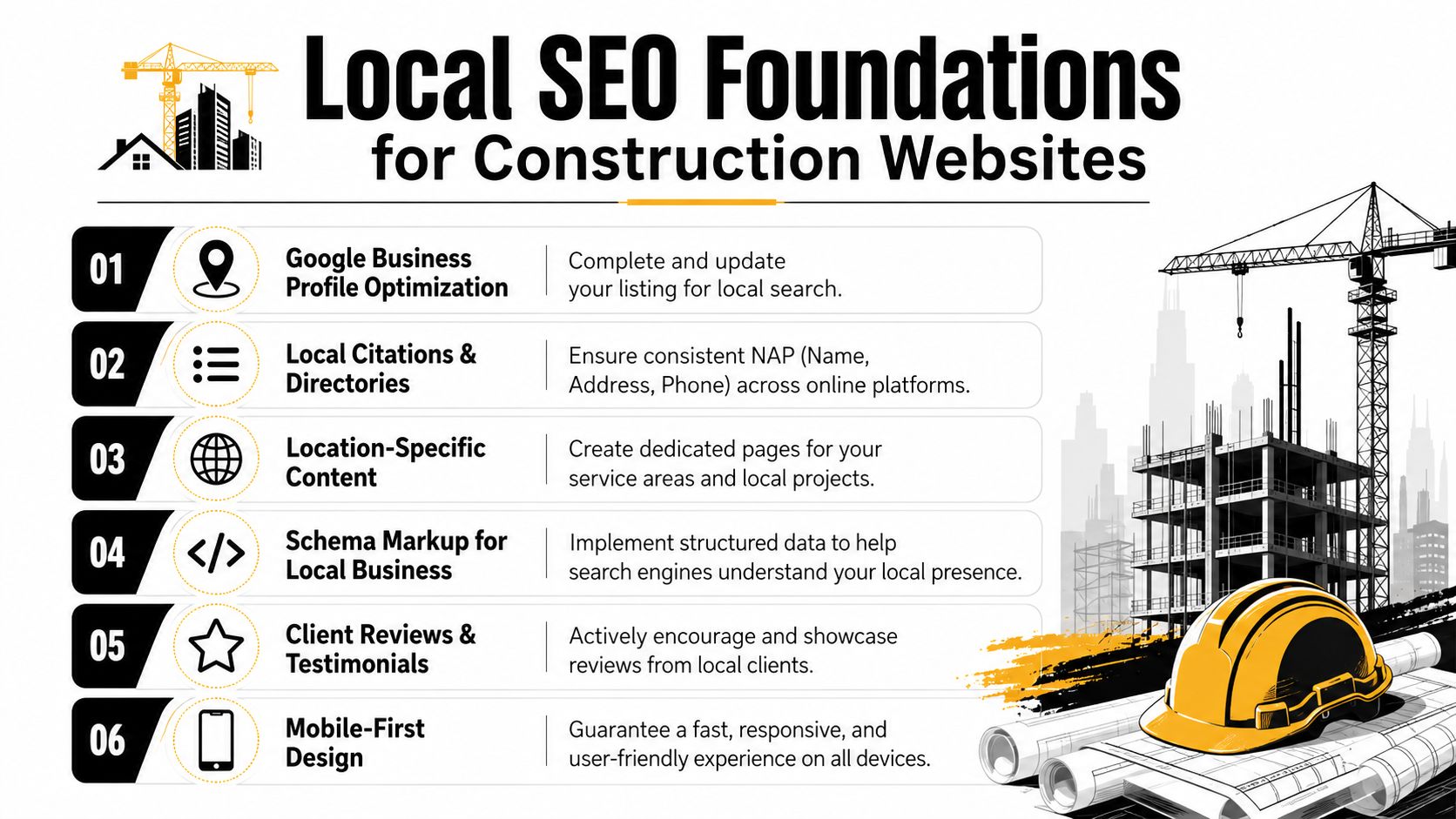
A construction site that wants local leads needs the basics done properly:
Google Business Profile. Keep the listing accurate, complete, and active.
Local citations. Make your business details consistent everywhere they appear.
Service-area content. Create pages for the specific places you want to work in.
Schema markup. Help search engines understand the business and service context.
Reviews and testimonials. Show proof from local clients.
Mobile-first design. Make the enquiry path fast and simple on a phone.
The point isn't to chase every possible ranking signal. The point is to make your website easy to trust, easy to use, and easy to associate with the right geography. That combination brings in better-fit traffic and reduces wasted sales effort.
Building the Conversion and Follow-Up System
A construction website doesn't win on traffic alone. It wins when the enquiry path is clear, the response is fast, and the follow-up doesn't fall through the cracks. That's the difference between a website that looks busy and one that effectively books work.
CTAs need to ask for the right next step
“Contact us” is too soft if you want serious leads. A better CTA speaks to the actual commercial moment. Depending on the page, that could be request a quote, book a site visit, arrange a consultation, or check project fit.
The form itself should stay short. Ask only for what you need to triage the lead properly. If the first screen feels like admin, people drop off. If it feels like a quick, useful step, they're more likely to complete it.
The next competitive edge is also changing. Recent industry guidance highlights faster response pathways, with increasing emphasis on AI-powered chatbots, WhatsApp-style instant messaging, and one-click scheduling to meet buyer expectations for fast, device-friendly contact options (construction web design guide). That doesn't mean every business needs every tool. It does mean slow response is becoming a bigger liability.
Connect the website to the back end
A good website captures interest. A better one hands that lead into a system your team can use. If a form submission sits in someone's inbox without a proper follow-up process, the website has done its job and the business has still failed.
Strong lead systems don't just collect enquiries, they organise them.
That means:
Routing enquiries correctly. Different services should go to the right person.
Logging every lead. Nothing should rely on memory.
Tracking call and form activity separately. You need to know which path produces better-fit work.
Following up quickly. Good leads go cold when response is slow.
For construction companies, the site transitions into a sales machine, not just the marketing layer. A booking flow, CRM handoff, and clear internal process protect the leads you've already paid to attract.
Your Next Step to a High-Performing Website
Most underperforming construction websites fail for the same reason. They were built to exist, not to qualify and convert. That's a strategic mistake, and it's fixable.
The right mindset shift is straightforward. Stop thinking of the site as a cost. Start treating it as a commercial asset that should reduce wasted enquiries, improve lead quality, and help your team spend more time on the right projects. Once you do that, the decisions become much clearer.
Review your current site against these questions. Can a visitor tell what you build within seconds. Can they see whether they're the right fit before they enquire. Can they move from interest to action without friction. If the answer is no to any of those, the website is costing you momentum.
A proper audit should look at structure, messaging, portfolio depth, local visibility, mobile speed, and follow-up flow together. That's the only way to see where leads are leaking out of the process. A construction website is never just a design job. It's a pipeline job.
Raffine Studio builds conversion-focused websites and lead-generation systems for Australian businesses that need better enquiries, not just more traffic. If your construction website isn't qualifying leads properly, visit Raffine Studio and book a conversation about turning it into a more reliable source of project opportunities.