website design for mortgage brokers, mortgage broker website, broker lead generation, mortgage compliance Australia, AI search for brokers
Website Design for Mortgage Brokers: A Lead Guide
by raffiné studio

Mortgage brokers facilitated 81.6% of all new residential home loans in Australia in the June 2026 quarter. That makes a conversion-focused website a commercial necessity, not a nice-to-have.
A broker website has to do more than display a logo, a phone number and a generic “Book a call” button. It must help the right borrower understand the service, trust the business, satisfy disclosure requirements, take a useful next step and receive a fast response. In a crowded market, website design for mortgage brokers is sales infrastructure.
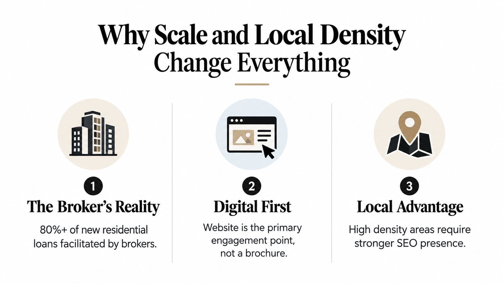
Why Scale and Local Density Change Everything
Brokers facilitated 81.6% of all new residential home loans in the June 2026 quarter, according to the MFAA's 2025 Value of Mortgage and Finance Broking report. The report also placed the broker channel at 75% of all residential loans written, an increase of 18 percentage points from earlier periods.
That reach gives the website a larger commercial job. It is the trust checkpoint a borrower reaches after finding a firm through Google, social media or a referral. The page must help that visitor identify the right service, verify the business and choose an appropriate next action.
The audience has several levels of familiarity. The MFAA report found that repeat customers represented 44% of broker business and referrals represented 28%. A first-time borrower may need a plain-English explanation of the application process. A referred client may already be ready to check credentials and book. A past customer may only need a direct contact route. Give each group a clear path instead of making every visitor start from the homepage.
Metro competition demands sharper structure
The 2026 Australian mortgage broker industry dataset counted 8,617 mortgage brokers nationwide, including 2,508 in New South Wales, or 29.1%, and 2,008 in Victoria, or 23.3%. Sydney alone had 291 brokers, while the dataset listed 7,130 websites in the category.
A generic national site will struggle in that environment. A Sydney broker needs pages that match local search intent and explain the areas, property types and borrower situations the team serves. A Melbourne refinance broker needs different proof and language from a regional broker focused on self-employed applicants.
Set up the site around four deliberate pathways:
Location pages: Build pages for the cities, suburbs or regions the broker serves. Explain local relevance, property conditions or service coverage on each page. Do not swap suburb names into one repeated template.
Borrower situations: Separate first-home buyers, refinancers, investors, self-employed borrowers and commercial clients where those services are offered. A first-home buyer page should answer process and deposit questions, while an investor page should lead with relevant lending considerations.
Referral pathways: Give referred visitors a direct route to the team, credentials, process and booking form. Do not make them search through generic service pages to confirm who they were referred to.
Research pathways: Route first-home buyers to a deposit-saver guide and refinancers to a cost-comparison tool before presenting a booking form. A visitor researching borrowing options needs a useful answer before a sales request.
Strategic rule: In a dense metro market, a polished template is weak differentiation. Clear positioning, local relevance and a shorter route to the right action win more attention.
High paid-search costs make poor structure expensive. Sending every visitor to one homepage and one immediate call request ignores the difference between curiosity and readiness. Use the SEO approach for mortgage brokers to strengthen organic visibility, then make every landing page qualify, reassure and direct the visitor.
Building a Calculator-First Funnel Pathway
A visitor searching for borrowing power, repayment options or refinance information is rarely ready to book a call immediately. If the landing page offers only “Book a call”, it leaves the original question unanswered and loses the enquiry.
A calculator-first pathway matches the visitor's intent. Give people a useful result first, then ask for the next commitment when the context supports it.
An Australian mortgage website source reports that high-intent searches such as “mortgage broker melbourne” can cost A$60 to A$110 per click, while lower-intent calculator searches such as “how much can I borrow” can cost A$15 to A$35, as described in the Australian mortgage broker website design guidance from KC Web Design. Use research traffic to introduce a practical tool, then reserve the booking request for visitors who show stronger intent.
Use four stages instead of one blunt CTA
Start with the question. Build a borrowing-power calculator, repayment estimator or decision guide around a real search behaviour. Keep the first interaction focused. A visitor should receive useful information before the site requests a full application or detailed personal history.
Return a useful result. Explain what the estimate means, which assumptions shaped it and what may change after a proper assessment. Present the output as an initial indication, with clear limits. The result must not read like approval or personal advice.
Offer a qualified next step. After the result, present a booking, callback or document-preparation pathway. Match the CTA to the visitor's likely situation. Someone exploring borrowing capacity may need a discovery call. Someone comparing refinance options may need a refinance assessment with relevant documents ready.
Send the lead into a controlled workflow. Capture only the information required for correct routing, then connect the form to a booking calendar, CRM and follow-up sequence. A form that sends an email into a shared inbox creates a queue because no routing, ownership or follow-up is triggered. Assign the enquiry to a person, record the tool or page that generated it, and define the next response.
This pathway also gives the broker better context. The site can record whether someone used a borrowing calculator, read a first-home buyer guide or arrived through a refinance page. That information makes the first conversation more useful and lets the team prioritise enquiries by intent.
Speed is part of funnel economics
Interactive tools must load and respond quickly. The KC Web Design guidance reports that a 3-second mobile LCP on high-CPC traffic can damage campaign economics and cites a 12% lift in form completions for every 1-second LCP improvement. It recommends LCP under 1.8 seconds, INP under 200 milliseconds and CLS under 0.1.
Set these as design requirements before development. Compress calculator assets, remove unnecessary scripts, test every form on mobile and make the result screen load promptly. Follow a lead-generation funnel framework that connects the calculator, form, booking flow and follow-up, so the enquiry journey operates as one system.
Designing Around ASIC Disclosure Rules
ASIC disclosure requirements should shape the site architecture before visual design begins. A polished broker website creates risk when its disclosures are hidden, outdated or separated from the enquiry path. In regulated financial services, disclosure affects the placement of service pages, forms and calls to action.
ASIC states that website disclosure information can support financial product advice or related dealing services when the required Financial Services Guide statements are available by the point at which the client would otherwise receive an FSG. The ASIC disclosure guidance summarised for mortgage broker websites highlights the need to show the document title, date and purpose statement.

Put disclosure where decisions happen
A footer link alone is weak compliance design. Someone submitting an enquiry or booking a conversation should be able to access the relevant information at that decision point, without searching through the site.
Build these requirements into the page templates:
The FSG is easy to find: Link to it from high-intent service pages, enquiry forms and booking screens, rather than placing it only in the footer.
The document is current: Display the document title and date clearly. Set an internal process for replacing outdated versions across every page.
The purpose is understandable: Explain the document's role in plain language before the visitor opens it.
Licence information is visible: Show the Australian Credit Licence or credit-representative status in an appropriate, easy-to-locate position.
Best interests positioning is clear: Describe the broker's role and service boundaries without making claims the business cannot substantiate.
The form supports review: Give visitors a practical opportunity to read or access the disclosure before submission.
Good compliance design reduces intimidation while ensuring the correct information is available at the correct moment.
Trust and conversion should reinforce each other
Prominent disclosure can strengthen the trust system when it sits within a clear service explanation. A mortgage page should explain who the broker helps, what the process involves, what the broker can and cannot confirm online, and where the relevant FSG is available.
Avoid exaggerated claims. Promises of guaranteed approval, universally better rates or certain outcomes create avoidable risk and weaken credibility. A qualified borrower needs a clear explanation of the service, visible credentials and a sensible next step. The page should answer those questions before asking for contact details.
Design principle: In mortgage broking, compliance content should reduce uncertainty, not compete with the call to action.
Before launch, the broker and relevant compliance advisers should review the complete customer journey, including service pages, forms, booking screens and document links. Designers can create the information architecture and interaction patterns. The business remains responsible for the accuracy, currency and suitability of its disclosures. Build that review into the launch process, then repeat it whenever documents, services or claims change.
Closing the Gap Between Form Submit and First Response
A website can generate a well-qualified enquiry and still lose the opportunity before the broker sees it. The failure happens after submission, when a form sits in an inbox and nobody takes ownership.
Independent Australian lead-response research reports that contacting an inbound lead within 5 minutes is 21 times more likely to qualify the lead than contacting it after 30 minutes. Its benchmark table reports lead-to-opportunity conversion of 21% under 5 minutes, 13% from 5 to 30 minutes, 8% from 30 to 60 minutes, 5% from 1 to 24 hours and 2.3% after 24 hours. These figures are published in Australian inbound response-time research.
A separate Australian lead-response analysis cites an average response time of 47 hours for Australian businesses. It recommends immediate or near-immediate handling for hot leads, including under 60 seconds for chat and SMS and under 5 minutes for hot inbound form leads.

Build the handoff before launch
Your website should trigger a defined response rather than merely store contact details. A practical workflow looks like this:
The visitor submits an enquiry. The form records the service interest, location, preferred contact method and any qualification information the broker has chosen to request.
The lead receives an immediate confirmation. An SMS or email confirms receipt, sets a realistic expectation and provides a direct route for urgent contact.
The broker receives an alert. The CRM or workflow tool identifies the enquiry, assigns ownership and alerts the appropriate team member.
The system starts follow-up. If the broker can't make contact, a short sequence can use phone, SMS and email rather than relying on one channel.
The outcome is recorded. The team tracks whether the lead was contacted, booked, assessed and progressed.
Australian follow-up guidance recommends first contact within 10 minutes during business hours, a 72-hour cadence for new leads and a 14-day nurture sequence for “not now” prospects. It also recommends measuring cost per lead, lead-to-contact rate, contact-to-appointment rate, appointment-to-application rate, application-to-settlement rate and time to first contact. The mortgage broker lead-generation guidance provides that operating framework.
The sales funnel automation approach matters because response speed isn't a staffing preference. It's part of conversion design. A broker who invests in traffic and a calculator but leaves follow-up manual has only built half the system.
Your Implementation Roadmap
Four implementation steps determine whether a broker website turns attention into qualified enquiries. Start with the current site, not a moodboard. Trace the borrower journey from search result to enquiry, then fix the points where confidence, clarity or momentum drops.
Step 1 Audit the current state
Test the main pages on mobile and desktop. A visitor should quickly understand who the broker serves, which loan situations the business handles, where it operates and what action to take next.
Review these areas:
Commercial clarity: Does the homepage lead with a defined audience and service, or rely on generic finance language?
Search structure: Are there useful pages for locations, borrowing situations and service categories?
Compliance access: Can users find the current FSG, licence details and relevant disclosures near high-intent actions?
Technical performance: Do calculator, form and booking pages meet the recommended Core Web Vitals targets?
Lead handling: Does every submission create clear ownership, confirmation and a follow-up task?
A site audit should expose operational gaps, not just visual inconsistencies.
Step 2 Define the conversion architecture
Build the site map around borrower decisions rather than internal departments. A practical structure can include a homepage, purchase and refinance pathways, first-home buyer content, self-employed borrower information, location pages, a borrowing-power calculator, an about page, an FSG access point and a contact or booking flow.
Give each page one primary job. A location page should establish local relevance and direct visitors to a suitable service. A calculator should provide an estimate, explain its limits and guide an engaged visitor towards an appropriate conversation. An FSG page should support informed review without leaving the visitor at a dead end.

Step 3 Choose the connected technology
Choose tools by workflow, not by feature count. The booking platform must pass useful context into the CRM. The form builder must support consent and disclosure requirements. The calculator must state its assumptions and avoid suggesting formal approval.
A WordPress build, specialist mortgage platform or custom implementation can all work. Choose the setup that stops staff manually copying names, phone numbers and enquiry details between systems.
Step 4 Validate borrower journeys
Before launch, validate the full borrower journey across these scenarios:
First-home buyer: Can the visitor find an educational path and a clear next step?
Referred borrower: Does the referral route reach the right person without unnecessary friction?
Refinance visitor: Can the visitor identify the relevant service and proceed confidently?
Mobile user: Can the visitor complete the key action without a slow page or awkward form?
Then review the operational checks:
Page performance: Check LCP, INP and CLS against the targets cited in the mortgage broker website performance guidance.
Form routing: Submit every form and confirm the correct team member receives each lead.
Booking confirmation: Check calendar availability, time zones, confirmation messages and reminders.
Disclosure timing: Review how and when users access the FSG and other required information.
Measurement: Track enquiries, booked calls, source, service interest, response time and downstream outcomes.
Launch only when the website, CRM and response process operate as one product. Slick design cannot compensate for unclear compliance information or a broken handoff.
Frequently Asked Questions About Broker Websites
Should a credit representative and licence holder share one website
Yes, they can share a domain if the ownership, representative relationship and disclosure information are clear. The site must distinguish the credit representative's role from the licence holder's role. It must not imply that the business holds a licence it does not hold.
Show the relevant status near the about information, service pages, forms and booking pathways. These are the points where borrowers decide whether to continue. Keep the FSG and related disclosure documents current, easy to find and clearly identified. If representatives have different service boundaries, use separate profiles or service paths instead of one generic statement that leaves visitors guessing.
The practical test is direct. Before the advice interaction begins, can a borrower identify who they are dealing with, what that person does and which disclosure document applies?
Should the site prioritise Google SEO or AI search visibility
Build the information architecture for both. Search engines and AI assistants need clear pages covering the broker's services, locations, audiences, process and trust signals. A page built around a keyword alone will not answer the detailed questions borrowers ask about borrowing power, refinancing, documentation or eligibility.
Use descriptive headings, direct explanations and properly connected service pages. Include evidence that reflects the actual business. Keep important information in crawlable page content instead of placing it only inside an interactive widget or image. Make the business entity, locations and people easy to understand throughout the site.
AI search visibility does not justify thin FAQs or invented authority. Specific, reliable information does the work. A broker specialising in self-employed borrowers should explain that process in detail. A broker serving Sydney suburbs should demonstrate genuine local knowledge instead of publishing duplicate location pages.
What should a broker fix first on an outdated website
Fix the failure that creates the greatest compliance or commercial risk. Unclear licence or FSG information requires attention before visual refinements. If paid traffic reaches a slow calculator or broken form, repair that path before increasing campaign activity.
Then assess the borrower journey:
Can visitors identify the right service without reading every page?
Is there a useful first step for people who are not ready to book?
Do service and location pages lead to a relevant action?
Does the form request only information the team can use?
Does a person receive and act on each lead promptly?
Can the business identify which enquiries become appointments and applications?
A redesign should create an accountable operating system, not only a new homepage. Strong website design for mortgage brokers connects local search structure, calculator-led journeys, compliant disclosure, clear qualification and follow-up.
Raffine Studio builds conversion-focused websites and funnel systems for Australian mortgage and finance brokers, connecting search visibility, booking flows, CRM handoff and lead follow-up. Review the borrower journey, find where enquiries are being lost, then contact Raffine Studio about making the website a more accountable lead-generation system.