website redesign service, conversion focused redesign, buyers agency website, professional services web design, redesign checklist
Website Redesign Service That Drives Real Bookings
by raffiné studio

Last month's pipeline report looks healthy until you trace the gap. Search impressions are holding, paid campaigns are still sending visitors, and referral partners are introducing qualified prospects, yet booked calls have stopped moving. The founder checks the sales team first, then the marketing budget, then the follow-up process. The website is usually the last suspect.
That's a mistake. A website can attract the right people and still lose them before they understand the offer, trust the firm, or know what to do next. A serious website redesign service should fix that commercial leak. It should make the website easier to find, easier to believe, easier to act on, and easier for the business to measure.
When the Website Becomes the Bottleneck
The pattern is familiar in Australian law firms, buyers agencies, brokers, accountants and specialist B2B firms. The homepage lists services. The service pages describe capabilities. The contact page offers a generic form. Nothing looks catastrophically broken, but visitors still leave without enquiring.
The business owner sees the symptoms elsewhere. Sales conversations feel harder to start. The team hears, “We need to think about it,” more often. Marketing reports traffic rather than booked conversations because those are the numbers the current setup can produce.
A polished visual identity won't solve a journey that never gives a qualified visitor enough reason to continue. Australian data points to the commercial pressure behind redesign demand. One roundup reports that 68% of small to medium businesses seek professional website help because of low conversion rates, while 61.5% start redesign projects because of poor user experience. It also cites an average 25% revenue increase after a UX-focused redesign across Australian businesses, alongside 94% of visitors viewing responsive design as essential. These figures are reported in Australian website redesign statistics, but the practical lesson is more useful than the headline numbers: redesign decisions should begin with the path to enquiry.
The leak usually sits between interest and action
A prospective client may arrive on a service page after searching for a specific problem. Instead of seeing a clear outcome, they find broad claims, a long list of features, and proof that says little about risk. The page asks the visitor to do the work of deciding whether the firm is relevant.
That friction is expensive. The site needs to answer four questions quickly:
Relevance: Is this firm built for my type of problem?
Confidence: Can it handle the complexity, risk or value involved?
Process: What happens after I enquire?
Action: Should I book a call, request an assessment or ask a specific question?
Commercial rule: Treat the website as the booking mechanism, not as a digital brochure.
The right redesign therefore starts with pipeline evidence. Review the landing pages, search queries, form starts, form completions, calendar bookings, phone clicks and lead sources before choosing a new colour palette. If qualified attention reaches the site but doesn't become a conversation, the redesign must target that transition.
What a Website Redesign Service Actually Covers
A website redesign service has two distinct layers. Strategy work determines what the site should say, who it should guide, and how it should turn attention into a commercial action. Surface design determines how that strategy looks and behaves through typography, imagery, layout, animation and interface components.
Buyers often combine these layers because both appear in the same proposal. They approve a sitemap, a Figma file and a new homepage, then discover that the offer is still vague and the forms still create friction. The design has changed, but the decision path hasn't.

Strategy work comes before the interface
A commercially responsible project should establish:
Positioning clarity: Define the audience, problem, distinctive value and commercial outcome.
Audience segmentation: Separate journeys for different buying groups, such as property investors, buyers agency clients or corporate decision-makers.
Offer framing: Turn a list of services into a reason to choose a particular service now.
Journey mapping: Trace the route from search, referral or campaign landing page to a qualified booking.
Conversion architecture: Decide where calls to action, proof, objections and booking options belong.
Baseline definition: Record the current performance of key journeys before changing them.
The output shouldn't be a vague strategy presentation. It should be a discovery document containing baseline analytics, a messaging map organised by buyer stage, a conversion architecture brief, a content inventory and a measurement plan.
Surface design supports the commercial system
Surface design still matters. A professional services firm needs a visual system that supports credibility, readability and brand recognition. That includes typography, photography, colour, spacing, responsive templates, accessibility, interaction patterns and development quality.
The problem is not visual design. The problem is allowing visual design to stand in for commercial thinking.
Ask whether each deliverable advances a booking, clarifies a decision or removes a barrier. A visually refined prototype has value only when it improves the experience the visitor needs to complete. The quality of the Figma file is not the success metric. More qualified enquiries, stronger booking completion and clearer attribution are.
Why Most Redesigns Miss the Real Problem
An outdated-looking site can damage trust, but a modern-looking site can still be commercially weak. Professional services websites in Australia can convert only 1.97% of visitors into contacts on average, with desktop at 3.2% and mobile at 1.8%, according to an Australian conversion rate benchmark. The benchmark doesn't prove that design causes every conversion gap. It does show why traffic volume alone isn't a sufficient measure of website health.
Three failure modes appear repeatedly.
The first is a visual refresh with no change to the offer. The firm receives new photography, a cleaner menu and updated colours, while the page still fails to state who the service is for or why a prospect should act.
The second is a copy rewrite with no structural change. The words become warmer, but the visitor still has to scroll past generic claims before finding proof or a next step.
The third is a full rebuild that preserves the same weak paths. The CMS changes, the templates change, and the old conversion problem survives inside a more expensive shell.
Visible symptom | Typical response | Real underlying cause |
|---|---|---|
The website feels dated | Replace colours, fonts and imagery | The positioning no longer reflects the value of the firm |
Visitors read service pages but don't enquire | Rewrite the page copy | The page lacks proof, objection handling and a clear next action |
Mobile users leave quickly | Make the layout responsive | The mobile journey is cluttered, slow or difficult to complete |
Paid traffic produces few leads | Create more landing pages | The offer, qualification and follow-up process are disconnected |
Forms receive starts but few completions | Change the form styling | The form asks for too much, offers too little context or routes poorly |
Measurement must expose the leak
Australian UX guidance recommends measuring task success and completion time, while the Victorian digital guidance describes the System Usability Scale as a standardised 10-item metric, with scores above 68 considered above average. Those measures are more useful than asking whether stakeholders like the new homepage. The relevant tasks might include finding a service, confirming expertise, comparing options and booking a call.
A measurement-first redesign is also more disciplined about performance. An Australian performance source reports that every additional 100 milliseconds of load time can reduce conversions by about 1%, while ecommerce conversion falls from 3.05% for sites loading under two seconds to 1.94% for sites loading between three and four seconds. The source is Australian website performance testing guidance. Service firms aren't ecommerce stores, but the principle carries across: speed affects every form view, calendar click and mobile decision.
Don't redesign the paint when the leak is in the plumbing.
The Deliverables That Matter for Lead Capture
A strong project follows the discovery-to-booking journey rather than a sequence of design phases. The first deliverable should make the business easier to understand. The final deliverable should make its performance easier to inspect.
Start with a message a buyer can repeat
The site needs a positioning statement that identifies the audience, problem, outcome and reason to trust the firm. That statement should shape the homepage headline, service page hierarchy, navigation labels and calls to action.
For a buyers agency, the copy may need to distinguish research, negotiation and acquisition support rather than presenting “property services” as one broad category. A law firm may need separate routes for business owners, employers or private clients. A broker may need to explain the lending situation it handles best, the information required, and what the first conversation will cover.
Use the service page to pre-sell the conversation. A useful page typically includes:
A direct promise: State the problem and outcome above the fold.
A proof stack: Use relevant case studies, named clients where permission exists and professional credentials that reduce perceived risk.
Objection handling: Address cost, timing, process, eligibility and what happens if the engagement isn't suitable.
A comparison point: Explain how the service differs from doing nothing, using a generalist or attempting the work internally.
A specific action: Offer a booking or enquiry path that matches the visitor's intent.
The lead-generation website design framework is a useful reference for connecting page structure with the action a business wants visitors to take.
Build the booking layer into the page
A booking system isn't an accessory added after launch. It should be part of the conversion architecture.
Use a calendar embed that works on mobile, route bookings according to service line or adviser availability, and keep the qualification form short enough to complete. Send submitted details into the CRM, trigger confirmation and reminder messages, and ensure the booking platform passes useful source information into analytics.
The implementation should also include:
GA4 events: Track every important call-to-action click, form start, form completion and calendar interaction.
Thank-you page tracking: Fire conversion events after a real submission, not merely when a button is clicked.
Server-side resilience: Reduce the impact of browser restrictions on attribution where the stack supports it.
Technical performance: Optimise templates, images, scripts and server response so speed doesn't undermine the page.
Structured data: Use suitable service and FAQ schema where the content supports it.
A weekly dashboard: Show sessions, qualified enquiries, bookings, lead source and follow-up status in terms a founder can read.
Each deliverable should have a metric attached. If a wireframe can't show where the visitor learns, believes and acts, it isn't ready for visual design.
Choosing Between a Refresh and a Full Rebuild
The correct choice is a scope decision, not a taste decision. A tired interface doesn't automatically justify replacing the CMS, rewriting every URL or migrating the entire website.
A refresh is appropriate when the brand still feels credible, the site attracts relevant visitors, the information architecture is usable and the main problem is presentation or content polish. Keep the existing foundation where possible, preserve URLs and metadata, improve the highest-value templates, and remove obvious friction.
A targeted UX revamp suits a site with a specific failing journey. Perhaps the service page attracts qualified visitors but the form is buried. Perhaps mobile users struggle with a key template. Perhaps one audience has no dedicated route. Fix the offending page, form or booking path before touching the rest of the estate.
A full rebuild earns its cost when the structure is badly broken, the CMS cannot support required booking or CRM workflows, technical debt blocks campaigns, or the firm's positioning has changed substantially. A rebuild should not be chosen because a competitor's site looks newer.
Criterion | Refresh | Targeted UX revamp | Full rebuild |
|---|---|---|---|
Traffic quality | Relevant traffic already reaches useful pages | Relevant traffic reaches specific underperforming journeys | Traffic is poorly aligned with the new market position |
Conversion baseline | Existing paths work but need clearer presentation | A defined page, form or device journey leaks enquiries | Conversion paths are inconsistent or impossible to measure |
Technical debt | CMS, forms and tracking remain serviceable | One integration or template causes the issue | Platform limitations prevent booking, CRM or measurement |
Content condition | Core pages are accurate with local gaps | A small group of pages is stale or misaligned | The whole information architecture no longer matches the offer |
Booking requirements | Existing calendar and CRM can be retained | Routing or qualification needs focused improvement | The business needs a new booking and follow-up system |
SEO risk | Preserve the current URL and metadata structure | Change only what the evidence justifies | Plan migration, redirects and content preservation before launch |
Australian buyers have options across the cost spectrum. One 2026 Australia-focused redesign guide places a targeted strategic refresh from around AUD 4,000, while a full rebuild with new architecture, custom design, content restructuring and ecommerce functionality can reach AUD 25,000 or more. A separate Australian source reports approximately 3,300 web design firms in 2022, with more than 33% charging AUD 1,000 to AUD 1,500 for a basic site. Those figures appear in Australian website redesign cost guidance, and they reinforce a simple buying principle: price scope against the problem, not against the number of screens in a proposal.
How to Vet a Website Redesign Agency
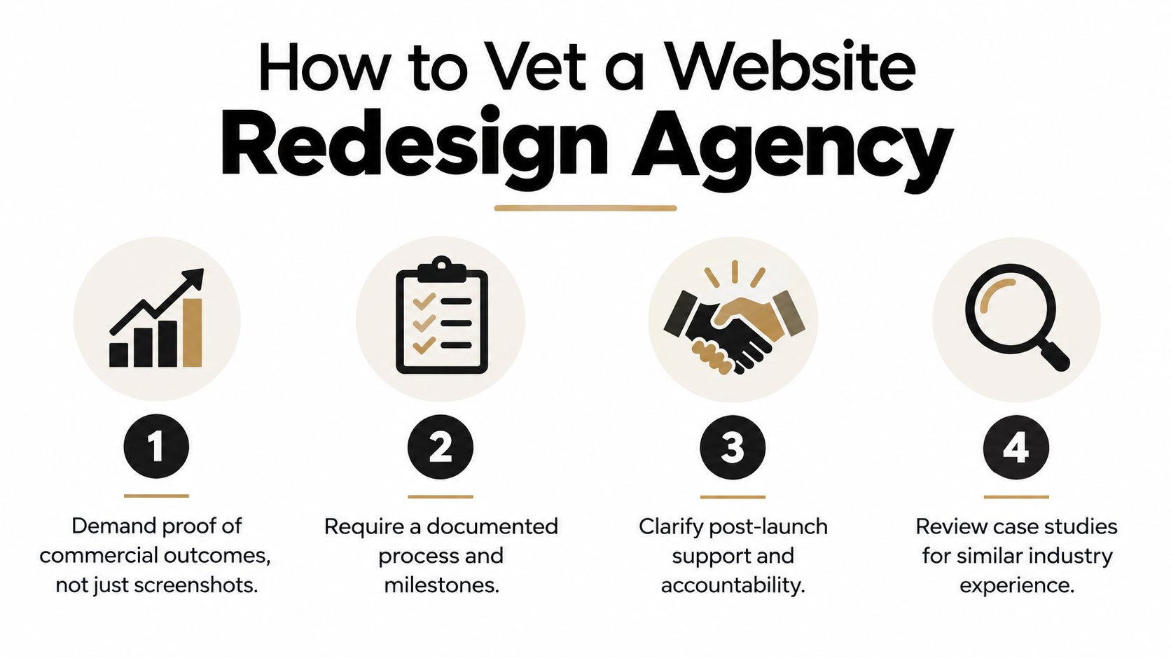
The agency with the most impressive portfolio isn't automatically the right commercial partner. Screenshots show taste. They don't show whether the agency found the conversion leak, protected search visibility or improved the booking process.
Start with evidence. Ask for before-and-after conversion data, booked-call movement and references from comparable professional services, buyers agency or broker businesses. If confidentiality prevents detailed reporting, the agency should still be able to explain the baseline, intervention, measurement setup and decision process without inventing a success story.
Examine the working process
Ask who owns strategy and whether research is shared before design starts. Confirm that the team approves information architecture and wireframes before visual design, and establish how revision rounds, content responsibilities and stakeholder decisions are handled.
Then inspect the booking stack. Confirm compatibility with the firm's calendar provider, the depth of CRM integration, routing by service or consultant, and the events that will be tracked. A site that captures an email but loses the lead source still leaves the founder guessing.
Put post-launch responsibility in writing
A proper handover includes GA4 dashboards and a guide explaining how to read them. Ask whether the agency provides a defined optimisation window after launch, how issues are prioritised, and what happens if enquiry quality or volume doesn't improve.
Review the commercial terms as carefully as the creative work:
Scope: Identify exclusions for copy, migration, integrations, accessibility and testing.
Ownership: Confirm who owns the copy, design files, code and account access.
Commercial model: Understand fixed fees, time and materials, milestone payments and change requests.
Exit terms: Know what happens if approvals stall or the relationship stops working.
Reporting: Require access to the underlying analytics, not only a monthly summary.
The B2B web design agency selection guide covers the same discipline from a business buyer's perspective.
Red flags are easy to recognise. Be cautious of guaranteed rankings, vague claims about “more visibility”, heavy paid-media upsells before the website is fixed, and any agency that refuses to share baseline metrics. The embedded discussion below can provide another perspective on evaluating a redesign partner.
Measuring Whether the Redesign Worked
A redesign succeeds when the business can defend it with evidence. Stakeholder approval, a faster-looking homepage and a positive launch email don't prove that the new site produces better commercial outcomes.
Record the baseline before development begins. At minimum, capture discovery-call bookings per 100 sessions, contact-form completion rate, organic cost per enquiry, time to first response and qualified lead-to-client conversion. Keep the definitions stable after launch, otherwise the business ends up comparing different measures and calling the difference progress.
Use a measurement window, not a launch-day opinion
Set review points at 90 days, six months and 12 months. The first period helps identify broken events, weak pages and obvious booking friction. The later reviews show whether the redesigned journey continues to attract suitable enquiries and support sales conversations.
Don't attribute every movement to the redesign. Compare the pre-launch and post-launch windows, then use a year-on-year view where available. Record changes to paid spend, campaign targeting, seasonality, staffing, service availability and major search updates. A useful dashboard makes those conditions visible beside the enquiry data.
KPI | Baseline (Pre-Launch) | Target at 90 Days | Target at 12 Months |
|---|---|---|---|
Discovery-call bookings per 100 sessions | Record the current rate by source and device | Improve the weakest high-intent journey without sacrificing lead quality | Establish a stable booking rate that supports pipeline planning |
Contact-form completion rate | Measure starts, completions and abandonment | Remove form friction and confirm accurate event tracking | Maintain completion quality while testing qualification fields |
Cost per enquiry from organic search | Link organic sessions to enquiries in the CRM | Confirm source attribution and identify pages producing qualified leads | Use the trend to guide SEO, content and conversion investment |
Time to first response | Record the current response interval | Connect alerts, routing and ownership to every enquiry | Review response performance alongside qualification and close rate |
Qualified lead-to-client conversion | Define “qualified” and match leads to opportunities | Check whether the new message attracts the intended buyer | Use client conversion to refine positioning and page-level promises |
Australian businesses often need a stronger analytics operating model, not another isolated dashboard. The distinction between channel reporting and commercial reporting is explained in marketing analytics versus business analytics.
Protect the gains after launch
Review the same baselines quarterly. If a key measure drifts by more than 15%, record the cause, owner and intervention before changing the design again. The response might be a broken form, slower page, weaker traffic source, unavailable consultant or follow-up failure.
Speed and mobile experience deserve their own checks. Recent Australian coverage reports that more than 65% of first-time customer interactions occur on mobile devices, and independent reporting says pages taking longer than three seconds see a 53% increase in bounce rates, as summarised in Australian redesign activity coverage. Google has also started rolling out Search Console reporting for impressions from AI Overviews, AI Mode and other generative search experiences, according to coverage of AI search visibility reporting. Measure those visibility surfaces alongside traditional search, but keep the commercial endpoint clear.
Fast booking and follow-up belong in the same review. Australian lead-response benchmarks report that companies responding within five minutes are 21 times more likely to qualify a lead than those responding after 30 minutes, as detailed in Australian speed-to-lead benchmarks. A redesigned page can't compensate for a booking system that loses the enquiry afterwards.
Raffine Studio helps Australian buyers agencies, brokers and professional services firms redesign websites around qualified enquiries, discovery-call booking, SEO, AI search visibility, CRM handoff and follow-up automation. Visit Raffine Studio to review the service and start a conversation about whether your business needs a targeted refresh, UX revamp or full rebuild.