cpa website design, accountant web design, accounting seo, cpa lead generation, funnel design
CPA Firm Website Design: Build a Lead-Generation System
by raffiné studio

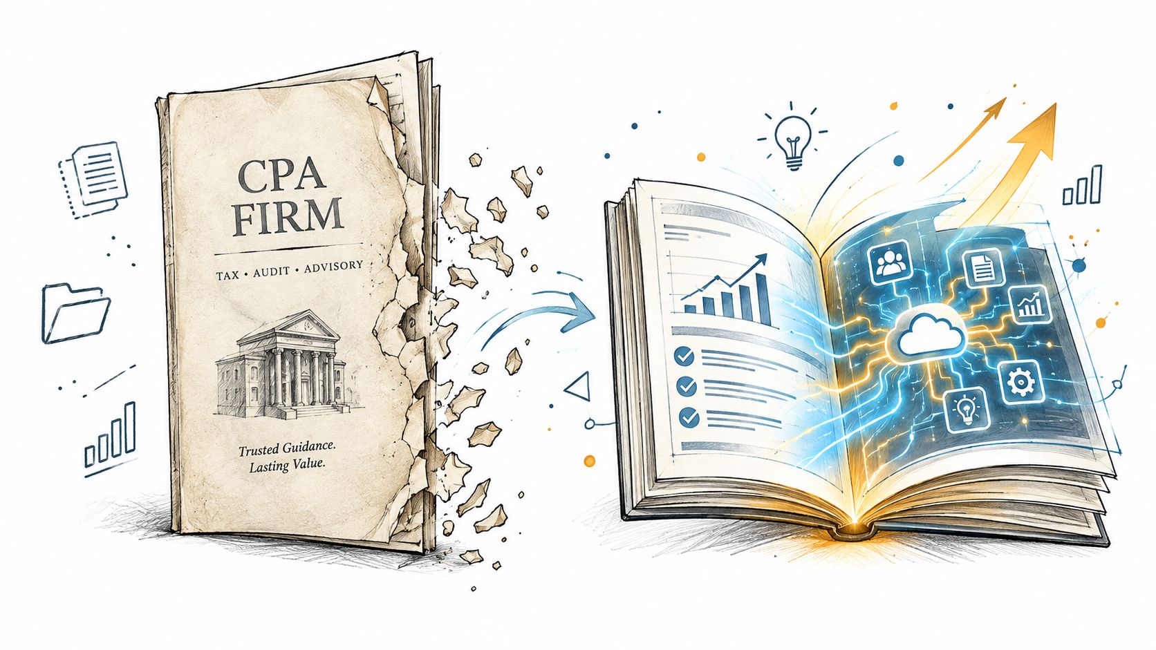
A polished website isn't automatically a productive one. For many Australian CPA firms, the site still functions as a digital business card: it lists services, displays partner biographies and provides a contact form, but leaves visitors to work out whether the firm can help and what they should do next.
That approach confuses being present online with generating qualified conversations. Australian business-data reporting recorded 6,842 accounting firms in August 2026, with 5,581 websites, so basic web presence is no longer a meaningful differentiator. New South Wales accounted for 1,984 firms, or 29%, while Victoria accounted for 1,585, or 23.2% of the market. The Australian accounting-firm data points to a crowded, fragmented category where the quality of the digital experience matters.
Effective CPA firm website design should help a prospect identify the right service, trust the people delivering it, understand the next step and book a suitable conversation. It should behave like a structured front desk and an informed first salesperson, not a static brochure.
Stop Treating Your Website as a Digital Brochure
The popular advice is simple: make the site look professional, list your services and add a contact page. That may satisfy a credibility requirement, but it doesn't solve the commercial problem. A visitor with a tax issue, cash-flow concern or business-growth question still has to diagnose their own situation and decide whether your firm is relevant.
A brochure site makes the visitor do too much work. It often places every service under one menu label, uses broad copy such as “quality accounting solutions” and sends every enquiry to the same generic form. The firm has supplied information, but it hasn't created a decision path.
Australian professional-services websites commonly convert at around 2.0% to 4.0% through lead forms, according to Australian conversion benchmark guidance for professional services. That range isn't a promise or a target that applies equally to every firm. It does show why a CPA website needs measurable enquiry paths, not just attractive pages.
Build the site around the prospect's problem
A useful website answers the questions a prospective client is already asking:
Can you help with my situation? Separate business advisory, tax, audit, SMSF and compliance pathways where those audiences have different needs.
Do you understand businesses like mine? Use industry and client-type language instead of a long list of capabilities.
What happens after I enquire? Explain whether the next step is a discovery call, document review, consultation or service assessment.
Can I act now? Put a relevant booking or enquiry action beside the decision-making content.
The change is structural, not cosmetic. Navigation, page hierarchy, copy, forms, calendar tools and follow-up must work as one system. A strong homepage creates orientation, service pages capture intent and booking flows turn serious interest into an organised conversation.
Practical rule: If a visitor has to return to the homepage to work out what to do next, the page hasn't finished its job.
Engineering Trust Through Clear Authority and Design
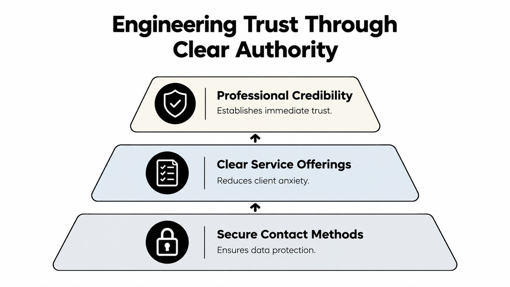
People don't hand financial information to a firm because the logo looks polished. They look for evidence that the team is competent, organised, responsive and appropriate for their circumstances. Good design reduces the uncertainty surrounding that decision.
For a CPA firm, trust begins with visible authority. State relevant CPA or CA designations, registrations, service locations, industry experience and areas of expertise where they apply. Partner profiles should explain how each person helps clients, rather than presenting only a title and a list of qualifications. Credentials matter most when they're connected to a client's practical concern.
The visual layer carries its own message. Cluttered layouts, inconsistent typography, stock imagery that doesn't resemble the firm and vague calls to action can make a financially anxious visitor question the firm's attention to detail. Clean spacing, readable pages, accessible contrast and real team photography won't replace expertise, but they make that expertise easier to believe.
Make authority easy to verify
Trust signals should appear close to the point where someone might enquire, not be hidden in an obscure footer. A service page for business advisory might include:
Relevant credentials: Identify the qualified people responsible for the work.
Specific service boundaries: Explain what the engagement includes and where it begins.
Client reassurance: Describe confidentiality, communication and the expected first step.
Evidence of understanding: Use carefully selected examples, FAQs or insights that address genuine client questions.
Contact confidence: Provide secure, professional enquiry methods and clear expectations about the response.
This hierarchy matters because visitors often arrive under pressure. Someone dealing with an overdue tax issue needs clarity before they need a long history of the practice. Someone considering outsourced finance support needs to understand scope, fit and ongoing involvement. Different audiences require different reassurance.
Design for confidence, not decoration
A premium appearance should support comprehension. It shouldn't bury the booking button beneath animated elements or force a visitor to interpret clever headlines. Use visual emphasis to direct attention towards the decision the visitor is ready to make.
The most persuasive combination is straightforward: recognisable expertise, relevant language and a low-risk next step. When the page demonstrates that the firm understands the issue and explains what happens next, the design reduces perceived risk without making exaggerated promises.
Structuring Service Pages to Capture Intent
An “Our Services” page is useful for orientation, but it rarely carries enough detail to convert a high-intent visitor. Someone searching for SMSF audit support, BAS advice for a growing retailer or outsourced CFO assistance isn't looking for a general description of accounting. They're trying to solve a defined problem.
Each priority service needs its own page, built around the language and decision criteria of that audience.
Start with one problem and one audience
Before writing, define four things:
The audience: For example, founders, property investors, advisers, retailers or established professional firms.
The trigger: What prompted the search? Compliance pressure, growth, complexity, uncertainty or a need for better reporting.
The desired outcome: A compliant filing process, clearer financial control, strategic advice or an ongoing engagement.
The next action: Book a discovery call, request an assessment or ask a focused question.
This prevents the page from becoming a catalogue of capabilities. “Tax services for businesses” is broad. “Tax planning for growing professional practices” gives the visitor a clearer reason to continue.
Use a page hierarchy that answers buying questions
A strong service page usually moves in this order:
Specific opening: State who the service is for and the problem it addresses.
Recognisable symptoms: Describe the situations that indicate the service may be relevant.
Method and scope: Explain how the firm approaches the work, without hiding behind process language.
Proof of competence: Show relevant credentials, expertise, FAQs or appropriate client examples.
Fit and exclusions: Clarify who benefits most and when another service may be more suitable.
Focused call to action: Offer one clear next step, such as “Book a discovery call”.
The page should support both search visibility and human judgement. A visitor may arrive from a local query, a referral or an AI assistant, but they still need to understand the firm's specialisation quickly.
Replace generic claims with useful specificity
“Personalised solutions” doesn't tell a prospect much. Explain what the firm reviews, what information the client should prepare, who will be involved and what the first conversation covers. If the firm serves multiple locations, make service areas explicit on relevant pages rather than relying on a single contact address.
Avoid forcing every service into the same template. An audit page may need to explain independence and documentation. An advisory page may need to show how conversations support business decisions. A tax page may need to organise content around common triggers and deadlines. The structure should reflect how the client evaluates that service.
Why Mobile-First Design Is Non-Negotiable
A CPA firm can lose a qualified prospect before its desktop site ever enters the picture. People discover firms between meetings, while travelling, after a referral, or when a financial issue becomes urgent. If the mobile page makes the next action awkward, that initial interest disappears before the visitor can assess the firm properly.
Australian benchmark data cited by Raffine Studio reports 4.3% desktop conversion compared with 2.2% mobile conversion. The Australian B2B web-design benchmark shows a substantial device effect, with mobile conversion roughly half the desktop rate in that benchmark. Mobile visitors arrive with intent; the friction is added by the layout itself.
Remove effort from the mobile path
A mobile-first CPA website should make the following details obvious:
Tap-friendly actions: Buttons such as “Book a discovery call” should be easy to select without zooming.
Short forms: Ask only for information needed to route or prepare the enquiry.
Readable service summaries: Keep the first screen focused on relevance rather than a dense block of text.
Visible contact options: Show phone, email and booking choices without sending visitors through several menus.
Fast-loading pages: Compress heavy media, remove unnecessary scripts and test the actual page experience on mobile connections.
Stable layouts: Prevent buttons and content from shifting while assets load.
These details affect whether a visitor reaches the enquiry stage. A page can look polished in a desktop review and still lose prospects through small mobile delays, difficult fields or a booking button that moves as the page loads.
Test the complete journey
Do not stop after confirming that the site technically responds. Ask a staff member to find a service, judge its relevance and book a call using one hand on a mobile device. Record every hesitation, including unclear wording, awkward scrolling and unexpected redirects.
Check whether the form keyboard behaves correctly, calendar slots display properly and the confirmation message explains what happens next. Test current Apple and Android devices, because a layout that works in a browser preview can still fail during a real booking journey.
Mobile-first design is not a visual preference. It protects the path between discovery and enquiry.
Automating Discovery Calls to Filter Serious Leads
A generic contact form creates the appearance of lead capture without necessarily creating a useful pipeline. It asks a visitor to write a message, then leaves the team to interpret the situation, chase missing details and arrange a time manually.
A better system gives high-intent prospects a direct route to a suitable conversation while collecting enough context to protect the firm's time. The booking flow should qualify, not interrogate.

Design the funnel around intent
A practical discovery-call flow can follow this sequence:
Service-specific action: Place a relevant booking button on the service page, not only in the global navigation.
Light qualification: Ask what support the visitor needs, their business type, location and preferred outcome.
Scheduling: Display available times through a tool such as Calendly or Microsoft Bookings.
Confirmation: Send the prospect a clear confirmation with preparation guidance.
Internal hand-off: Push the details into the firm's CRM or agreed lead-management process.
Follow-up: Send useful reminders and route the booking to the right person.
The questions should help the firm prepare, not create unnecessary barriers. A prospective advisory client may need to identify their current stage and key challenge. A compliance enquiry may need a service type and location. Avoid asking for sensitive financial information before the firm has established a secure and appropriate channel.
A booking form should help the right person reach the right adviser with the right context.
Replace one generic CTA with deliberate routes
“Contact us” is vague because it doesn't tell the visitor what will happen. Use calls to action that match the page and the level of commitment:
Early-stage visitor: “See whether we can help”.
Problem-aware visitor: “Discuss your accounting needs”.
High-intent visitor: “Book a discovery call”.
Existing client: “Access the client portal” or use the designated support channel.
Keep the general form available for unusual enquiries, but don't make it the only route. The booking experience should also handle cancellations, reminders and notifications so the team doesn't become the scheduling system.
Raffine Studio documents automated system examples for lead handling, including the broader principle that website actions, booking systems and follow-up should connect rather than operate as isolated tools. Review the workflow from the visitor's perspective, then test the internal hand-off with real staff.
SEO and Visibility for Financial Queries
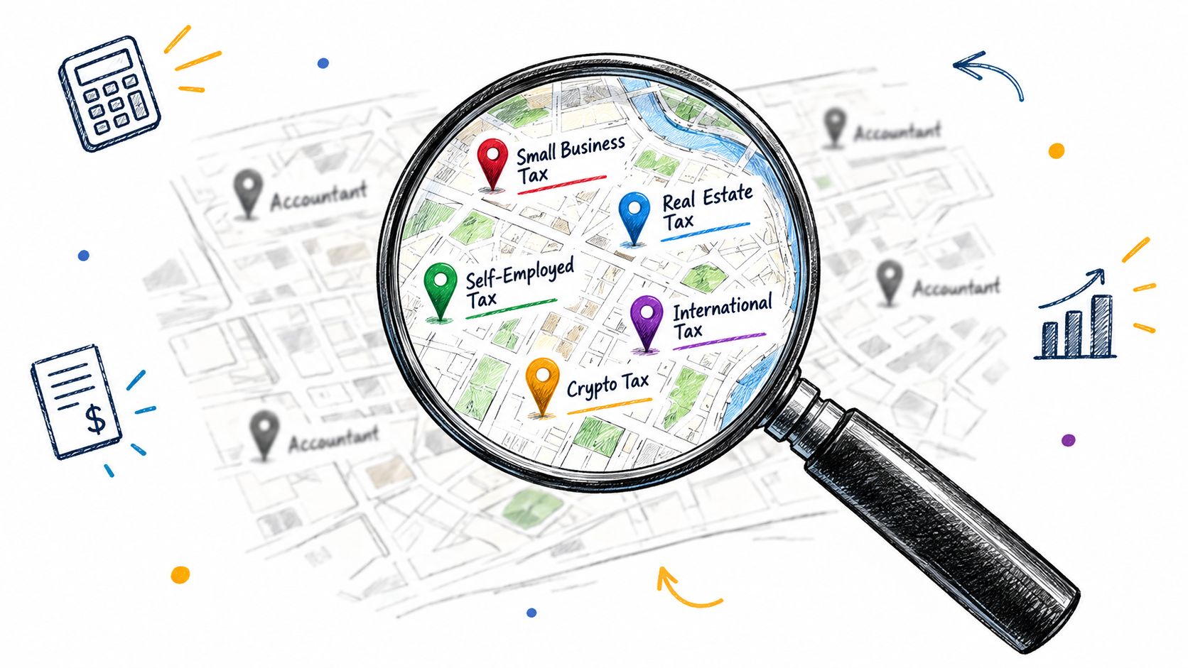
Ranking for “accountant” alone is a weak strategy for most firms. The term is broad, commercially mixed and difficult to connect to a specific service decision. A smaller firm will usually create more useful visibility by targeting the problems, locations and client types it can serve well.
An intent-led structure might include pages for business tax planning in a defined service area, SMSF audit support for advisers or accounting services for a particular industry. The point isn't to publish pages for every possible phrase. It's to build authoritative resources around genuine expertise and a clear commercial path.
Make the firm understandable to search systems
Traditional SEO and AI-search visibility share a foundation, but they reward different weaknesses and strengths in the site.
Brochure-site approach | Intent-led approach |
|---|---|
One broad services page | Separate pages for defined needs and audiences |
General claims about experience | Verifiable credentials and specific expertise |
FAQs written for keywords | FAQs that answer real client decisions |
Location hidden in the footer | Clear service areas and local context |
Traffic as the main measure | Enquiries, bookings and lead quality |
Australian search-marketing coverage reports that visits to the accounting and auditing category rose 7.63% year on year to 47.09 million in the 12 months to March 2026, while March 2026 unique visitors were up 41.16% year on year. The Australian accounting-marketing analysis presents this as a more competitive discovery environment. The practical response is not to chase every query. It is to make the firm's expertise clear where buyer intent is strongest.
Structured content also helps AI assistants interpret the business. Define the firm, services, practitioners and locations consistently. Use direct answers, descriptive headings and authoritative FAQs. Add appropriate structured data, including LocalBusiness markup, and keep Google Business Profile details aligned with the website. Australian guidance on AI search visibility links structured data, location information, mobile performance, HTTPS and local search signals with clearer machine understanding.
Connect visibility to conversion
SEO can bring a visitor to a page, but the page must still make a decision easy. Explain the service, show relevant trust signals and offer a natural next action. This guide to SEO for lead generation treats search as part of a wider path from query to enquiry rather than as an isolated ranking exercise.
Review performance using more than impressions. Watch which service pages attract qualified visitors, where users leave, which calls to action receive engagement and whether booked conversations reach the intended adviser. A page that attracts less traffic but produces better-fit enquiries can be more commercially valuable than a broad informational article.
Turning Your Website into a Growth Engine
A CPA website becomes a growth asset when its parts reinforce one another. Clear positioning helps search engines and visitors understand the firm. Service pages capture defined problems. Trust signals reduce risk. Mobile-first paths remove friction. Booking and follow-up systems turn interest into a managed conversation.
The market structure makes this especially relevant. With many Australian accounting firms already maintaining websites, launching or refreshing a site will not create an advantage. The firms that stand out give prospects a more authoritative and convenient route from uncertainty to action.
Use a practical redesign sequence
Start with the commercial diagnosis, not the visual moodboard.
Map the best-fit clients: Identify the services, industries and locations that deserve priority.
Audit the existing journey: Test how a stranger finds a service, evaluates relevance and requests help.
Rebuild the information architecture: Give important services their own decision-focused pages.
Rewrite the conversion points: Match calls to action to visitor intent and service context.
Add trust where decisions happen: Place credentials, team expertise, privacy reassurance and useful evidence near enquiry actions.
Connect booking and follow-up: Route submissions, calendar events and notifications to the right people.
Measure the pipeline: Track qualified enquiries and booked calls alongside search visibility and page engagement.
Australian service businesses are reported to convert at about 2.3% overall, while service-focused lead-generation pages can reach 5% to 15% enquiry rates from high-intent paid traffic when the offer, audience fit and hierarchy align. The Australian professional-services web-design benchmark provides useful context, but the figures shouldn't be treated as a guarantee for an accounting firm. They show why page structure and traffic intent must be assessed together.
A lead-generation website design approach connects the website to the larger operating system: search, content, forms, booking, CRM hand-off and reporting. That connection matters because visibility without a usable booking path just sends more people into the same leak.
Review the site as a pipeline every quarter. Ask which pages attract the right prospects, which forms create useful context, where the booking process loses people and how quickly the team follows up. The strongest design isn't finished at launch. It gives the firm a clearer system for learning and improving.
Raffine Studio builds conversion-focused websites, service-page funnels and automated booking systems for Australian professional-services firms, including CPA practices that need more qualified discovery calls. Visit Raffine Studio to review how your website, SEO, AI search visibility and lead follow-up can work as one client-acquisition system.